Newsletter • Issue 77
What do these beautiful sites say?
Howdy, partner!
I hope your week's off to a great start. I've rounded up some great CodePens, articles, and resources for this week! I've also found a couple of inspirational websites that I don't understand but love anyway.
You can always read this on the web.
CodePens
Save the Fish
I only just found Pedro Ondiviela, but they have so many wonderful CodePens! In this one, you've got a fish with a leaky bowl, so you need to use the faucet to keep the water level up or the fish dies.
Please save the fish.
Designer's Eye
This is such a great animation and effect, you really need to see it for yourself. Works best on Chrome and Firefox.
Leaping Loader
Our friend Adam Kuhn created this fun loader that looks like it's running and jumping platforms. It's made with CSS keyframe animations, so comment out 'wobble' or 'run' to see how each is affecting the letters.
Sponsor
Polypane

The browser that puts you in the saddle
It won't take your site to the Horsehead Nebula but the newly launched Polypane Portal will take your localhost where you need it, to all the devices you need to test on. Scroll, click and edit styles in Polypane and see all your devices update along in an instant. Or share your in progress work with your fellow cowboys and share your design changes as you make them.
"You've just changed the way I develop for phones." - Alex Trost, famed equestrian.
Quit horsing around in a normal browser, and switch to one that "feels like devtools with cheats enabled". Try it out for free and see for yourself. Use code FRONTENDHORSE20 to get 20% off any plan.
Articles
Making SVG Loading Spinners: An Interactive Guide

Sébastien Noël continues to make wonderful resources over at fffuel. In addition to this guide, he's made more SVG generators than I can count. A site that needs to be in your bookmarks.
How I Solved My Font Rendering Problem
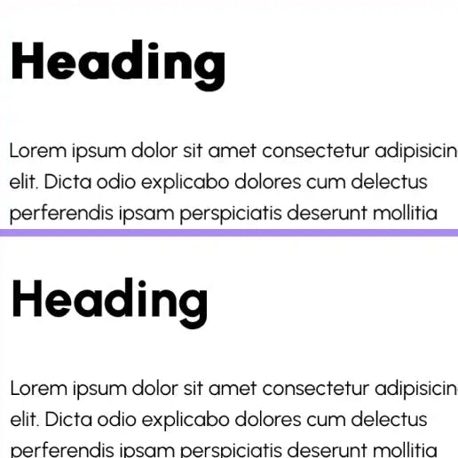
Michelle Barker describes an annoying iOS font issue as well as its solution. I just happened to run into this exact same problem two days after Michelle published this, and Kilian sharing it in the Frontend Horse Discord was a godsend.
A Practical Guide to Using Shadow DOM
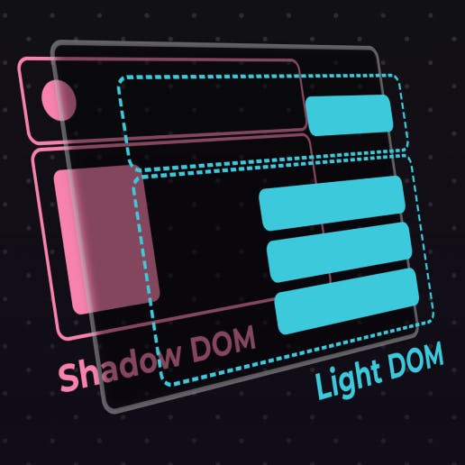
Declarative shadow DOM is now available across Chrome, Firefox, and Safari, so Mayank is here to provide a practical guide. They explain imperative vs declarative, some common use cases, style scoping, and the problems that still exist with the shadow DOM.
Resources
Codrops Demo Archive
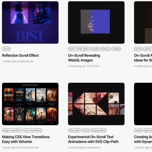
The legendary Codrops have launched a new page where all of their incredible demos are easier to browse through. If you ever need some ideas for a great new effect, look no further.
Inspiration
Eat more pineapple
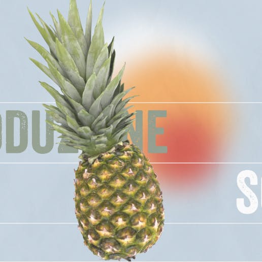
Goodness this is a gorgeous site with excellent 3d model work.
The only downside? It seems to only be in Italian, so I can't read a word of it. They seem to be selling me pineapple and damn it, it's working.
Grab & Go
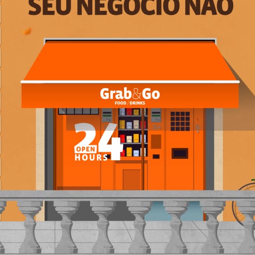
Is this another site where I can't read a single word? Yes.
Is this another site where it just doesn't matter because it's so damn good? Also yes.
Cool parallax effects, perspective typography, 3D scroll animations - this little landing page has it all. Lots of fun techniques to steal from this one.
So long, partner
Thanks for riding with me this week!
If you liked the issue, it's always appreciated if you send it along to a friend. If you don't like the issue, send it to an enemy. I won't tell them which one they are.
Your neigh-bor,
Alex