Newsletter • Issue 78
I'm obsessed with these fun blur effects!
Howdy, partner!
We've got a great article on the apparent devaluing of frontend, and a way to reclaim that value through quirky uses of blur. Let's get to it!
CodePens
Dead Simple Grid
A great little CSS snippet to get simple grid columns. Reminds me a lot of Stephanie Eckles's Smol CSS Grid which I use everywhere, but I do like the addition of the `grid-columns` property if you need extra control.
Retro style UI
I love this cool retro-style UI. It feels like something I would have launched via MS DOS back in the early 90's. The toggle switch changing the theme to dark mode is wonderful.
Sponsor
Polypane

The browser that puts you in the saddle
It won't take your site to the Horsehead Nebula but the newly launched Polypane Portal will take your localhost where you need it, to all the devices you need to test on. Scroll, click and edit styles in Polypane and see all your devices update along in an instant. Or share your in progress work with your fellow cowboys and share your design changes as you make them.
"You've just changed the way I develop for phones." - Alex Trost, famed equestrian.
Quit horsing around in a normal browser, and switch to one that "feels like devtools with cheats enabled". Try it out for free and see for yourself. Use code FRONTENDHORSE20 to get 20% off any plan.
Articles
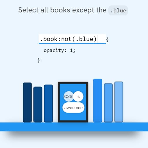
CSS :has() Interactive Guide

This is part article/part interactive tutorial that will get you trained up on how to use CSS :has(), :not(), and lots of other great little selector exercises. It's excellent and it'll make you feel comfortable with these selectors.
The quiet, pervasive devaluation of frontend

Josh Collinsworth puts to words what I think many of us have felt at some point in this career. These two points especially rang true:
"Our output is artistic, to some degree, and artistic things have a long, storied history of being tragically devalued merely because they seem simple and enjoyable."
"Frontend tools market themselves as though frontend is something no one wants to do, and nobody should care about any more than they have to."
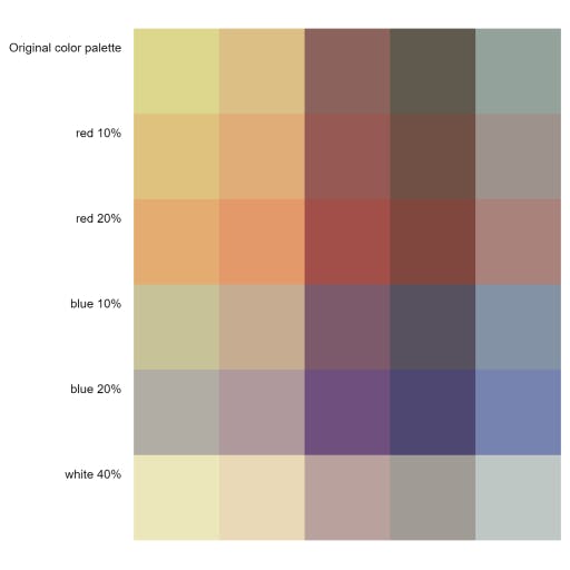
Creating Color Palettes with the CSS color-mix() Function

Michelle Barker shows us how to use the CSS color-mix() function to create lighter or darker variations of brand colors. It's especially handy because you can store the results as CSS custom properties and easily use the new colors across your project.
Videos
Blurring things in Quirky ways
A fun experimental video by Juxtopposed where they apply blur to UI in a bunch of different ways.
It couldn't come at a better time, because I've been throwing the blur filter at everything I can and I'm always looking for more ideas.
Check out the CodePen collection here.
So long, partner
Thanks for riding along with this issue! We just went through daylight savings time here and I couldn't be more happy. More sunlight makes for happier horses. I hope you have a wonderful week and I'll catch you in the next one!
Your neigh-bor,
Alex
