Newsletter • Issue 74
This GSAP Rebrand is SPECTACULAR
Howdy, partner!
It's been a while since we last saddled up, but after a tough year, I'm excited to get back to it.
Our Discord community has been going strong this whole time, so thanks to all the wonderful folks there, and please join if you're not already!
CodePens
Divtober

Lynn Fisher's Divtober is in full swing, and there's a ton of fantastic art to check out.
The rules are simple: Use one div. The results are anything but simple, and it's amazing what folks can pack into a single element with some very clever CSS. I've linked to the tag on CodePen, where you'll find lots of fun and impressive work.
Merging Letter Toggle

When toggled, the F characters merge into a single N. A great effect that Jon Kantner accomplishes with SVG paths and the stroke-dashoffset property.
Sponsor
Articles
Progressively Enhanced WebGL Lens Refraction
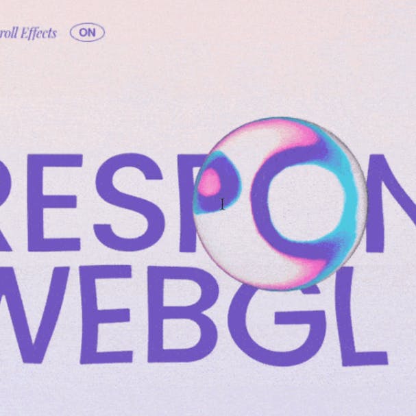
A great tutorial by David Lindkvist of 14islands. I appreciate that they're focusing on making WebGL responsive and accessible, as most devs don't seem to bother.
Understanding the JavaScript Modulo Operator

I promise this article is much more interesting than the title and topic make it sound. As in all of Josh Comeau's articles, you're likely to learn something new, and even if you don't, you'll have the best time reading and playing with the interactive bits.
Reality Check - Making Dribble designs realistic

In this new series from the brilliant Andy Bell, he takes a design from Dribbble and shows how he'd reproduce it for the web. He explains, "So often, work on Dribbble and Layers is visually stunning, but how it will actually work in the browser hasn’t been considered."
I always learn when I watch an expert go from design to code, and I love Andy's focus on responsivity.
CSS Findings from the Photoshop Web Version
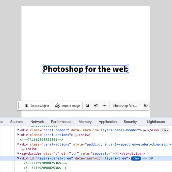
A great article for those of you who love peeking behind the curtain of web apps like Figma. Ahmad Shadeed digs into the CSS that was written for the new web version of Photoshop.
I was honestly surprised by how much Adobe used flexbox and CSS variables. Good on them for leaning in to the power of the browser.
Inspiration
GreenSock Redesign
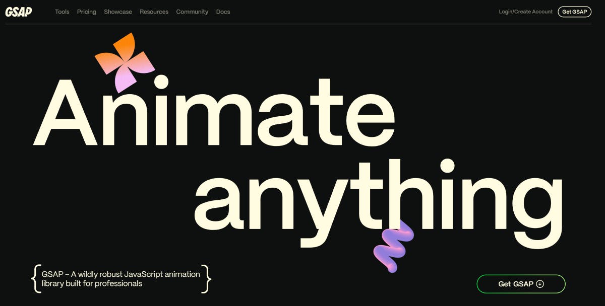
GSAP has released their rebrand and it's just spectacular. Every page is dripping with care and attention, perfectly showcasing what you can do with the tool. There are dozens of new interactive examples across the Scroll, SVG, UI, and Text pages to glean inspiration from.
Even the docs and forums have gotten the much-needed face lift, and they even upgraded my most-visited page, the Ease Visualizer.
Videos
Next.js 13 and Prismic tutorial

I made a complete video course where I walk through creating a Next.js and Prismic website using TypeScript and Tailwind. It's a great way to create a headless page builder your editors will love.
(If you don't know, I work at Prismic and get to create courses and help other devs create better websites.)
Why isn't the task done? (Skit)

The age-old problem of trying to fix one thing on the website, only to find 30 other tasks along the way.
So long, partner
It was great getting back into the saddle with y'all, so thanks for riding along.
Your neigh-bor,
Alex