Newsletter • Issue 71
Color Fonts, Scrolling Rainbows, and Figma Sale
Howdy, partner!
I'm currently touring England and France, but I still managed to collect some fantastic stuff for you.
Last week over 40 of you replied to the newsletter, and it was wonderful chatting back and forth with some of you.
Feel free to reply and just say hello! I'd love to hear from you.
It's also our second week having the wonderful Jamstack Conference as our sponsor. I'll be there in November, so if you're attending let me know, and be sure to use our coupon code below!
CodePens
Colorful Variable Fonts
I put this CodePen together after reading about the first batch of color fonts coming to Google Fonts.
Color fonts allow us to create our own color palettes to customize fonts like never before. The variable font in use here, Nabla, has an isometric, 3d style that you couldn't get without heavy use of SVG or 3d. Here it's just a Google font.
These are really fun, but unfortunately, still a peek into the future. The COLRv1 format only works in Chrome, but Firefox plans to support it in the future.
Scrolling Rainbow

Fabio Ottaviani creates an awesome scrolling effect using simplex noise and a whole lotta divs. It's all silky smooth thanks to GreenSock's ScrollSmoother plugin.
Doom Island
Since Apple unveiled the 'Dynamic Island' for the new iPhone 14, folks have been having fun with demos. My favorite so far has been this evolution of "Where can we run Doom?" by Adam Kuhn.
Open up the island and you've got a working version of the game right there in your browser.
Sponsor
Jamstack Conf 2022

Come celebrate with us at the biggest party of the year!
Join thousands of developers and web enthusiasts for two days of keynotes, hands-on workshops, connection building, all the food and drinks you can handle, and the Jamstack block party with a special live-coding performance by Char Stiles and Dan Gorelick!
Use Code FRONTENDHORSE20 to get 20% off early bird tickets today.
Articles
How do QR Codes actually work?

An excellent thread by Dan Hollick explaining what each of those little QR squares do. If you're curious about the little piece of tech that's taken over the world in the past few years, give this a read.
Designing for device sizes is dead

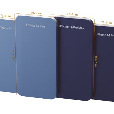
Our friend Kilian Valkhof explains how the new iPhone 14 sizes puts the nail in the coffin for designing for specific devices. It's been a bad idea for a while, but a lot of devs will only test on 'big iPhones' and 'small iPhones.'
The TLDR: "Let go of the idea that you're designing a site to fit devices. You're designing a site to fit its content."
Kilian also includes a few general tips for building in this new fluid era.
The Power of CSS Blend Modes

The article looks at Scott Kellum's fun pen that we covered back in June. He uses Scott's technique to get a similar effect with photographs, as well as a halftone dot pattern like old comic books used.
Adobe's acquisition of Figma is bad for everyone (except Adobe)

After hearing the news yesterday, I had planned to explain my thoughts in this issue of the newsletter. But my friend Chris did it better than I could.
My thoughts:
I love Figma and avoid Adobe as much as I can. Adobe has never done anything out of the goodness of their hearts. Not much will change at first, but in a year or two we'll need some form of subscription to get most of Figma's utility.
Inspiration
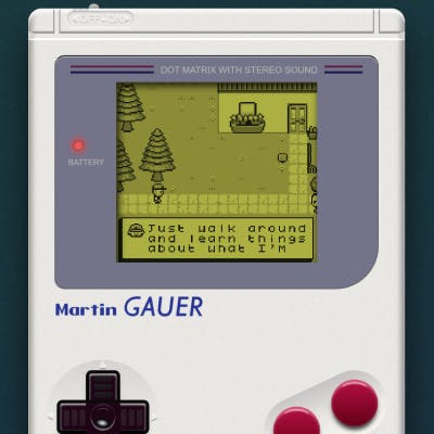
Martin Gauer - Personal Site

This personal site is incredible.
Here you learn about Martin Gauer by playing through a retro-style GameBoy game that he created. The GameBoy itself is made in CSS.
I don't read a lot of biographies, but I think I would if they were all in video game form.
So long, partner
That's the end of today's trail. Thanks for riding along with me!
I'm wrapping up this issue at my hotel in Paris. England was lovely, and I got to meet some fantastic people. Now it's time to tour Paris and meet my Prismic coworkers for the first time.
Thanks again to all those who replied! It was wonderful getting to meet and chat with you 😄.
Your neigh-bor,
Alex