Newsletter • Issue 70
CSS Sunsets, Blurry Eclipses, & Grumpy Cats!
Howdy, partner!
Let’s address the Clydesdale in the room: I’ve moved email hosts! It’s a big change, and things might be bumpy to start.
I’d really appreciate your help: reply to this email. This tells the email gods that you really want this email in your inbox. Tell me what you’ve got planned for the weekend, or what you’d like to see more of. I’d love to hear from you regardless.
We also have another new thing! After two years, we have our first-ever sponsor: Jamstack Conf 2022. I’ll be attending in-person, so use the promo code below and let me know if you’re going!
Well we’ve got a lot to get to, so let’s saddle up.
CodePens
A Moment of CSS
It's wonderful to watch a master at their craft continue to improve and challenge themselves. Here Ben Evans is "attempting video realism with just CSS & HTML."
An animated sunset over a wheat field, with flying birds, moving sun glare, and parallax effects. Like everything Ben puts out, this is really something special.
Blurry Eclipse
This piece from David Aerne would make for a delightful hero animation. A transparent circle swivels in front of another, and the blur it creates is *chefs kiss*
Grid and Container Queries
Frontend Horse community member Ryan Trimble makes a delightful demo with fluid type, Container Queries, and CSS Grid
Sponsor
Jamstack Conf 2022

Come celebrate with us at the biggest party of the year!
Join thousands of developers and web enthusiasts for two days of keynotes, hands-on workshops, connection building, all the food and drinks you can handle, and the Jamstack block party with a special live-coding performance by Char Stiles and Dan Gorelick!
Use Code FRONTENDHORSE20 to get 20% off early bird tickets today.
Articles
Modern alternatives to BEM
Dave Rupert lays out some newer alternatives to the classic BEM way of structuring CSS.
The popularity of Utility Classes is included in the wonderful CUBE CSS.
While I have yet to try them, Cascade Layers bring totally new ways of organizing our CSS across big projects. Dave includes a few new CSS organization styles that lean in to @layer.
Inspiration
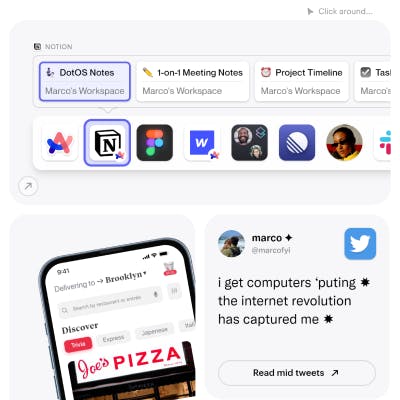
Marco Cornacchia's Portfolio

This incredible portfolio feels like you're clicking through a bunch of different widgets and mini apps on a big ol' iPad. Just about everything has something to hover, click, or explore. Every single animation is perfect.
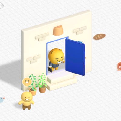
Why Ryan Hates Mondays?

I have no idea what this adorable experience is for, but the combination of 2d and 3d is a lot of fun. Click around the screen to find the sweet potatoes!
Videos
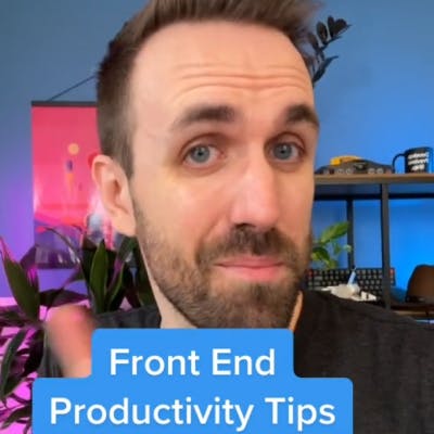
Color Accessibility Tip

I've been making short-form videos about web dev, and people really enjoyed this one. I show how I use Color Review to check for sufficient color contrast.
So long, partner
Well that’s it for this week!
I’m flying to England and France on Monday! I’ll be stopping by London for a few days, then heading to Paris to work in-person for the first time since I joined Prismic. I’m thrilled to get the chance to spend some time with my coworkers. Let me know if there’s anything in London or Paris that I must see.
Your neigh-bor,
Alex