Newsletter • Issue 60
Animated Text Effects, Border Effects, and Perspective Illusions!
CodePens
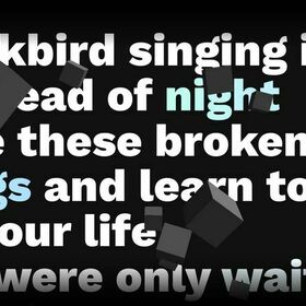 ScrollSmoother + Three.js Demo — codepen.io
The 3D cubes and parallax are fun, but I especially love how some words become colorful when they reach the middle of the screen.
Malven is setting the text’s color with HSL and CSS custom properties. As the word gets closer to the center of the screen, GSAP ScrollTrigger changes the lightness variable (--l) from 100% to 80%.
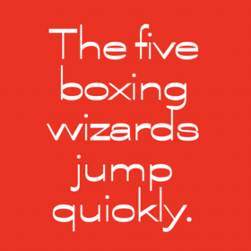 Variable Font Fun — codepen.io
I shared how Roboto is now a wildly robust variable font a few weeks back. Well, this fun playground by Rob DiMarzo plots some of the many axes to let you see them all in action.
As you’re playing with this just remember: this is Roboto.
It seems we might be approaching a time where it’s much harder to identify fonts, and two sites using Roboto could look wildly different. I’m so excited about this new age of typography.
 Border Hover Effect — codepen.io
This is a really fun demo where the border slides around the box on hover. Temani uses some fun background tricks and CSS custom properties.
 CSS 3D Perspective Illusion — codepen.io
This is a fun CSS perspective illusion. What seems like a 3D ladder propped against a wall is really a “folded” div with some clever drawing.
Upcoming Livestreams
The Netlify Team breaks down the new homepage!
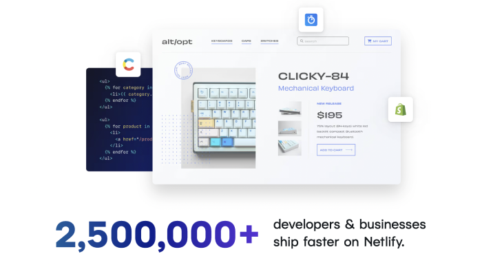 Part of the Netlify homepage
On Tuesday, June 21st we’ll be joined by three of the people that built Netlify’s beautiful homepage to show us how they made it!
If you haven’t checked it out yet, give it a scroll through. There are so many delightful details that I want to ask about. We’ll dig into design decisions, wonderful animations, and much more!
Bring your questions, because chat participation is highly encouraged!
I’ll have it on the Frontend Horse website soon, but for now here’s the Discord Event, the Google Calendar event, and the Twitch Event.
Inspiration
Linear’s Story of Magic
There are a million ways to handle a company’s “Jobs” page. Most are pretty similar and straightforward. They tell a bit about what makes the company a good place to work, who works there, and maybe the company’s mission.
SaaS company Linear went in a totally different direction by creating a three-part “scrollytelling” story with some fun visuals.
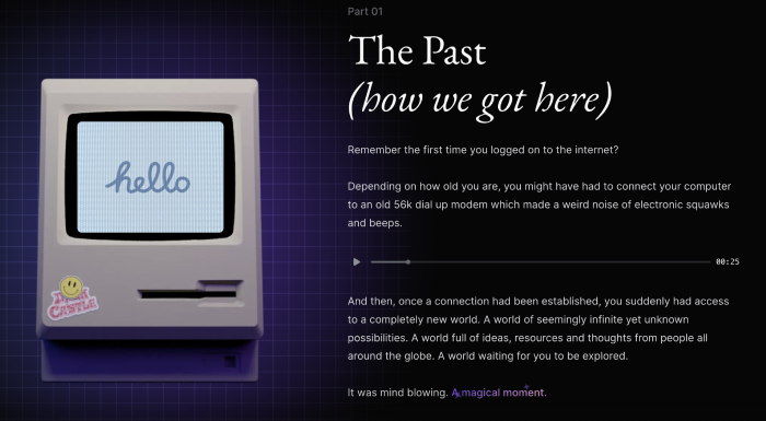 The start of the scrollytelling story
As you go down the page, the Macintosh changes to reinforce the written content with lighting and animation. There are also some great text effects inside the copy to add some spice to the message.
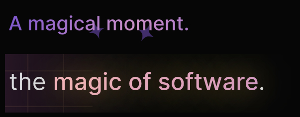 Two of the animated text effects
There’s a sparkle effect that’s very similar to Josh Comeau’s sparkle text, but with an added animated gradient.
Check out Linear’s Story of Magic.
Resources
 Magical Text Effect Tutorial — www.youtube.com
If you want to learn how to make the sparkle text from the site above, here’s a short video tutorial on exactly that. Plus a CodePen to match!
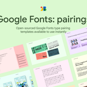 Google Font Pairings — www.figma.com
One of the most important things for creating a well-designed site is picking a great font. However things get quite a bit tougher when it’s time to choose a second font.
This Figma file offers 9 pairings with detailed examples on just how to use the fonts together.
So long, partner
That’s it for this week! Thanks so much for reading. If you enjoyed it, sending it along to a friend or sharing it on Twitter is always appreciated. 💜
I’m currently on vacation and loving the chance to see family and recharge. I’m trying to get better at viewing rest and relaxation as positive things. I’m someone who feels uncomfortable when I’m not “being productive,” so it doesn’t come naturally.
I hope you’re also getting the chance to step back and just relax and recharge. Have a lovely weekend!
Your neigh-bor,
Alex