Newsletter • Issue 25
Wave Spheres, Rocket Ships, and SVG Tips!
Howdy partner! It’s great to see you back here on the web dev riding trail. As always we’ve got a full itinerary of sights to see. We’ll be looking at a great CSS animation with spheres, a 3D/2D combination Rocket Ship, an SVG explainer tip, a dark and glossy 3D scene, and lots more!
CSS Wave Spheres
This animation by Yusuke Nakaya is just so calming to watch. 100 spheres move like they’re in a wave pool, floating above a glossy surface. Yusuke is doing this all with HTML and CSS, and using some really cool techniques.
Yusuke uses CSS Grid to easily position the 100 spheres in this square layout. The spheres are actually two-dimensional divs and need to rotate to face the camera as the entire piece rotates around. It’s a cool optical illusion that makes them feel 3D.
The reflection seems like a small detail, but it’s what grounds the shapes in the scene. They feel like they’re floating over a smooth surface.
The reflection is made with just one line of CSS.
filter: drop-shadow(0 100px 12px rgba(#6094b3, 0.2));Three.js Rocket Ship
Check out this playful rocket ship by Stivali Serna! I love the combination of 2D and 3D elements. The Rocket is a 3D model that has been imported, lit and animated with Three.js. Everything else is a 2D DOM element that don’t use any JavaScript!
Stivali said she wanted to get a 2D and 3D combination effect, and using CSS and SVG was the easiest path to that. Let’s dig into some of what makes this CodePen great.
Check out the difference lighting makes in this piece.
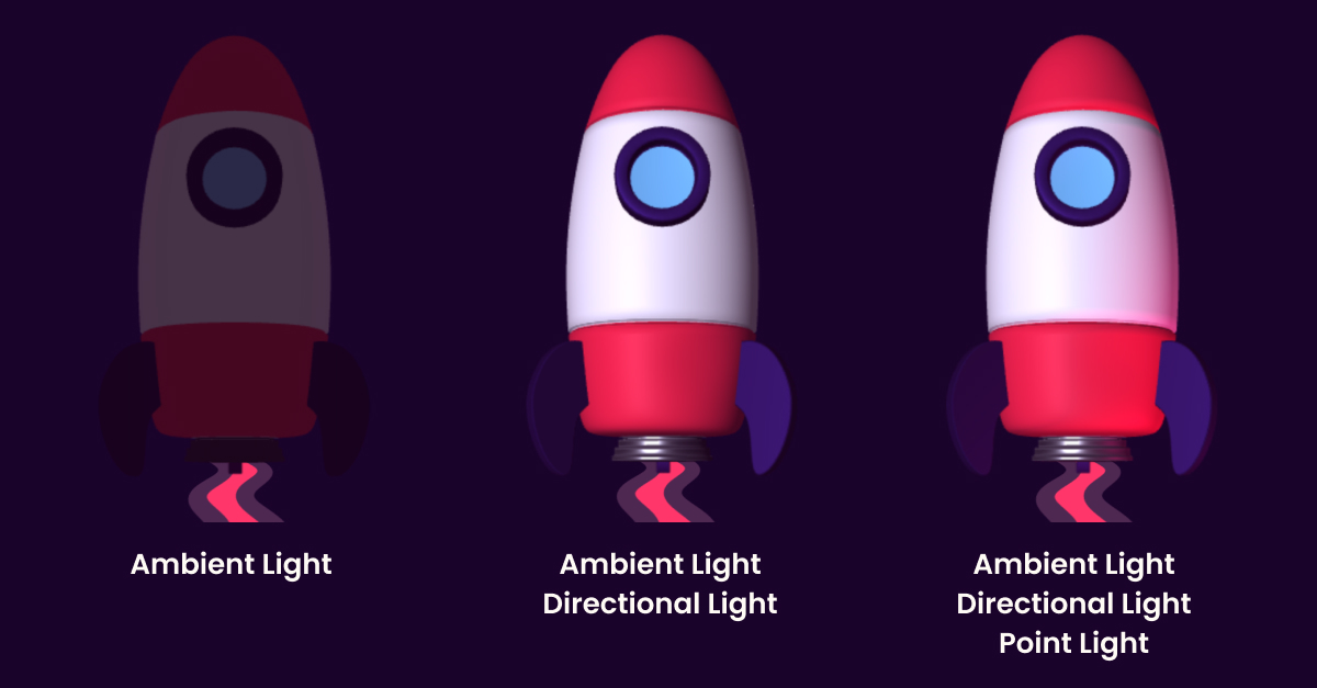
With ambient and directional light the rocket is good, but the red point light is the added touch that makes it great.
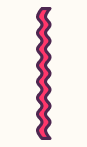
The flame coming out the bottom of the rocket is actually just this SVG with some clever CSS sprinkled on top.
Stivali makes the bottom of the flame/smoke trail larger because it’s tilted to be ‘closer’ to us than the top is. Stivali first adds perspective: 10rem; to the body, which affects the way things look when they’re rotated towards the ‘camera’. With that, she can rotate the flame forward with rotate3d(1, 0, 0, 60deg).
The streaking stars are actually divs! They’re absolutely positioned, so if you remove the animation, here’s what the scene looks like:
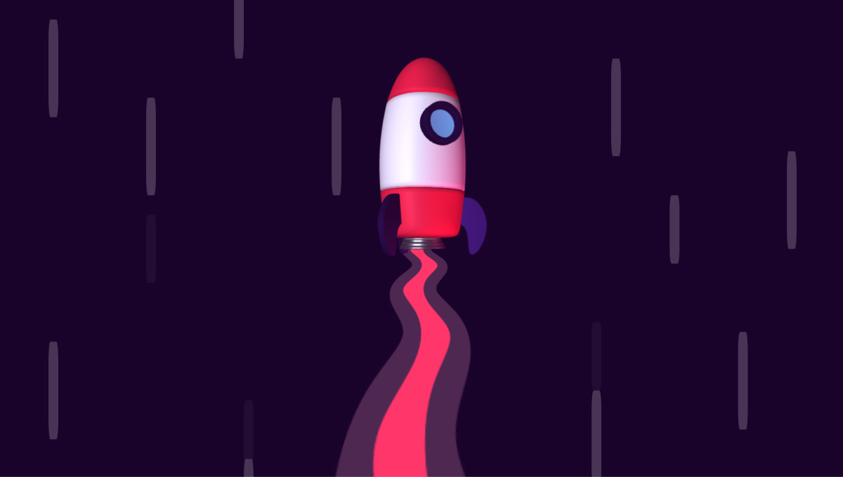
Then Stivali is able to run the same keyframe animation on all of them and they all feel balanced.
Stellar work! 🚀
Check Out 3D Rocket Ship 🚀SVG Tip
Last week we looked at a great SVG Path Visualizer that turns path code into plain English. This week let’s level up our SVG understanding with a tip from SVG expert Louis Hoebregts.
You might have seen the property fill-rule="evenodd" in your SVG code and wondered what it was. Louis demonstrates the difference between evenodd and its counterpart, nonzero with a character from the movie Soul.
When the same path loops over itself, fill-rule="nonzero" will keep that bit solid, while fill-rule="evenodd" makes the portion transparent.
You can read more about the fill-rule attribute here.
This is the latest in Louis’s Twitter thread of wonderful SVG tips. Start here and work your way backwards through the quote tweets. I promise you’ll learn something new.
Louis and Cassie Evans publish the viewBox newsletter where they talk about a different aspect of SVG every month. Go subscribe, it’s a wonderful newsletter by wonderful people.
We The Collective
Friends of the Horse, We the Collective, have a lovely new site! The playful Next.js experience shows off their work, like some of the sites they’ve made for Nintendo. I especially love the transitions between pages.
The thing I want us all to steal is the “Reduce Motion” switch just above their navigation.

If the user has prefers-reduced-motion or this switch active, the animations and transitions around the site will not trigger. It’s a great way to make accessibility features even more accessible to users.
Check Out We The Collective2000
Liam Egan is part of the “We” in We The Collective and has had quite the busy week! In addition to launching the above site, he’s created a beautiful 3D scene celebrating 2000 followers on CodePen.
I love the charcoal palette with the noise and shine. It took me quite a while to realize that the mouse controls an additional point light, so go play with this one!
Check Out 2000CSS Link Hover Effects
The way that buttons and links react to hover and focus can communicate a lot about a brand. Here’s a couple great resources for hover effects that I’ve found recently.
Mary Lou at Codrops put together a great collection of CSS only hovers.
Adam Kuhn’s animated SVG hover effects bring a ton of personality.
Katherine Kato shows the different options that text-decoration-style gives us in this CodePen, and I love this spring/bounce hover effect from Mark Mead.
This collection from Peiwen Lu offers a variety of border animations, as does this collection from Thomas Aufresne.
If you have any other hover effects you love, let me know! I’d love to feature them in a future issue.
Container Queries
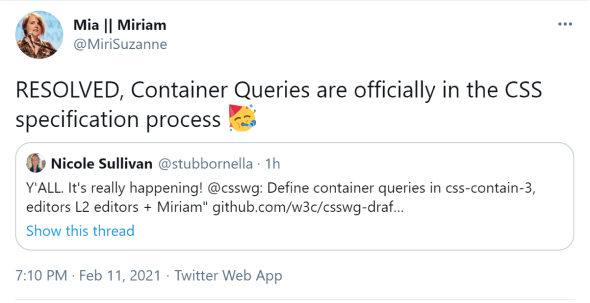
Right now we write media queries to change our styles when the window hits certain sizes. Container queries would allow a component’s styles to change based on the size of the individual component.
Here’s the CSS Working Group Draft on Github.
Watch this space.
Horse Supporters
So I added a “Buy me a coffee” link to the end of the newsletter last week and I was knocked out of my saddle with how generous you all were.
Huge thanks to Tom Miller, Colby Fayock, Darin Senneff, Anonymous, Scott Spence, George Francis, Amit Sheen, Adam Kuhn, Brian Hinton, Lynn Fisher, Michelle Barker, Vince Parulan, Aaron Iker, Pete Barr, and Craig Roblewsky for donating this week!
🐴❤
So Long, Partner
That’s it for this week. Thanks for hitting the trail with me! Special thanks to Stivali Serna and Liam Egan for talking with me about their work!
Follow @FrontendHorse on Twitter, and if you enjoyed this, I’d be over the moon if you share it with a friend or tweet about it.
This took about 7 hours to put together. If you’d like to support my work you can buy me a coffee.
It’s the end of the trail for now, but I’ll see you next week. Take care.
Your Neigh-bor, Alex