Newsletter • Issue 26
Component Carousel, Space Travel, and 3D effects!
Howdy, partner! Welcome to another trip on the Web Dev riding trail! We’ve got some fantastic things in store for you today, I can’t wait to show you the sights. So saddle up and let’s get going!
Component Carousel
The month of April has been so much fun, as I’ve been having some of my favorite creative developers on my new Twitch stream to build out components!
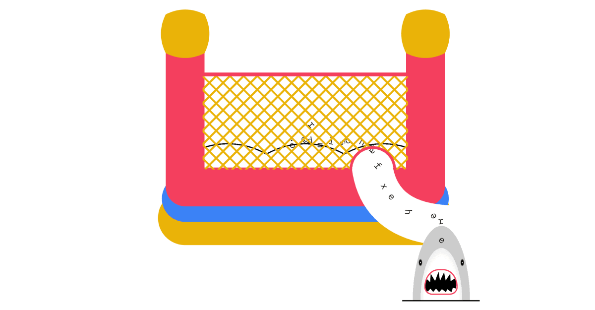
Adam Kuhn came on and turned a normal signup form into a form that turns into a bouncy castle!
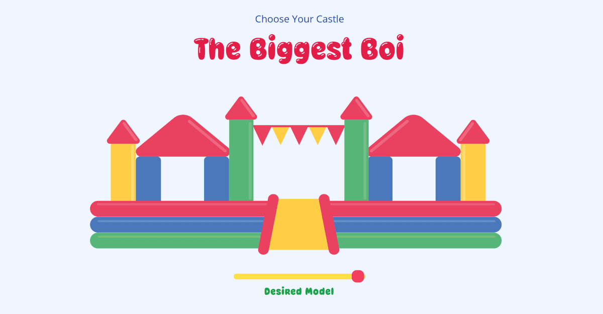
Cassie Evans made a wonderful “Pick your Castle” slider component with fun, springy animations.
And George Francis showed us some of his generative tricks when he made our typical ‘Team’ component give everyone their own unique balloon heads.
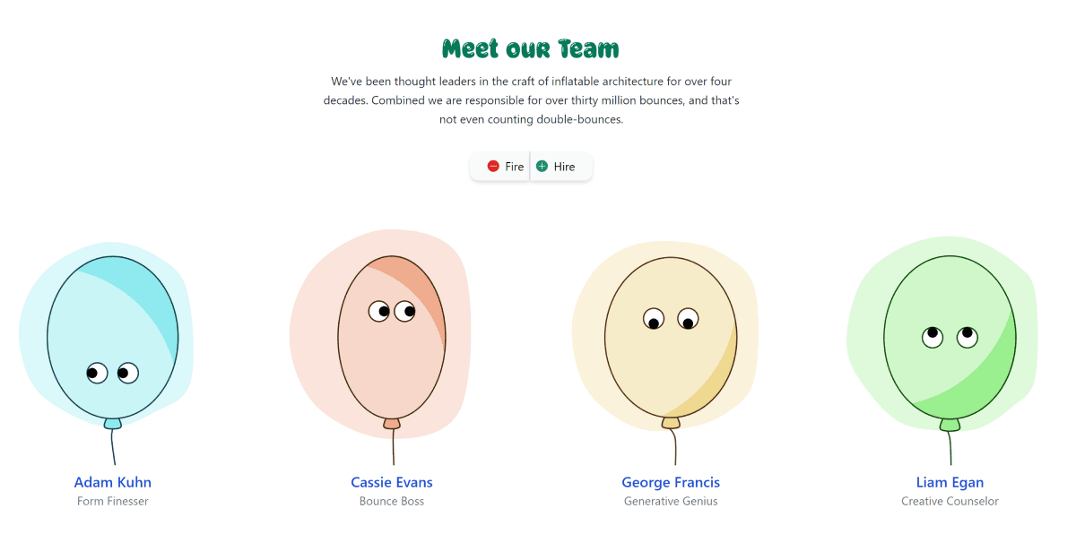
As you can see, it’s been a lot of fun.
Not only that, but we’ve been doing raffles every week! People in the chat have won Bruno Simon’s Three.js Journey, a spot in Cassie Evans’s upcoming workshop, and a CodePen pro membership!
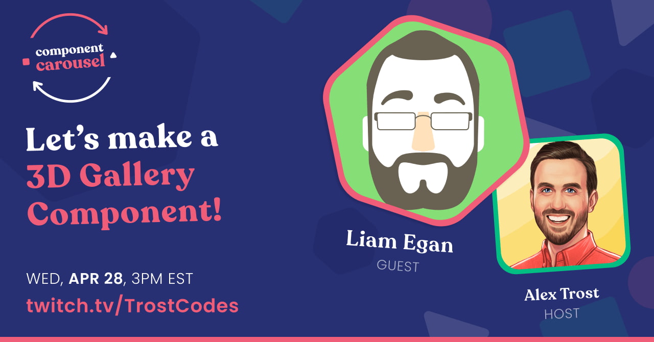
Today, Wednesday April 28th, Liam Egan is coming on to build a fantastic 3D Gallery component! He’ll be using react-three-fiber and some fun physics to create a truly unique and delightful component. I hope to see you there!
Space Travel
This one’s out of this world.
Shunya Koide combined some SVG and Three.js to make this delightful space adventure scene. Similar to the Rocket Ship we covered in a previous issue, the pairing of 2D and 3D graphics is really effective here.
The Robot and the screens it’s touching are all SVG, while the star field and the floating geometry are all Three.js.
The star field is made with Three.js Points and is based on this great tutorial. The effect is just like the old Windows screensaver from the nineties.
With so many details, the animations are my favorite part, and it’s all handled with GSAP. Because GSAP at its core just tweens values, it’s able to handle both SVG and Three.js elements easily.
PS: Click the robot :)
Check Out Space TravelI’d love to see more pens combining SVG and Three.js, so if you know of any send them my way!
So Many Eyes
Too many eyes, if you ask me. Two is my limit.
Sikriti Dakua has created this fantastically off-putting grid of eyes that follow your mouse around the screen. It’s made in Three.js and the little point lights really help to sell the effect.
Sikriti has offset the point of rotation to be a bit in front of each eyeball, rather than at their center. This makes them move in a more interesting way, almost as if they’re shifting to avoid your mouse.
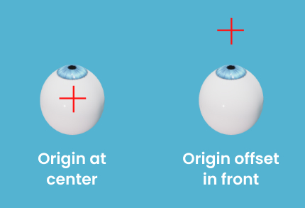
To see what I mean, watch me ruin the effect:
I’ve removed the offset, making the eyes rotate on their own center axis. Not nearly as fun, is it?
Check Out So Many EyesPricing Concept
I really love this two-sided pricing card by Ivan Grozdic. When you toggle between Kayaking and Camping the assets animate in and out and the card flips around to show the other side.
Little details really sell the tangible/3D feel here. The tent, bush and rock all have similar shadows going in the same direction, which make it feel real and cohesive. The kayak and tent extending past the edge of the card make them more dynamic than if they were contained inside the card.
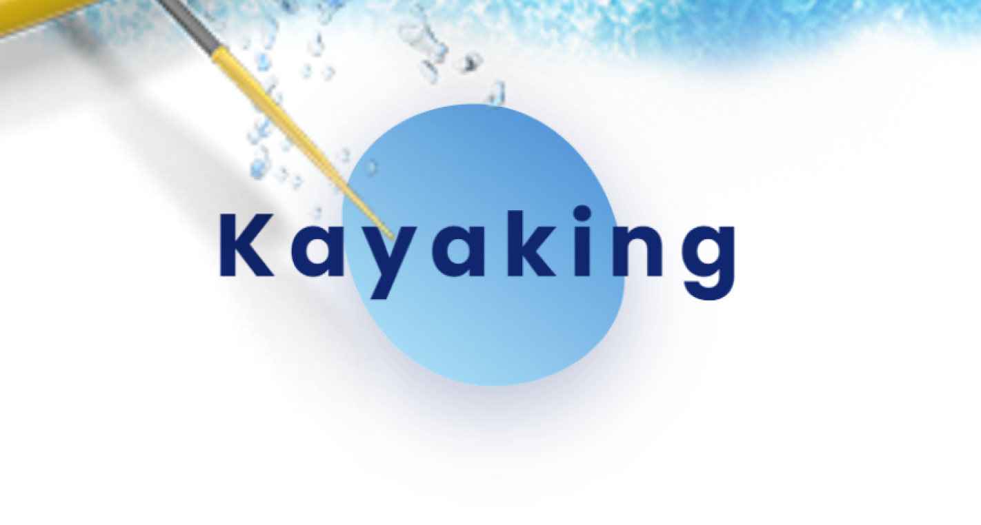
I assumed the circular blob in the center of the card was an animated SVG, but it’s actually the :before pseudo-element of the h4. Ivan has given it a size, a linear-gradient background, and then animates the border-radius on the element. It’s got such a great, wiggly feel, I’m gonna try this trick on my next project.
It turns out that Ivan has a whole slew of these wonderful demos over at his site, Front.Codes! Lots of gorgeous pens featured there, so definitely check this out.
Article Roundup
How to Use & Integrate APIs
I recently wrote an article for the great folks at Snipcart that provides a full introduction to web APIs. I tried to make it as thorough as possible, and we even make an app that uses the Jokes API by the end. If you’re still getting the hang of using web APIs I’d love to know if it’s helpful and where it can be improved.
APIs for BeginnersReproducing a Game UI with react-three-fiber
Florent Lagrede is back with another great tutorial on how to bring game UIs to the web! He walks us through building it out with react-three-fiber with accurate mesh models. I love the use of 3D and 2D design in this one. Check out the working demo here.
Reproducing a Game UIA Beginner’s Guide to Applying Color in UI Design
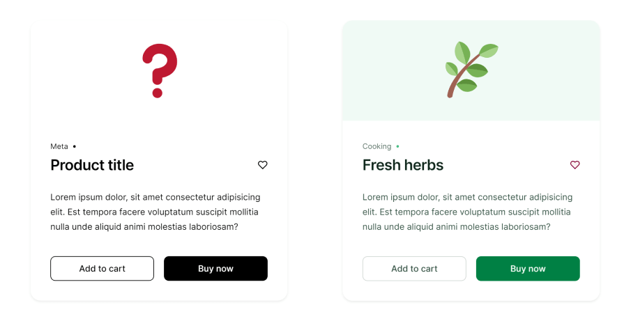
Our good friend George wrote a fantastic tutorial to help us make better decisions around our use of color on our websites. He goes step by step and turns the card on the left into the delightful card on the right, explaining why he’s making each decision.
Horse Fact
There are lots of different horse breeds, but apparently, the Arabian horse has one fewer vertebra than other horse breeds. I don’t know how the breeder of the first Arabian horse did it, and frankly, I don’t want to find out.
Horse Supporters
Huge thanks to Andy Bell, Johan, Cassie & Louis of viewBox, and luxonauta for buying me a coffee and supporting the newsletter. I can’t tell you how much it’s appreciated ♥.
So Long, Partner
That’s it for this week. Thanks for hitting the trail with me! Special thanks to everyone who joined me on Component Carousel, as well as the people I’ve featured in this issue.
Follow @FrontendHorse on Twitter, and if you enjoyed this, I’d be over the moon if you share it with a friend or tweet about it.
It’s the end of the trail for now, but I’ll see you next week. Take care.
Your Neigh-bor, Alex