Newsletter • Issue 24
Spotlight Text, 3D CSS Bedroom, Rising Steps, and an announcement!
Howdy, partner! Welcome to the web dev riding trail, I’m thrilled you’re here.
I’ve packed some peanut butter sandwiches for the ride, I hope you’re not allergic. Oh, and before we set off I’ve got a quick announcement.
I’m Starting a New Job!
Starting Monday I’ll be a Developer Experience Engineer at Prismic! My goal is to make it easier for Gatsby and Next.js engineers to use Prismic.
I’m also planning a lot more public work like videos and live streams, so I’ll keep you posted.
This won’t change anything about how Frontend Horse is run or the kind of content it features. Frontend Horse has always been something I do in my own spare time.
But enough about me, let’s ride on to some fantastic web dev techniques!
Spotlight Cursor Text
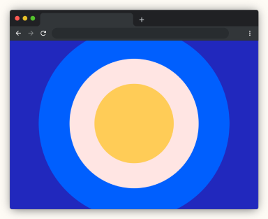
In this CodePen from Caroline Artz, colorful circles follow your cursor and only show inside the letters. At first I thought she was using an SVG mask but it’s a different trick entirely.
It turns out this is all possible thanks to a great use of mix-blend-mode: screen;!
Here’s a quick breakdown of how it works:
The ‘shapes’ layer contains the circles.
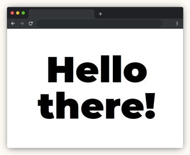
The ‘content’ layer goes on top. It has a white background and black text, completely covering the circles
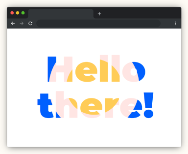
The ‘content’ layer is set to mix blend mode: screen. The black letters turn transparent but the white background remains.
While you could use an SVG mask, it wouldn’t be as easily editable as the text here is.
Caroline gets the circles follow your cursor with a tiny bit of JavaScript and GSAP.
Check Out Spotlight Cursor Text3D CSS Bedroom
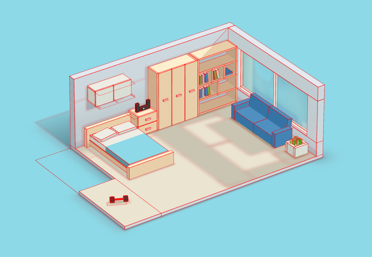
Friend of the Horse Ricardo Oliva Alonso is back with another great 3D CSS CodePen!
This 3D bedroom, based on this Dribbble shot, is made completely with HTML and CSS, with some JavaScript just to hand the fun interactive elements! Mouse over the books or click on the cabinets and sound system.
I’ve covered Ricardo’s excellent 3D CSS methods in this article already, so I won’t go into detail here.
Add this one line to the CSS to see where all the elements are:
* {
  outline: 1px solid red !important;
}
I would love to be able to click on the pillow and straighten it, but now I’m just getting greedy.
Check Out 3D CSS BedroomRise Up
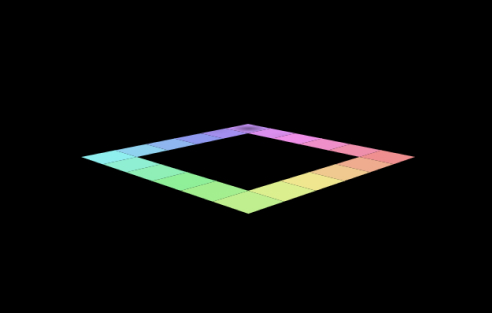
This pen by Amit Sheen is a lot of fun to watch, and similar to Ricardo’s 3D bedroom, the scene is all HTML and CSS!
It’s a satisfying endless stairway, where the steps fly out the bottom and then back in the top. As you might assume, Amit doesn’t add an infinite number of elements to the DOM, but instead reuses the same 20 steps over and over.
Here’s a little breakdown of how Amit made his steps out of a few divs:
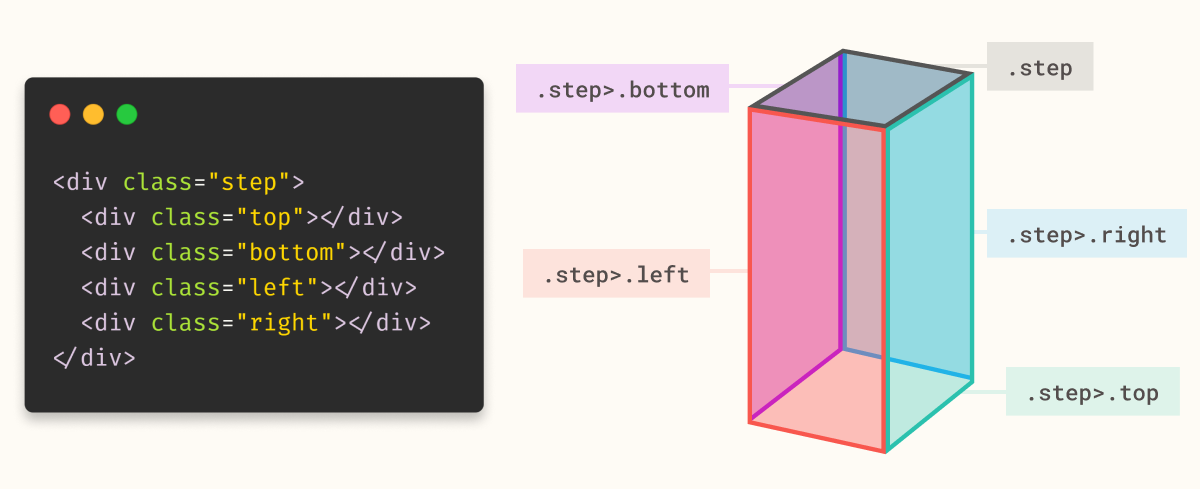
The top, shown here in gray is actually the .step div, while the sides are the top, bottom, left, and right divs. The animation moves just quick enough that you can’t tell there’s no bottom div.
The shadow you see cast on the step is a perfectly timed .step::after that slides over.
As in all 3D CSS, the key property is transform-style: preserve-3d;. If you comment out that one line the whole scene goes flat!
As for the bouncing ball, what you see is actually .ball::before. With this, Amit runs two animations to put the ball in motion. .ball moves around as if the stairs were flat like in the above image, while .ball::before only worries about bouncing.
This pen was done for the CodePen challenge theme “Rise.” Check out the challenges and join in if you don’t already. It’s a great way to flex your creative coding muscles.
Check Out Rise UpSVG Path Visualizer
This SVG Path Visualizer by Mathieu Dutour is a wonderful resource to learn what all the letters and numbers in an SVG path are actually saying.
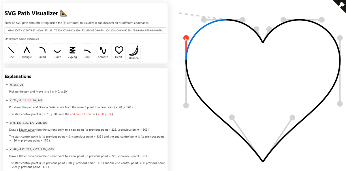
You can choose from the examples that Mathieu has provided, or paste your own paths in. Then read through the plain-language explanation of each part, complete with an interactive diagram.
I recommend clicking through a few and getting more comfortable with the path syntax. It’s a lot less intimidating thanks to this handy explainer.
Check Out SVG Path VisualizerTransition.css
Check out this excellent transition animation library from Adam Argyle, Transition.css.

You can transition any element with a wipe, circle, diamond, and a few others, all in whatever direction you choose.
In addition to the excellent transitions, I really like the syntax Adam has made for this library. Instead of adding classes you add a transition-style property. I feel like without knowing the library, you can read and understand what this code will do:
<div transition-style="in:circle:bottom-right">A transitioned IN element</div>

<div transition-style="out:wipe:down">A transitioned OUT element</div>
Here’s the CSS that targets that first element:
@keyframes circle-in-bottom-right {
  from {
    clip-path: circle(0%);
  }
  to {
    clip-path: circle(150% at bottom right);
  }
}

[transition-style="in:circle:bottom-right"] {
  animation: 2.5s cubic-bezier(0.25, 1, 0.3, 1) circle-in-bottom-right both;
}
Super tidy!
Here’s the Github repo that explains how to set it all up. If you don’t want the overhead of the (rather tiny) library, you can grab only the styles you need from the transition.style site.
Check Out Transition.cssTwitter Videos
I’ve been putting out some videos on Twitter lately that I think you’d enjoy! I try to keep them all around a minute so that they’re snappy and easy to digest. Here’s the top recent videos:
- A breakdown of last week’s featured soda scroller
- Adam Argyle’s awesome link hover effect
- Rotating one div 3D frame effect
I plan on creating and posting more each week, so make sure you’re following Frontend Horse on Twitter if you aren’t already!
Check Out Frontend Horse on TwitterHorse Fact
This week’s Horse Fact is also a bit of photography history!
In 1878 photographer Eadweard Muybridge set out to prove that at a point in the horse’s gallop, all four feet leave the ground and it becomes airborne. He did so by setting up 12 cameras in a line. When the horse ran by, it tripped wires connected to the cameras, firing the shutters.
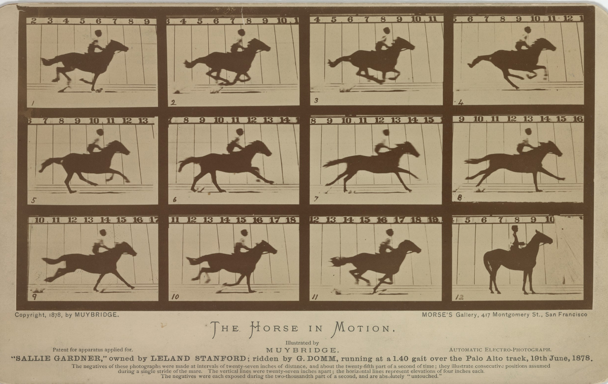
This was a big breakthrough for photography, but also proved that horses can fly if they wanted but simply choose not to.
So Long, Partner
That’s it for this week. Thanks for hitting the trail with me! Special thanks to Amit Sheen for talking with me about their work!
Follow @FrontendHorse on Twitter, and if you enjoyed this, I’d be over the moon if you share it with a friend or tweet about it.
This issue took about 7 hours to put together. If you’d like to support my work you can buy me a coffee.
It’s the end of the trail for now, but I’ll see you next week. Take care.
Your Neigh-bor,
Alex