Creating 3D Illustrations with CSS
Featuring Ricardo Oliva Alonso
I love how CSS allows for so many different styles of drawing. From realistic portraits and landscapes like we saw with Ben Evans, to fun cartoons as we saw with Oscar Salazar.
One style I’ve been loving is the 3D work that Ricardo Oliva Alonso creates on CodePen.
It’s a style that looks like it was drawn in Adobe Illustrator or modeled with Three.js. Ricardo will often find a piece on Dribbble and recreate it on CodePen, styling it entirely with HTML and CSS.
While I love the style, I had no idea how he was making the pieces. Luckily, Ricardo was kind enough to share his techniques with us.
The main trick?
“Everything is a cube!”
Cubes Everywhere
Yup, even things that don’t seem to be cubes are, in fact, modified cubes. But before we get into that, how do you actually make a 3D cube with HTML and CSS?
Transform Style
There’s one CSS property that makes all of these pieces possible. Ricardo adds it to everything in the piece.
*,
*::after,
*::before {
  transform-style: preserve-3d;
}
The default value for transform-style is flat, which makes all children of an element flatten to the same plane as the parent. Changing it to preserve-3d allows for the children to all exist in 3D space.
This example from MDN shows it nicely:
Toggle the checkbox to see how essential preserve-3d is to making these pieces. You can also see that they’re making the cube through CSS transforms by rotating and translating the elements into place.
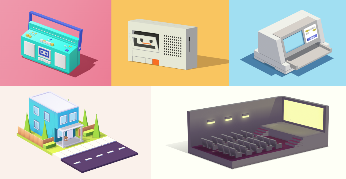
Some of Ricardo’s pieces contain a lot of cubes, like this Boombox, that has over 30.
Thirty cubes with six sides each would mean 180 CSS classes. Yeesh.
Luckily, Ricardo leans on the power of Sass mixins to create cubes much more efficiently.
Here’s his cube mixin, which takes parameters for width, height, and depth. This gives him a little cube factory where the repetitive parts are handled for him.
@mixin cube($width, $height, $depth) {
  &__front {
    @include cube-front($width, $height, $depth);
  }
  &__back {
    @include cube-back($width, $height, $depth);
  }
  &__right {
    @include cube-right($width, $height, $depth);
  }
  &__left {
    @include cube-left($width, $height, $depth);
  }
  &__top {
    @include cube-top($width, $height, $depth);
  }
  &__bottom {
    @include cube-bottom($width, $height, $depth);
  }
}
You’ll notice each line has an @include statement. That points to another mixin. Here’s cube-back for example:
@mixin cube-back($width, $height, $depth) {
  width: $width;
  height: $height;
  transform-origin: top left;
  transform: rotateX(-90deg) rotateY(180deg) translateX(-$width) translateY(
      -$height
    );
}
The width, height, and depth get passed through, and the mixin creates the CSS for this face.
Here’s a single cube made with Ricardo’s Sass mixin. It’s a lot of boilerplate code for one cube, but pays off the more cubes you create.
Irregular Shapes
What happens when the shape we’re making can’t be a cube? What about a shape like this?
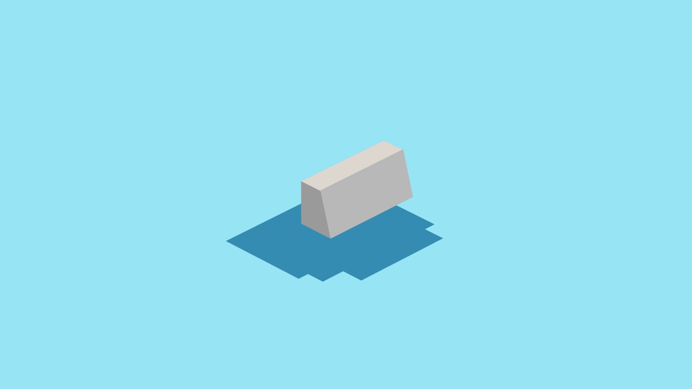
This starts as a cube, too, but gets changed a bit. Ricardo made us this GIF to make things clearer. He’s making the trapezoid shape on the sides by using background-image and a linear-gradient.
Here’s a similar linear-gradient in isolation without the perspective changes. The red border shows the bounds of the element.
Line 10 is the key. If you change the 250px to separate values, you’ll see them begin to blur like most gradients we’re used to. When they’re the same value, there’s a hard ‘start’ and ‘stop’ point.
If you’re looking at one of his pieces and can’t figure out where the cubes are, try everyone’s favorite CSS debugging technique:
* {
  border: 1px solid red !important;
}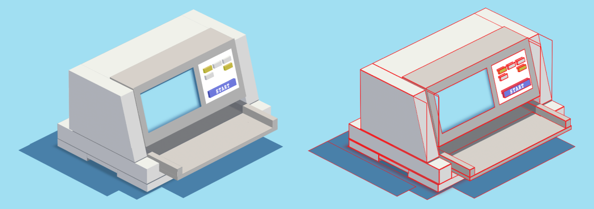
For the face in front, he tilts it backward with transform:rotateX() until it lines up with the other faces.
Pyramid Trees
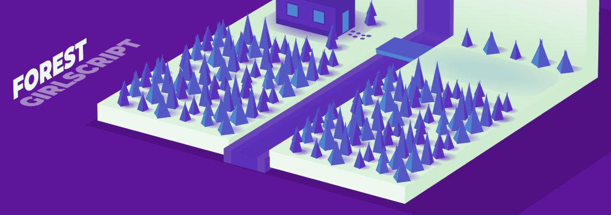
There’s a different technique at play to make the trees in his Forest piece. Each tree is a rectangular pyramid with a square base and triangular sides. Ricardo starts with the square and then makes the triangles by using borders in a clever way.
By making a div with big borders and no width or height, you get these triangles. Ricardo is using one for the side of his tree and turning the others transparent. Check out this GIF that shows the technique in context:
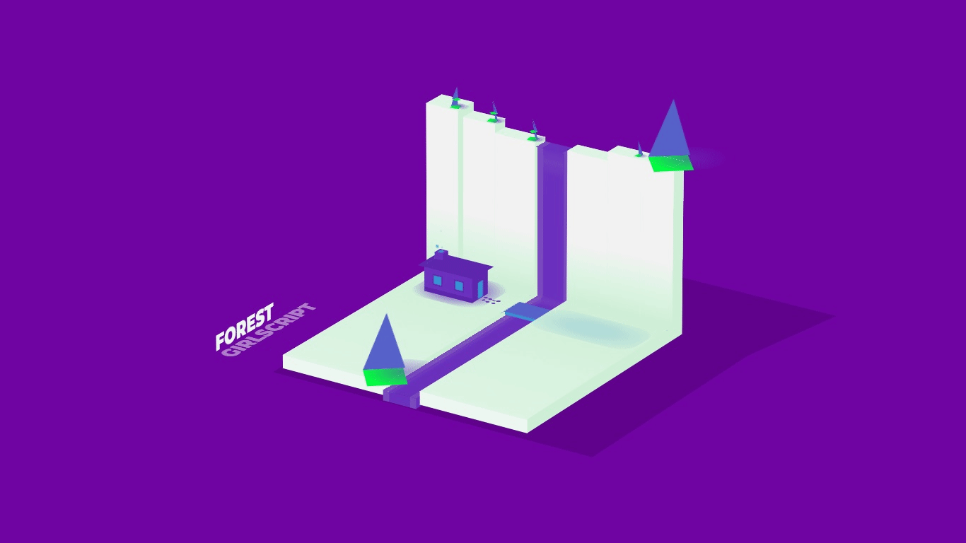
And here’s the full piece:
Animations
Most of Ricardo’s pieces have great animations, all done with CSS. He gives us a couple of process tips here.
First, animate the small parts of the object, like the cassette door and button here.
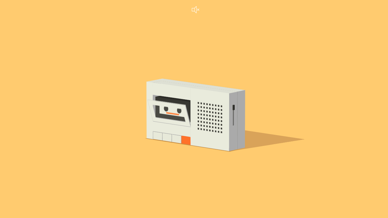
Then go through and animate the entire object. Click the orange button to watch the radio and its shadow bounce to the music.
Shading
Ricardo creates depth in his pieces with some subtle techniques.
First he says you need to choose a point for your light source. This informs how your object is shaded as well as where shadows will fall.
Then choose three variants of the same color for the faces of your object.
- Light: Direct light
- Medium: Indirect light
- Dark: No light
Because light bounces in the scene, the ‘Dark’ side will never be black, just the darkest of the three.
Check out this GIF to see how Ricardo uses shading to add depth. Notice that he’s even shading the cracks between the buttons with that same dark color.

Wrap Up
Here’s an entire collection of the pieces Ricardo made in this style. I hope you check them out, get inspired, and use the technique to make your own 3D CSS art!
A huge thanks to Ricardo Oliva Alonso for talking with me and creating the GIFs in this piece to help us understand. Check him out on CodePen and support excellent work.