Newsletter • Issue 21
Snowflakes, Glassmorphism, and SVG Animations
Howdy, and welcome to the web dev riding trail! We’ll be learning about conic gradients, backdrop filters, native SVG animation, and more!
Before we set off, we should talk about the Clydesdale in the room. Frontend Horse has a redesign! New colors, logo, website, fonts, and more! You might even notice the new graphics for the top and bottom of the newsletter. I want to make the trail a bit more tangible for all of us.
Check out the website and let me know what you think. It’s been a lot of fun building it over the past few months and it feels great to have it finally leave the stable.
With that out of the way, let’s hit the trail!
Paper Snowflakes
Michelle Barker has been busy since we last checked in with her on Weird Fishes. She’s created some fantastic paper craft snowflakes with the help of clip-paths, conic gradients, and CSS custom properties.
The snowflakes are made from the same clip path, repeated around in a circle. If you delete all the segment divs except for one, you get this.

If you’re like me, you haven’t used conic gradients nearly as much as linear and radial gradients. Here’s a graphic that shows the three gradient types, all with the same value.
.jpg)
The main reason that conic gradients aren’t as common is that we haven’t had them in the browser for very long. They won’t work at all in IE11, but hopefully in 2021 we’re finally past supporting it.
These paper snowflakes are great, but then she made it even cooler with a Paper Snowflake Maker!
You design your own snowflake by moving the handles which generate the custom clip-path.
At first glance this seems like an interactive version of the first pen, but Michelle insists it’s a bit more involved. She’s busting out some actual trigonometry to handle things like keeping the points inside the segment’s clip path boundary.
Michelle is working on an article to break down these steps further. Keep an eye on her excellent blog, CSS IRL for that!
Glassmorphism Creative Cloud App
If you’re looking to improve your app UI development skills, you need to spend a day or two going through Aysenur Turk’s CodePens. You’re sure to learn a lot as you dig through her code and see how she’s making these meticulous app designs.
Check out this great take on the Adobe Creative Cloud app, all done with a Glassmorphism style.
In this style the background of the app is semi-transparent, blurring whatever is behind it. This way you keep the user’s background color but still keep your content readable.
To get the glass effect, Aysenur is using the backdrop-filter CSS property. This lets you apply an effect to whatever comes behind an element. Here’s a demo CodePen with a bunch of the backdrop-filter options so you can see them in action.
Right now backdrop-filter is supported in every modern browser except Firefox.
The switch between dark and light mode is made so much easier here thanks to CSS custom properties. Every color used throughout the CSS is set to a custom property like --theme-bg-color. Then when dark mode is toggled, she only needs to change the class on the parent to light-mode and all the colors are reassigned. Super tidy!
I asked Aysenur what she’d recommend to someone trying to improve their UI skills, and she recommends coding designs in different styles. Taking a look through her Codepen will definitely give you some places to start!
Check It OutBy the way, Aysenur doesn’t only have apps on her CodePen. Check out this gorgeous CSS animation, Night Train Ride 😍.
SVG Loading Animation
This pen by Matthew Davis didn’t surprise me because of the actual animations being used. They’re pretty standard animations you might see on other CodePens, but it’s rare that you see it done without CSS or JavaScript. All the animation here is done within the SVG by using animateTransform and animateMotion elements.
The animateTransform element is for changing other element’s translation, scaling, rotation, and/or skewing. The animateMotion element is what moves the arrow along the path.
I haven’t used these before, but it’s good to know they exist and what they’re capable of, even if you don’t reach for them regularly.
Check It OutBuilding Real Life Components
In this thorough article, Ahmad Shadeed shows how seemingly simple app components quickly become complex in a real world implementation.

The article made me realize something about my own development workflow. I need to think deeper about all of the different variations of a component before I estimate how much time it’ll take.
Ahmad walks us through each step needed to create all possible variations, including the details on proper spacing and alignment.

Ahmad, like Aysenur above, recommends handling the switch between dark and light mode with CSS custom properties.
My favorite part about the article is how he shows the process of running into problems, fixing them, then hitting the next problem. He’s teaching us how to think and problem solve, rather than just follow a tutorial to achieve a result.
Most tutorials only have you build out the most basic forms of components, leaving you overwhelmed and lost when you go and create a real app. I’d love to see more content like this!
Check It OutOlivia Ng’s Site Redesign
Frontend Horse wasn’t the only site redesign to go live recently! Olivia Ng, also known as Meowlivia, recently launched her new personal site rebuild and it’s delightful!
There are so many great details, like this transition between the hero and main section.

I also recommend you hover over the Cat logo to watch it transform. Olivia is using some great SVG manipulation with CSS transforms to turn the drawing into the word Home.
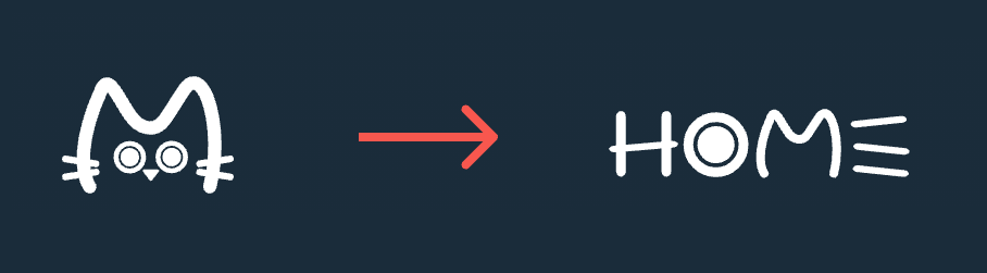
I also love that, partly because she works for the time-tracking company, Toggl, she’s able to state this about the website: “Made with 94 hours and 50 minutes of labor, after six years of procrastination.”
Olivia has a wonderful catalog of CodePens that you should also check out. Her CSS Grid ones are especially stunning.
Check It OutSo Long, Partner
Thanks for hitting the trail with us! Special thanks to Michelle Barker and Aysenur Turk for speaking with us about their work!
Follow @FrontendHorse on Twitter, and if you enjoyed this, I’d be over the moon if you share it with a friend or tweet about it.
Time to head back to the stable, but I’ll see you next time. Take care.
Your Neigh-bor, Alex