Newsletter • Issue 20
Collages, Grids, Morphs, and 3d Shapes
Howdy partner, and welcome back to the trail! It’s almost the end of the year, and I have to say, it’s been great riding with you these past few months. Let’s hope 2021 is a better year all around.
If you missed it, make sure you check out last week’s article, Swimming on Scroll with GSAP. In it, we dive deep into Michelle Barker’s Weird Fishes and learn how she used two GSAP plugins to make an interactive art piece. I think you’ll really enjoy it.
This week we’ve got a great roundup of CodePens and resources. Let’s saddle up and hit the trail!
Believe - GSAP Collage Animation
I haven’t seen too many web collages like Shunya Koide’s Believe, but I hope these start to catch on.
Shunya created the collage himself in Photoshop, then animated it with GSAP. He made each piece a separate element to all animate in at slightly different times. They all sprout from the center when you hover a certain spot. It feels like the season of Spring in a CodePen.
My favorite bits of this piece:
- He uses
backease on most of the elements, meaning they grow just a bit beyond their final resting place. It gives everything a more energetic and natural feel than a standardease-out. Comment out line 10 in the JavaScript, and you’ll see what a big difference a good ease makes. - The mask and blooming of the branch along the top. The way he masks the branch makes it feel like it’s growing right in front of us. Then the way the flowers on the branch grow and spin in makes them feel like they’re blossoming. It’s a great touch.
The visual and motion design make this piece special. Check it out, as well as the rest of Shunya’s fantastic CodePens.
GTA 5 Poster - Grid and Clip Path
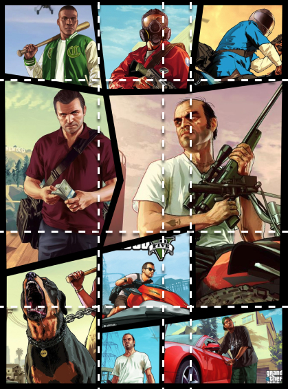
This GTA 5 Poster by Shireen Taj is an excellent execution of the classic GTA poster design. Each picture is a separate image file, and the black lines separating them are made from the black of the background.
So how did Shireen make these jagged cutouts with CSS Grid? She used a clever clip-path implementation.
First, let’s look at where the grid lines fall on this piece.

With this, you can see how she places the images within the grid. If you’re unfamiliar with CSS Grid, know that elements can span multiple rows and columns. The man center-right spans across two rows and three columns.
Shireen has created a grid-area for each image, then placed the image in that spot. Then she set the width and height of the images to 120%, so they extend a bit outside of their area. Next, she brought up Firefox’s clip-path to start creating the shapes for the images that you see above.
The way Shireen used CSS Grid in a new way reminds me of the fun that Andy Barefoot has in his CSS Grid demos. Make sure to check out our piece on his grid work if you haven’t already.
If you’re looking to do anything with clip-paths, it’s much easier with Firefox than any other browser. The built-in clip-path editor makes it a joy to tweak the shape in context with the rest of the piece.
I love the paper-cut feel to clip-paths, and would love to see a website layout incorporating paper textures and bright colors. I think this pen would be a great guide for something like that. Check it out.
Morphing Talk Bubble

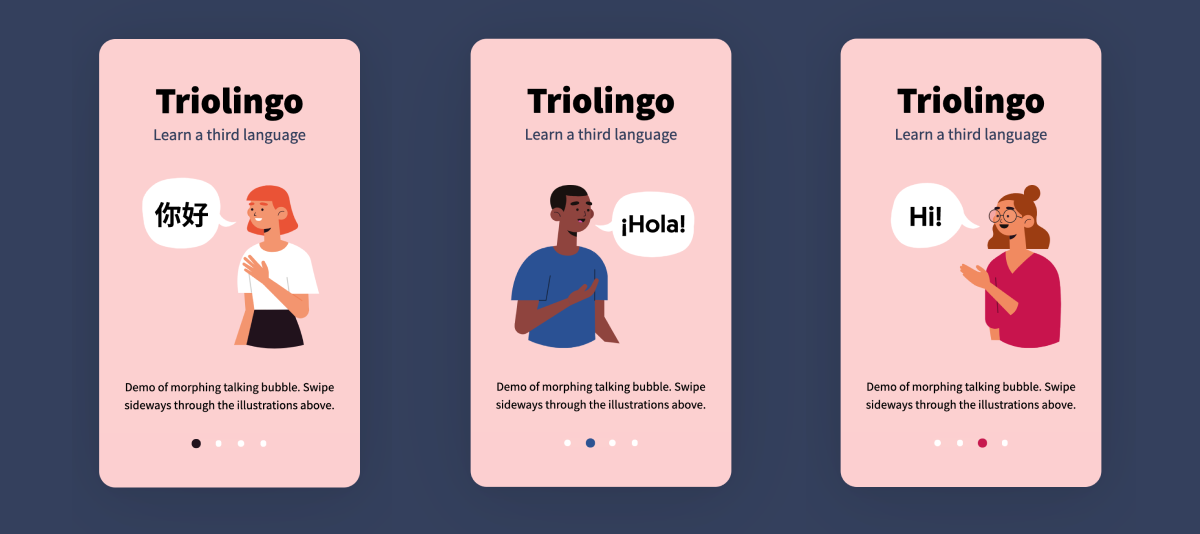
This Morphing Talk Bubble by Mikael Ainalem is a well-done piece of animation. It’s a phone screen with four states, and as you swipe, the people slide off-screen, but the quote bubble stays and reshapes. The little arrow on the bubble switches from the right, to the left, to the right again.
Mikael uses React Spring to morph the SVG, and lucky for us, he’s already written a great CSS Tricks article on the exact method he’s using. The key is animating between SVG paths that have the same number of points.
The physics-based animations give the whole piece a great feel. Check it out!
Resources
Today we’ve got a couple of great and free resources to add a 3d flourish to your websites or CodePens. It seems that the latest web development trend involves using slick 3d as part of the design.
Shapefest
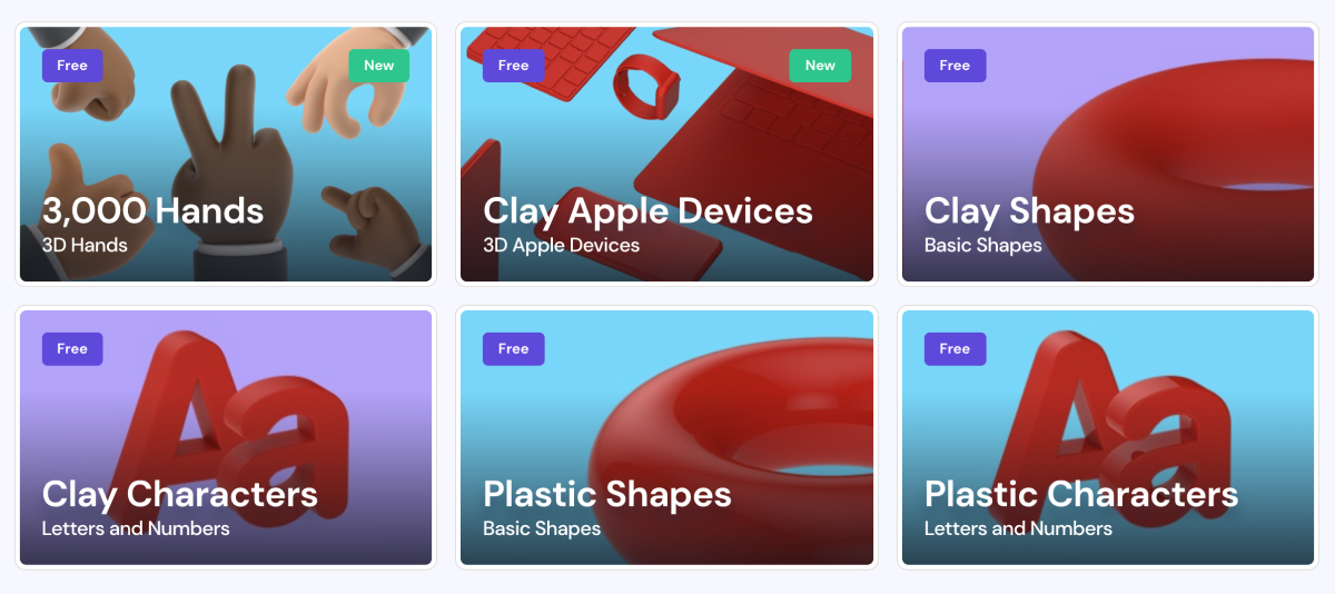
If you’re not skilled in a 3d program like Blender, then you might find Shapefest incredibly useful. Designer Joseph Angelo Todaro gives us a ton of letters and shapes with gorgeous materials and lighting. There’s many materials to choose from, like clay, plastic, acrylic, glass, aluminum, bronze, gold, paper, and lots more. It’s wonderful that this is all free!

Each asset is a high-quality 1280x1280 png file. Every pack is completely free when you enter your email. Check this one out and work some shapes into your next project! Check it out.
Spline
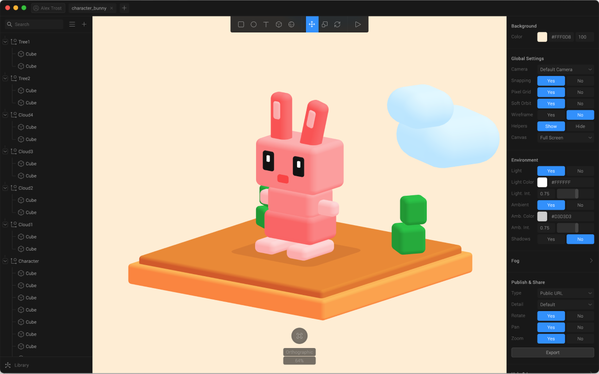
If that massive pack doesn’t have quite what you’re looking for, there’s a new app out today that might help. It’s called Spline, and it boasts a straightforward interface for creating 3D scenes. You can use primitive shapes like spheres and cubes or import 3d models.

The difference between Spline and something like Blender is in its simplicity. Spline’s only purpose is to output to the web. You can export your scenes as an iframe, as web assets, or as an image or video.
If you export it as “Web Content” you get a zip file that contains the HTML and JavaScript. Under the hood they’re using Three.JS and Anime.JS, so you should be able to modify the scene once you’ve exported it.
If you happen to give it a try, let me know. I’d be interested to hear what you think. It’s currently MacOS only with Windows coming soon. Check it out.
Giveaway Contests
This last week we did a fun giveaway for Colby Fayock’s excellent Jamstack Handbook. It all happened on Twitter, where we announced 5 lucky winners!
I’ve got a bunch of giveaways planned for the future, so make sure you’re following @FrontendHorse on Twitter so you don’t miss out on the next one!
Upcoming prizes include a year of CodePen Pro, a GreenSock License, a Polypane license, and lots more. Stay tuned!
Until Next Time
Thanks for hitting the trail with us! Special thanks to Shunya Koide, Shireen Taj, and Mikael Ainalem for speaking with us about their work!
Follow @FrontendHorse on Twitter, and if you enjoyed this, I’d be over the moon if you share it with a friend or tweet about it.
This is the part where we ride off into the sunset. You take care.
Your Neigh-bor,
Alex