Newsletter • Issue 22
Confetti, Conic Gradients, and GSAP Flip
Howdy partner, and welcome back to the Web Dev Riding Trail! It’s cold outside, so make sure you put one of those big ol’ coats on your horse before we saddle up.
There’s lots to get to this week. Here are the stops we’ll take on today’s trail:
- We’ll add delight to our projects with confetti bursts
- Look at a beautiful gradient design CodePen
- Learn about Flip transitions and the new GSAP Plugin
- See the White House’s new accessibility features
- Look at a new Three.js course
- Learn a horse fact!
Well, we can’t waste any time, let’s ride!
Add a Confetti Effect
I always get a bit of childhood joy when I can click a button to make confetti pop onto the screen and float down. It’s a fun addition to an experience, and can do a better job at bringing delight than any words on the page can.
We covered Aaron Iker’s Confetti button in the article Buttons that Spark Joy, where he used the GSAP Physics2D plugin to simulate gravity.
Josh Comeau gives you the option to launch Confetti in celebration for signing up for his newsletter.

Honestly, how could you not click a button labeled “Confetti?”
I love the non-standard shapes Josh puts into his. You can also use your mouse to knock them away! Great touch.
My favorite confetti CodePen is this Confetti Cannon by J Scott Smith. It’s one thing for a button to trigger confetti, but this lets you control the direction and intensity of the confetti burst. Super satisfying.
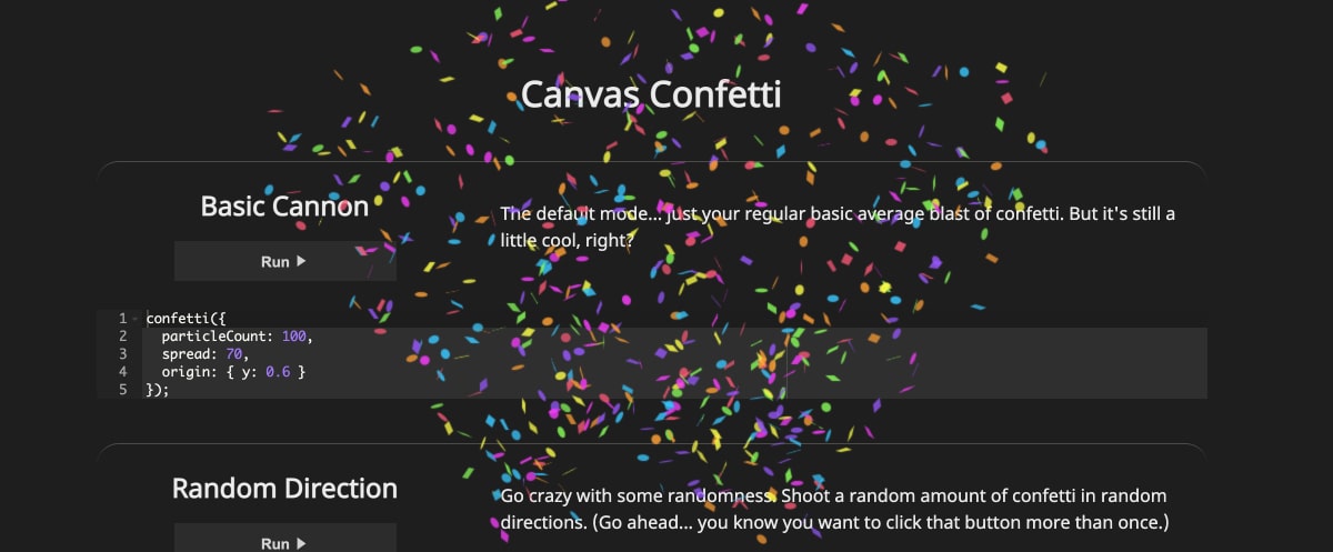
If you want to add some confetti bursts to your own site, you’re in luck! There’s a little JavaScript library called Canvas Confetti that lets you have a celebration with just a function call.

It uses the canvas API so it’s pretty performant. There are lots of examples on the demo page, so go click around and have fun!
Check It OutHowever, if we’re all going to add confetti to our sites, someone needs to make a version where the Rocky and Bullwinkle janitor comes through to sweep it all up.

Conic Gradient Design
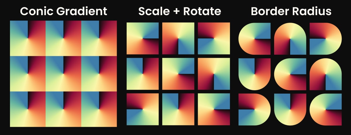
This CodePen from Bennett Feely would look right at home on the cover of an album.
A big part of what makes this so pleasing is the color choices for the gradient. The hard-stop of the black makes the shapes look like letters and once you see “CAD UCA DUC” you can’t unsee it.
Bennett is using conic gradients, border radius, and good use of Sass @for loops to keep the code small and tidy. Here’s a mini-breakdown of the different properties being added.

We touched on Conic Gradients in last week’s issue, so check that out if you missed it. Bennett is also the creator of some wonderful tools like Clippy and ZText. Definitely follow them on CodePen and check out their personal site.
Check Out this CodePenGSAP Flip Plugin
Animation super-library GSAP recently announced their new FLIP Plugin. FLIP is an animation technique that allows for animating elements even when there are major changes to the document layout.
For example, if you change an element from position: relative; to position: absolute; there would be a jarring shift as it takes its new place in the layout. The FLIP technique can make that a smooth transition.
Here’s a great article from David Khourshid that explains the technique and walks through using Flipping.js to achieve it. This pen by David explains the technique and the acronym nicely.
Now the fine folks at GreenSock have added Flip to their long list of plugins. The big ‘wow’ moment for me was when I saw this demo animating smoothly between flexbox column and row.
It’s a better user experience because they can follow the elements as they find their new place in the layout. They don’t need to reacclimate the same way they would need to if the elements just reappeared.
The new GSAP Plugin gives you an easy API to work with and allows you to hook into the rest of your existing GSAP workflow.
Check Out GSAP FlipWhite House Accessibility Features
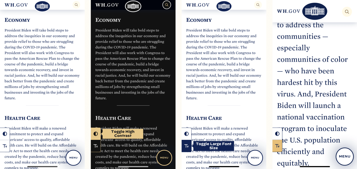
With a new American President comes a great deal of changes. I wasn’t expecting new website features starting on day one, though! The website for the US White House was able to launch a feature that focuses on accessibility.

I love that it’s right there in the open and doesn’t rely on users to change their own phone settings if they need assistance reading the content. I also like the menu button placement for ease of use, but on iOS it requires two taps to open. Still, it’s in an easier to reach place than the hamburger menu at the top of most websites.
Check Out WhiteHouse.govThree.js Journey Course
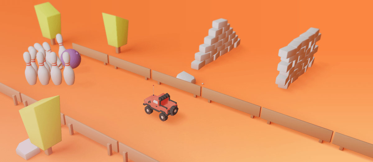
One of my favorite portfolio sites is Bruno Simon’s excellent RC Car experience. It’s more of a playground than a typical gallery of things I’ve made that most portfolio sites tend to be.

Well that same Bruno Simon has released their long-awaited course, Three.js Journey. It’s a massive course, and having been through a few of the lessons already, I can say it’s top quality. Even the custom site is on-par with other top course websites.

So if you’re looking to get into Three.js, or just want to go deeper, this looks like the course to take. I’ll be working through it in my spare time, so let me know if you are, too. It’s great having a study group! (Study herd? Not sure, I’ll work on it.)
Check Out Three.js JourneyHorse Fact
I think it’s only right that while you learn about web development, you also walk away with some horse knowledge. I thought about taking the Snapple Fact route and making half of these utter lies, but I just can’t lie to you. So here’s the first fact:
The early ancestor of the horse, Hyracotherium, was no larger than a Golden Retriever. It lived 50 million years before the invention of HTML and looked more like a tiny deer. We all had our awkward phase, right?
So Long, Partner
That’s it for this week. Thanks for hitting the trail with us!
Special thanks to Taylor Bell and the kind folks over at Egghead for the shoutout this past week! If that’s how you got here, welcome and I hope you enjoyed your first issue!
Follow @FrontendHorse on Twitter, and if you enjoyed this, I’d be over the moon if you share it with a friend or tweet about it.
It’s the end of the trail for now, but I’ll see you next week. Take care.
Your Neigh-bor,
Alex