Newsletter • Issue 17
Spirals, Toggles, Loaders, and 3D Transforms
Howdy, partner! Welcome to this week’s Frontend Horse, the finest web development horse trail you’ve ever seen! I’ve picked out a fine route for us today. We’ll trot along some generative art, gallop past a clever toggle, canter up to an animated loader, and finish our journey at a fine resource.
Whew, that’s a winding trail; I hope your horse is well rested. Let’s ride on!
Packed Spirals
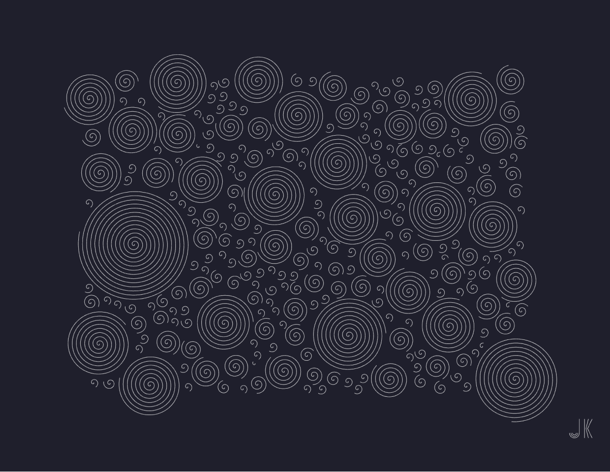
I loved finding Johan Karlsson’s generative artwork this past week. He has a ton of great pieces on his CodePen, but this piece, Spiral Packing, really caught my eye.
Because it’s generative, it’s created with randomized values. If you click the screen you’ll get a different design. Keep clicking until you find one you love, then hit your d key. It’ll download an SVG file to your computer!
So there are a couple of Johan’s techniques that I want to touch on here:
- How he determines a valid place to put a spiral
- How he packs the shapes together without overlap
- How he creates this downloadable SVG
While they’re technically spirals, they’re called ‘circles’ within the code, so to avoid confusion that’s what I’ll call them. Johan is using the Circle Packing Algorithm from Daniel Shiffman’s tutorial here.
Placing a Circle
The addCircles() function is responsible for adding new circles where no other circles exist. Here are the steps it goes through.
- Pick a random center point within the SVG’s boundaries.
- Checks if that center point is further than
16units from any other center point. - If it’s a good spot, add it to the
circlesarray.
Growing Spirals
After each circle is created, Johan loops through the entire circles array and passes each circle to the canGrow() function. canGrow() does some math and checks if the current circle would overlap any other circles.
- Find the distance between the center of the two circles.
- Using the distance and each circle’s radius, determine if there’s room to grow.
- If there’s room, the circle’s radius grows by
2. - If a circle is done growing, it’s
donevalue is set totrueand it’s skipped for potential expanding next time around.
It all renders instantly, but here’s what it looks like slowed down, step-by-step:

Notice how the first spirals grow until they run into another, then smaller ones fill the gaps in between. Such a great technique!
Downloading SVGs
I’ve seen a good amount of generative art on CodePen, but this might be the first time I’ve seen a built in download feature that exports an SVG with just a key stroke. Hit the d key on your keyboard and it’ll prompt a file download. I really love this download feature, and especially love that it opens up avenues for making physical art.
Johan has an AxiDraw Pen Plotter, which is basically a robot that draws on paper. Johan feeds it his favorite creations, and it sets to recreating it on paper. Here’s a spiral piece on paper:
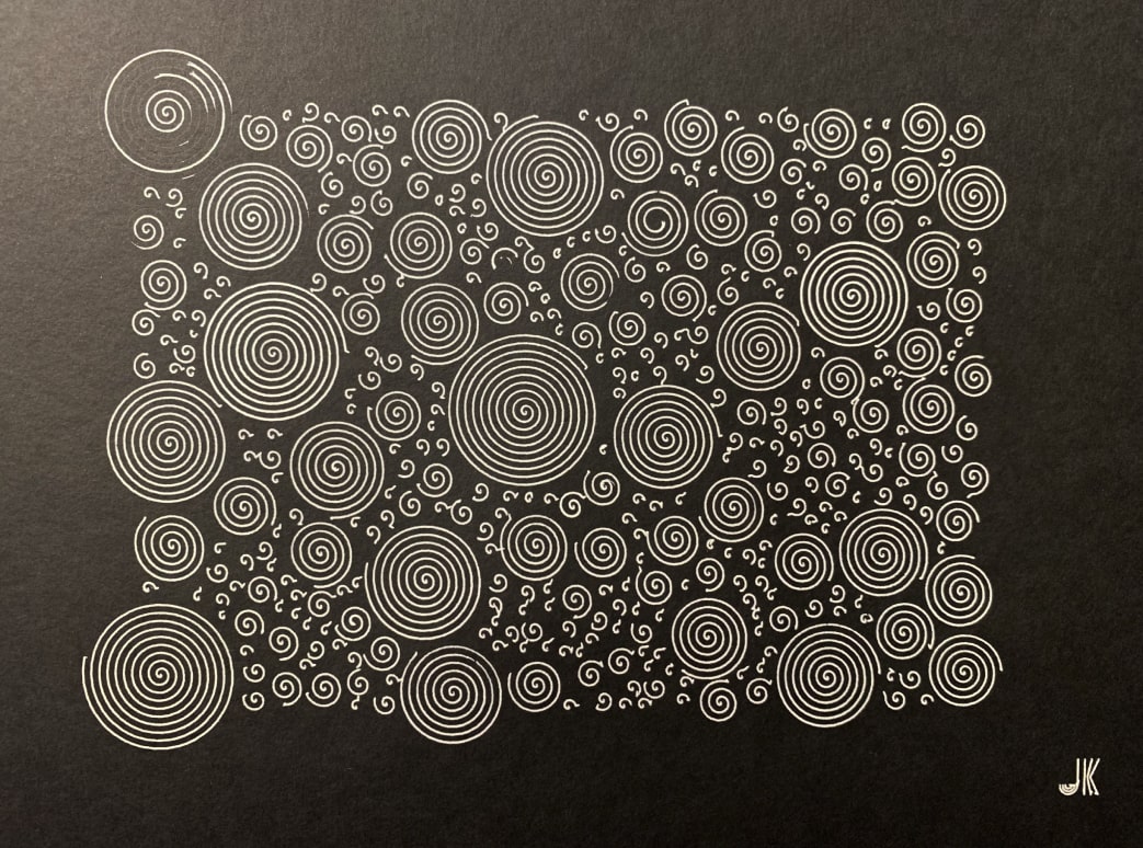
This is such a great way to make high-tech art. Program your constraints, randomize until you find an outcome you like, save it, and set your robot to drawing!
Check out the rest of Johan’s great work on CodePen, and follow him on Twitter.
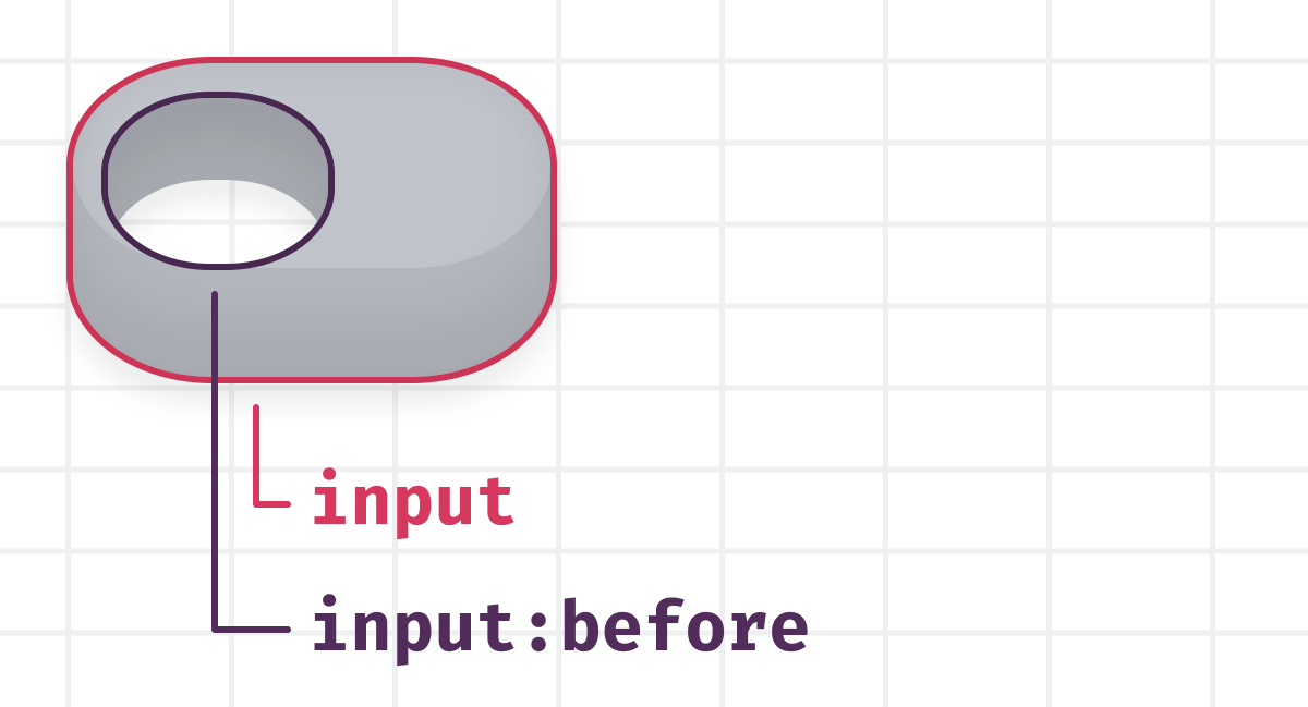
Toggle with a Hole
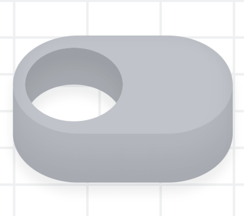
This toggle button by Jon Kantner feels a bit like stage magic. When trying to figure it out you notice the background grid and see it through the hole.
Jon could have used a solid color for the background and the hole, but you wouldn’t think there was really a hole. He takes the extra step to assure you that it’s a real hole, but it isn’t.
It’s a great sleight of hand, but how did he pull it off?
The HTML
First, let’s just touch on the HTML being used. It’s just this one input element.
<input class="pristine" type="checkbox" name="toggle" value="on" />All styling of the toggle is done on the input element, or its :before pseudo element. Putting a border on the input and input:before elements shows that the hole is the :before element.
Almost all of the magic happens in the CSS.
Background Grid
Here’s how Jon creates the background grid:
body,
input[type="checkbox"]:before {
  background-image: linear-gradient(90deg, #f1f2f3 2px, #f1f2f300 2px),
    linear-gradient(#f1f2f3 2px, #fff 2px);
  background-repeat: repeat;
  background-size: 0.75em 0.375em;
}
So that’s applied to both the body and input:before elements, but if that’s all we add, it still doesn’t look right.
The background grid is off, breaking the illusion.
That’s where Jon uses background-attachment and background-position.
input[type="checkbox"]:before {
  background-attachment: fixed;
  background-position: 50% calc(50% - 0.1875em);
}
Using background-attachment: fixed; sets the background relative to the viewport, not the element itself. This is the crucial property that makes it work.
From there, he adjusts the positioning to get the grid to line up just right.
The rest of the drawing is done using box-shadows, which we covered a bit in this article.
Jon even made some great styles for the prefers-color-scheme: dark; media-query, aka dark mode!

I’d love to see what other kinds of illusions you could create with this technique. Tweet @FrontendHorse if you make something similar!
Check out Jon’s other great work on CodePen, and follow him on Twitter.
Scanline Loader
This loader from Kassandra Sanch uses some great techniques.
Kass created the text style with this tutorial and Adobe Illustrator. That’s where she turned the text into paths and sliced them up, plus added all the little lines. Then Kass brought it to CodePen to add some animation and take it a step further.
Half of each letter is solid black, and the other part has an SVG <pattern> element set as its fill.
It’s mainly an SVG with defs and two group elements. Here’s a look at the abbreviated HTML:
<div class="container">
  <svg>
    <defs><!-- define the pink line pattern--></defs>
    <g id="Black"><!-- Paths for the black letter parts--></g>
    <g id="Lines"><!-- Paths for the clear/pink letter parts--></g>
  </svg>
</div>
You’ll understand the pattern better with this demo, showing just one instance of the pattern.
Each instance of the pattern is like its own SVG with a viewbox, so when Kass translates the lines to the right, they disappear. When you tile the pattern as the background of the letters, you get the “LOADING” effect above.
To make the lines fire at different times, Kass is using the animation library, Anime.js. Anime has a stagger function, so she’s able to provide a delay and Anime will apply the appropriate delay to each element’s animation. It all makes for a really slick result!
Kass does a lot of great CSS art and other work, so check out her CodePen and follow her on Twitter.
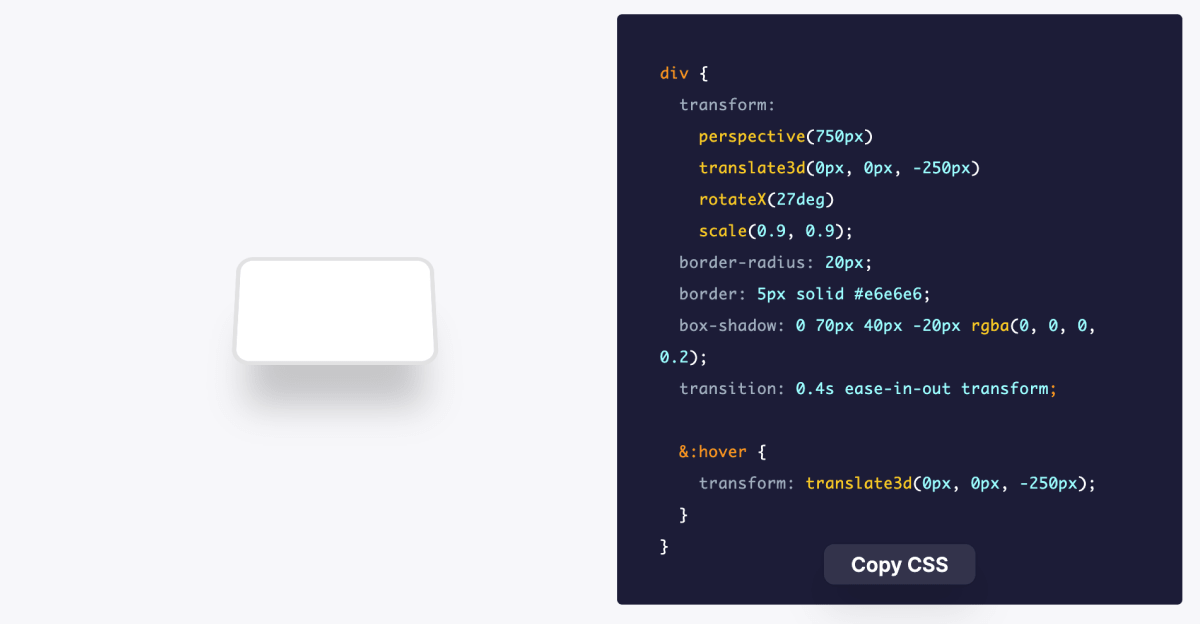
CSS 3D Transforms
If you’re looking to add some great 3D effects to your next project, Kilian Valkhof has a wonderful roundup for you. He’s collected 13 excellent CSS 3D transform examples from different websites, distilling each down to just the code you need.
The best part is that they’re all one div, even this one:

Each of these snippets involves some combination of the CSS transform property. Try mixing a couple to see if you can create something new.
Check It OutUntil Next Time
Thanks for hitting the trail with us! Special thanks to Johan Karlsson, Jon Kantner, Kassandra Sanch, and Kilian Valkhof for speaking with us about their work!
Follow @FrontendHorse on Twitter, and if you enjoyed this, I’d be over the moon if you share it with a friend or tweet about it.
This is the part where we ride off into the sunset. You take care.
Your Neigh-bor,
Alex