Creating Realistic Art with CSS
Featuring Ben Evans
It can be challenging enough to use CSS to match the exact layout you’re going for, but could you imagine using it to paint a landscape? Or recreate an intricate playing card? Or even create a realistic portrait? That’s exactly how Ben Evans uses CSS, and the methods he uses to make his art are fascinating.
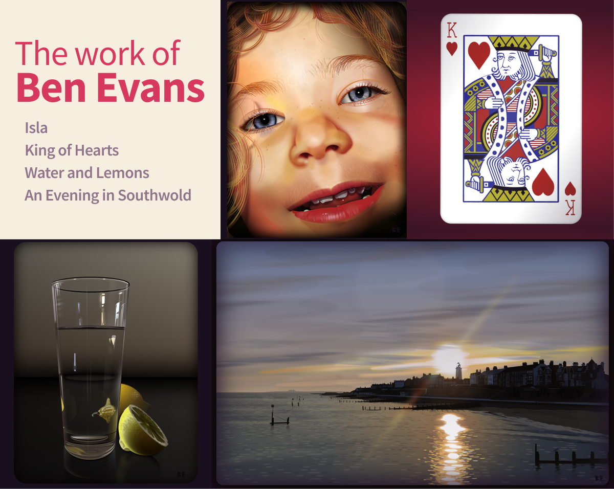
I could write pages about how detailed and beautiful each of these pieces are. I love it when people push the limits of HTML and CSS, so we had to bring Ben in and learn his techniques!
Unique HTML
The first thing that struck me when I look through Ben’s code was HTML. There’s an intense amount of styling happening, and yet he isn’t using a single class or id. For example, here’s the first 12 lines of code in his landscape piece:
<landscape>
  <sky>
    <x>
      <x></x>
      <x></x>
      <x></x>
    </x>
    <x>
      <x></x>
      <x></x>
      <x></x>
      <x></x>
      ...</x
    ></sky
  ></landscape
>
Ben explains that he’s obsessed with small code and likes the appearance of the <x> elements. They’re custom elements so there’s no default CSS to battle against. For your own mental model you can think of them as behaving just like divs.
So how does he style all these elements if they don’t have classes?
Styling with nth-of-type
Ben creates a bunch of elements in his HTML and then moves to his CSS. There he doesn’t need to worry about naming each bit, because he’s using the nth-of-type selector. This way he doesn’t have to name things or change his HTML.
You might think this makes it harder to keep track of, but Ben leaves comments by the major pieces and that makes it easier to sort through.
A great tip from Ben for anyone trying CSS illustration: Start with the background and work forward instead of using z-index or translateZ. Ben says, “Safari in particular gets very confused with pseudo-elements and z positioning.”
Responsive rems
The fact that all of these pieces are responsive is pretty dang neat. How does he do it?
html {
  font-size: 1vmin;
}
The vmin unit responds to the viewport’s smallest side, so it will decrease if the screen gets smaller. The rem unit is relative to the font-size of the root element. So if we base everything in rems, they’re all relative to the same value. Great technique!
Drawing Techniques
Ben sets the elements he’s drawing with to position: absolute; top: 0; left: 0; so that they leave the document flow. Then he moves them into place by using transform: translate3d(). He shapes the pieces with border-radius and various transforms, and sizes them with rems. Then most of the actual drawing uses background: linear-gradient and/or box-shadow.
box-shadow and linear-gradient are extra useful because they allow for multiple values separated by commas. Let’s see how he used this technique to make the hair of the King of Hearts.
King of Hearts
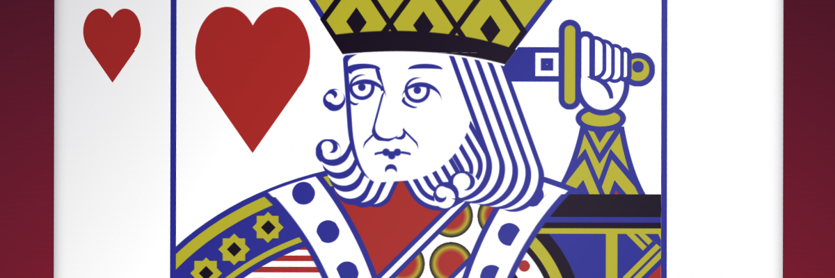
Box Shadow Hair
I’ve mainly used the box-shadow element for making soft blurry shadows under cards and other elements. Ben is using it for WAY more creative purposes in his work! The hair on the king is actually multiple layers of box-shadow. Let’s check it out by messing with it.
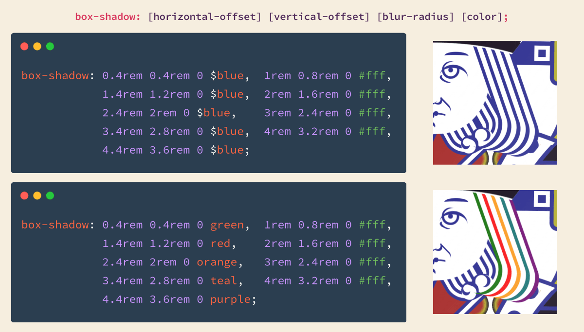
By using commas you can put multiple box-shadows on a single element. Ben alternates blue and white, increasing the offset each time to space them out. In my version, I changed the $blue to different colors to show us how it’s working.
The key for crisp lines? Setting the third property, blur-radius, to 0.
Animation
When you hover over the card it does a nice little spin and flip.
Ben’s doing a few things to achieve this great effect.
First, there’s a bit of thickness to the card. It’s really just two elements with white backs that Ben moves just a bit apart. The flip is quick enough that our eye registers the white in between as thickness. Awesome trick!
As the card rotates it gets dark when facing down and brighter when facing upwards. You almost don’t pick up on it because it’s so realistic. Ben has elements covering the front and back that animate between transparent, black, and white. Here’s the code for the effect with a nice animation shorthand:
@keyframes light {
  0%,
  100%,
  50% {
    background-color: $none;
  }
  25% {
    background-color: rgba($card, 0.7);
  }
  75% {
    background-color: $body;
  }
}
And you might not believe it, but the back of the card is just a single element. Pretty awesome.
Check out the video timelapse for this one to watch it all come together. Check out the King of Hearts on CodePen.
Isla
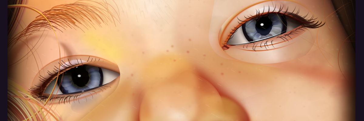
This was the first piece I saw of Bens, and it’s still probably my favorite. All the subtle touches he added to this to make the skin feel more realistic are just fantastic.
If you look close you can see that the iris is a bunch of rounded squares rotated around the center point. Ben used the same technique in the next piece for the center of the lemons.
The perfectly detailed hair really makes this piece. The eyelashes, eyebrows, face fuzz, and head hair all have different properties and make it feel more realistic. Ben’s using box-shadow here in a more complex way than he did for the King’s hair. Instead of white between the colors, he makes the gap transparent and changes the color to add depth.
Here’s a timelapse of Ben making the piece, and here’s Isla on CodePen.
Water and Lemons
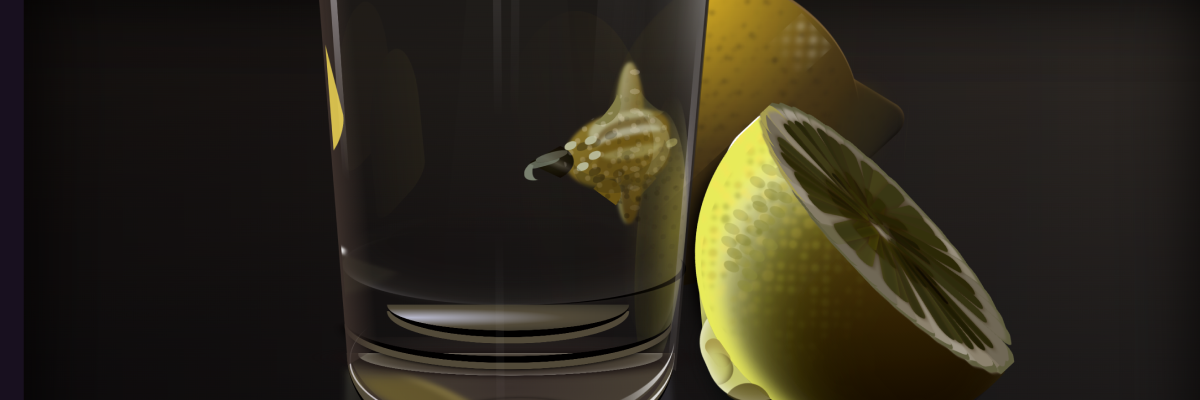
CSS Glass
I assumed the most difficult part of this piece was the glass. All the refractions and highlights are perfect and make this glass look so good!
Turns out I was mistaken. Ben says, “The main thing I have learned through all my CSS art is that man-made materials are a lot easier to draw with CSS than organic materials.”
Makes sense now that I think about it. The shapes and coloring of the lemons are much more complex than most man-made things. Ben even points to our Frontend Friend Oscar Salazar’s awesome glass ball as an example of glass done well in CSS!
Landscape
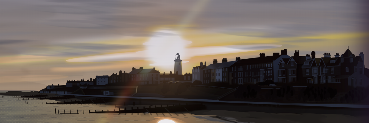
Not only is this piece stunning, but it holds a clever SCSS trick that lets the viewer tweak the colors. At the top of the CSS you see:
// v CHANGE THE COLOUR OF THE SUN v //

$sun1: #f2de6f;
What’s cool is that by using SCSS color functions, every other color is based on this one color. From that seed, Ben shifts the hue, changes the saturation, brightness, and opacity to create the rest of the colors.
As an example, let’s set the variable $start to aqua then use the adjust-hue function to make a new color. Hue is a value between 0 and 360 as you can see in the color wheel below. We can make a new color by increasing the teal’s hue by 60deg.
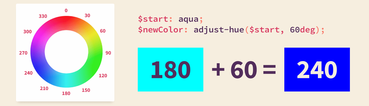
The result is more of a ‘blue’ rather than teal. If we were to use -60deg we’d get a green color.
Ben is using this function and many other SCSS/Sass color functions to create his palette from the color you choose.
Let’s look at some examples. On the left is Ben’s original color and four of the colors that are based on it. Then check out the results as I change $sun1 to orange, dodgerblue, and darkgray.
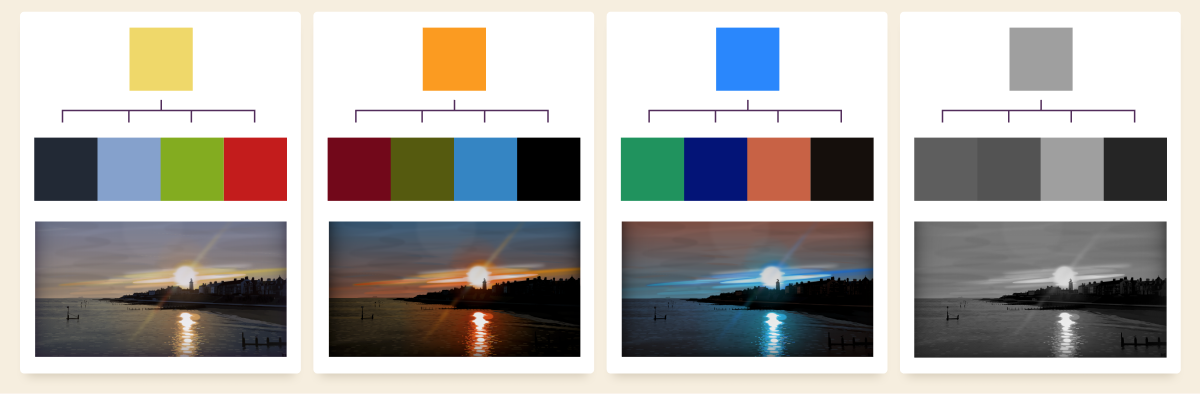
What a great way to utilize SCSS color functions! I love this concept and would love to see more people use it in their work.
Halftone Dots
If you look closely you’ll notice a dot pattern in the water similar to an old-school comic strip.
They’re called halftone dots, and I didn’t realize they could be made with just a couple lines of CSS. Ben shares his solution with us:
background-image: radial-gradient(blue 30%, #fff 0);
background-size: 1rem 1rem;
background-position:
  0 0,
  0.5rem 0.5rem;
Ben uses them in this landscape piece to add a bit of texture to the water. He’s also using them on parts of the lemons in the previous piece.
Check out the timelapse here.
Wrap Up
Well, that’s the end of the trail for us today. We learned so much by looking through Ben Evans’s work. Ben doesn’t use ids or classes but instead picks up the next element to style with nth-of-type. We saw just how powerful box-shadow can be, and how Ben uses it to make repetitive shapes or thin, wispy hair. Ben made his landscape customizable through Sass variables, and we saw how they work along with a few examples.
I hope this inspires you to give some CSS art a try, or maybe just use box-shadow in a new way on your next web build.
Huge thanks to Ben for teaching us his techniques. Go check out his website and follow him on Twitter.