Newsletter • Issue 31
Animated Credit Cards, New Animation Libraries, & Accent Color!
CodePens
Animated Credit Cards
Our friend Tom Miller brought some brilliant animations to some fun debit card designs.

This little GIF doesn’t do them justice, and there’s 4 in total, so click through to the CodePens to see the smooth animations in all their glory.
Tom’s using SVG elements and animating them with GSAP. The magic here is in the stellar motion design.
Pure CSS Scroll-Timeline Demo

This demo from Bramus shows off the upcoming Scroll-Linked Animations API coming to CSS. The full screen carousel uses zero JS. All the magic comes from the @scroll-timeline and animation-timeline properties in the CSS.
Right now it only works if you’re using Chrome and turn on “Experimental Web Platform features” in your ‘chrome://flags’ section.
Read Bramus’s explanation thread on Twitter
New Animation Libraries
This week brought two new animation libraries to the web, each serving a slightly different purpose.
 Theatre.js - JavaScript Motion Design Library — www.theatrejs.com
Theatre has visual timeline editing tools that you normally see in CG apps like After Effects. The great thing is it’s for the web and can animate the DOM, Three.js, WebGL, and really any JS variable.
 Motion One: The Web Animations API for everyone — motion.dev
Motion One is a tiny abstraction over the Web Animations API, made by the author of Framer Motion, Pose, and Popmotion. It handles keyframes, timelines, and staggers, clocking in at only 3.1kb.
People are already making some incredible stuff with Theatre. I’m hoping to learn about both libraries during future streams, so stay tuned for that!
Articles
Accent Color
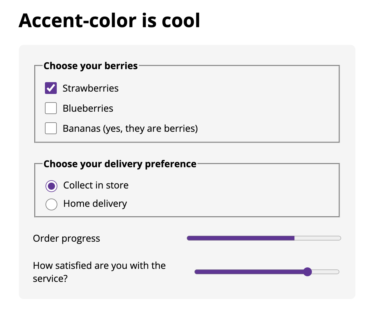
Why should you care about the new accent-color CSS property? One reason is that it allows you to use the built-in form elements (checkboxes, range sliders, etc) with your own custom colors.
Normally you’d hide the checkbox and reimplement your own with a bunch of CSS. Now to get a great looking set of form elements all you need is:
:root { accent-color: rebeccapurple; }
And your form is now on brand.
 Demo playground from Michelle Barker
Our friend Michelle Barker wrote all about it in a Smashing Magazine article, in the best explanation I’ve seen of it so far. Definitely check it out!
Past Episodes
I want to highlight two recent episodes that will seriously improve your understanding of Design Systems and Typography.
 Let’s Make a Design System w/ Mike Aparicio — www.youtube.com
Mike Aparicio teaches us about Design Systems, what a Design Systems Engineer does, and how to make a design system for a website of any size!
Mike went through the Frontend Horse homepage and simplified it, organized it, and showed the power of design systems.
 Learning Responsive Typography with Scott Kellum of Typetura — www.youtube.com
Scott Kellum taught us an incredible way to create responsive typography with Typetura!
Scott designed a site with beautiful responsive typography and showed us how Typetura makes it simple to build. If you haven’t used Typetura yet, you’ve got to check this one out.
Upcoming Shows
This week is PACKED with great shows, so make sure you’re following on Twitch.
Creating Private Content with Auth0, Next.js, and Prismic!
James Q. Quick | Tuesday, September 28th
Incredible Effects with Three.js
Luis Bizarro | Wednesday, September 29th
Learning the CUBE CSS method
Andy Bell | Thursday, September 30th
GSAP Community Questions
Cassie Evans | Friday, October 1st
So Long, Partner
Want a place where you can ask questions, help others, and learn about the fun parts of frontend?
(Enter with a pun for bonus points).
Hope to see you there, or at one of the shows this week. If not, I’ll see you next time we saddle up for the newsletter. Take care.
Your neigh-bor,
Alex