Newsletter • Issue 29
Discord, Container Queries, Audio Animations, and Multicolor Text!
Howdy, Partner! I hope you’re having a fantastic week.
In this issue, we’ve got a home for the Frontend Horse community, a couple of wonderful Component Carousel episodes to talk about, and some great CodePens to dig into.
Discord Community
We’ve started a Frontend Horse Discord community! It’s a fun, inclusive place where you can hang out, chat with friendly devs, and learn from wonderful people. We’ve got custom emotes, a few channels started, and a bunch of friendly folks!
Join the DiscordIf you’re not familiar with Discord, it’s similar to Slack but geared towards communities, where Slack is best for work and companies. Hope to see you there!
Learning Container Queries
We had the brilliant Stephanie Eckles on Component Carousel, and she taught us so much about CSS Grid, Container Queries, and even some art direction!
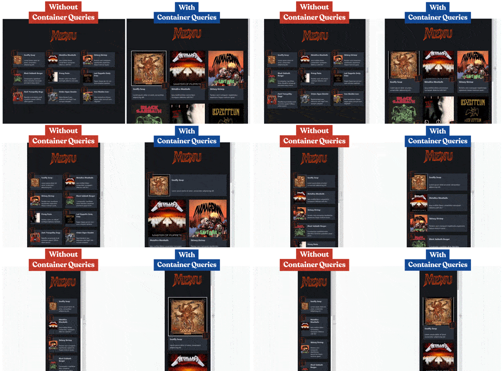
Container Queries are only in Chrome Canary, so Steph showed us how to progressively enhance our CSS Grid to work fine on current browsers, and look fantastic if container queries are supported. Check out the difference:
Steph has such a great teaching style, I know you’re going to really enjoy this episode.
Animating SVG with the Web Audio API and GSAP
Did you know that you can take values from an audio source to animate a GSAP timeline? Last week on Component Carousel, Andrew Rubin showed us how it’s done!
When the music plays, these three Fast Food band-mates headbang in time to the beat!
What makes this even cooler is the fact that Andrew drew the characters himself AND created the music that they’re rocking out to. Plus, the month’s theme of Heavy Metal Burger Joint was Andrew’s idea!
Watch how Andrew pulled this off in the episode replay on YouTube.
Multicolor CSS Text
This one was sent in by Arran in the Frontend Horse Discord!
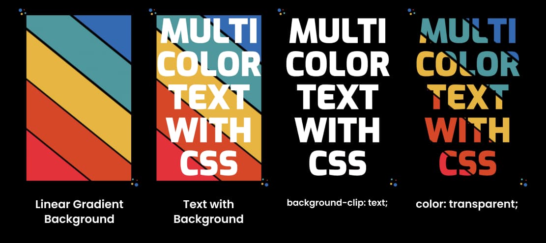
Shireen Taj created a wonderful text effect with this pen. They’re putting a linear gradient on the background of the h1, then applying the background-clip: text; property.
This does what it sounds like: it clips the background to the text.
Then, setting the text to color: transparent;, we only see the background where the text would have been.
Here’s a visual of the steps:
Generated SVG Plants and Shapes
Check out these lovely generated plants and shapes from Natalia. Click to generate a new bit of art.
Natalia is generating SVGs, randomizing the color and positions of the shapes.
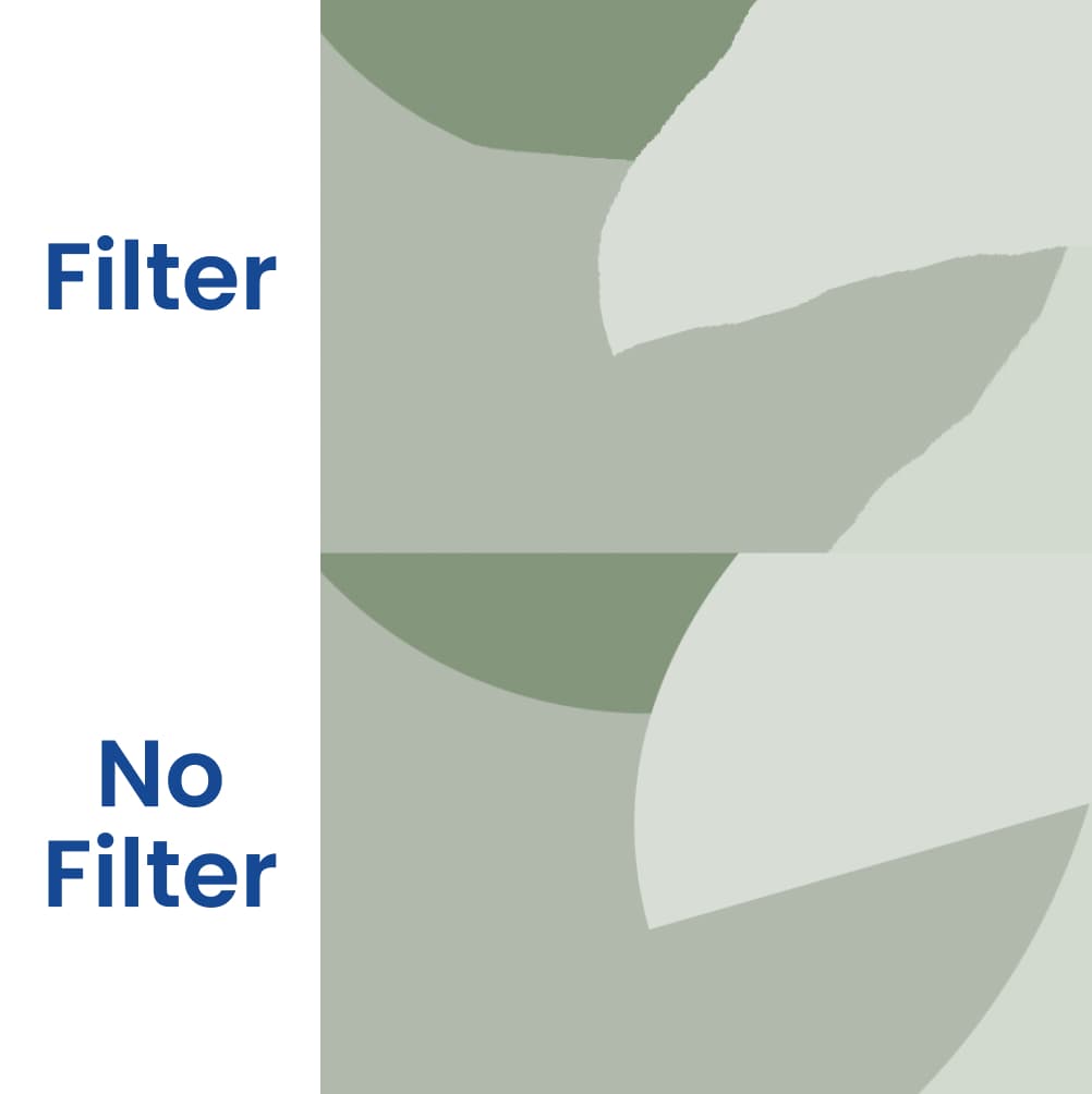
Then she adds the feTurbulence and feDisplacementMap SVG filters to warp the shapes for a more natural look. Check out the difference in this closeup.
Natalia’s work was shown to me by George Francis in the Frontend Horse Discord.
Generative Grid Layouts
I really love this tutorial article from our friend George Francis! George breaks down the steps of the tutorial:
- Add some
{ x, y }points to a 2D space. In this example, the point’s positions are random but biased towards a focal point.
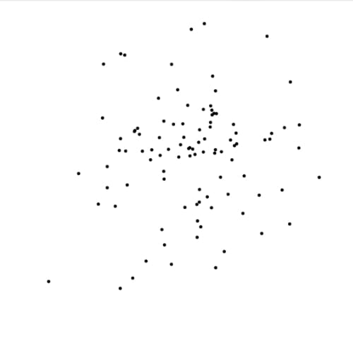
- Subdivide the space into quadrants based on the density/position of the points
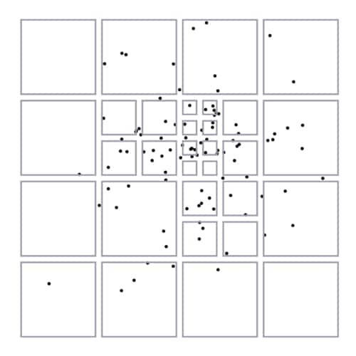
- Store a reference to the resulting rectangles (these are the grid areas)
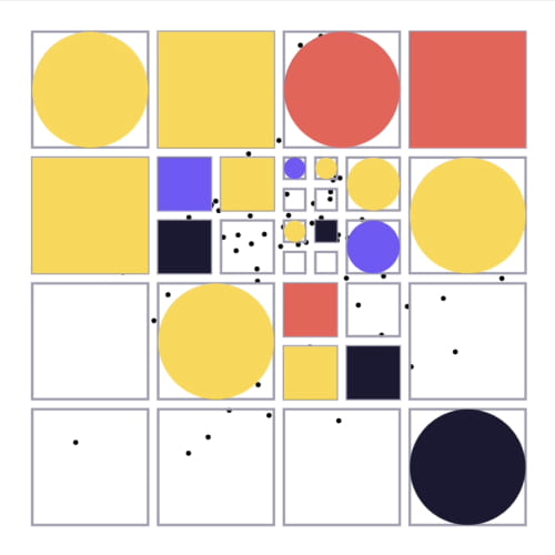
- Use the resulting grid areas to position stuff! In this example, I am using squares and circles to form a simple pattern.
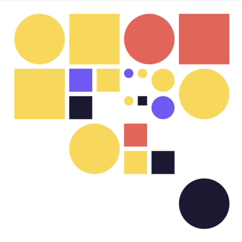
George goes on to make some really wonderful generative pieces with this workflow. You can take it and add your own color palette, variety of shapes, and whatever else to add generative grids to your own projects!
Read the ArticleI loved this tutorial so much that we had George come on stream with us and chat about it, and generative art in general. Give it a watch on Youtube.
Upcoming Events
Here’s what we’ve got cooking on the Twitch stream this week.
Casual Coding with Cassie Evans
Tuesday we’ll have the fantastic Cassie Evans on the stream! It’ll be a casual chat and we plan to go through some hidden GSAP goodies and learn together.
Not only is Cassie of my favorite people, but an SVG and GSAP expert! So if you’re looking for a great way to spend your Tuesday, make sure you’re following on Twitch so you get notified when we go live. (We’re still nailing down the time).
Bruno Simon on Component Carousel
Wednesday we will have Three.js expert, Bruno Simon, coming on Component Carousel!
It’s the first episode for this month’s new theme: Kaiju Demolition Services. Through the month of July we’ll have four fantastic guests build components around that theme! At the end we finish with another super cool website.
Bruno will teach us how to use physics with Three.js and rampage through a 3d city!

Twitch Appearances
I’ll be on a couple other shows this week as well! On Thursday I’ll be on SliceZone over on the Prismic channel, then Developer Hangouts with James Perkins.
Then on Friday I’ll join Ben Myers on his Some Antics show!
So long, partner
That’s all for this week! I hope to see you in the new Discord Community and in the chat for this week’s streams.
Follow Frontend Horse on Twitter, and on Twitch. If you enjoyed this, I’d be over the moon if you share it with a friend or tweet about it.
It’s the end of the trail for now, but I’ll see you next week. Take care.
Your Neigh-bor, Alex