Newsletter • Issue 28
3D Burger Drums, Gooey Text, and a Vue Game!
Howdy, partner! I’ve got another saddle full of delightful web nuggets to share with you today. We’ve been cooking up some fun on the Twitch stream, we’ve got a gooey text transition, a free Eleventy course, a Vue game, and more!
Let’s hit the trail and see what’s in store.
Burger Drums
This week on Component Carousel, we had Steve Gardner come on and build a cheeseburger that turned into a drum kit. It’s as wild and fantastic as it sounds.
And here’s the live stream where he showed us how to build it!
And make sure you’re following on Twitch so that you’re there for next week’s show with Stephanie Eckles!
Follow On TwitchCSS Text Morphing
This is a super cool transition effect from our friend Amit Sheen.
The key property that makes this possible is this:
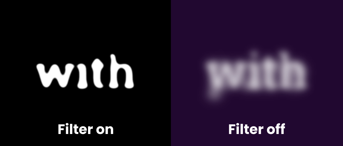
filter: contrast(25) blur(1px);Here’s a little demo that lets you toggle the filter on and off. When the background is purple there’s no filter. Click the screen to change the color to black and turn on the filter.

Without the filter it just blurs out and in. The high contrast of the filter makes every edge more crisp, giving this melting effect.
The gooey/blob effect has been around for a bit, but I’ve never seen it applied to text like this. Chris Coyier has a great write up about the technique if you’re looking to learn more.
Eleventy From Scratch
We got some wonderful news from Andy Bell! Last week I mentioned his contributions to the fantastic Learn CSS course that is completely free and incredibly high quality.
This week he’s announced that his Learn Eleventy from Scratch course will be free from now on!
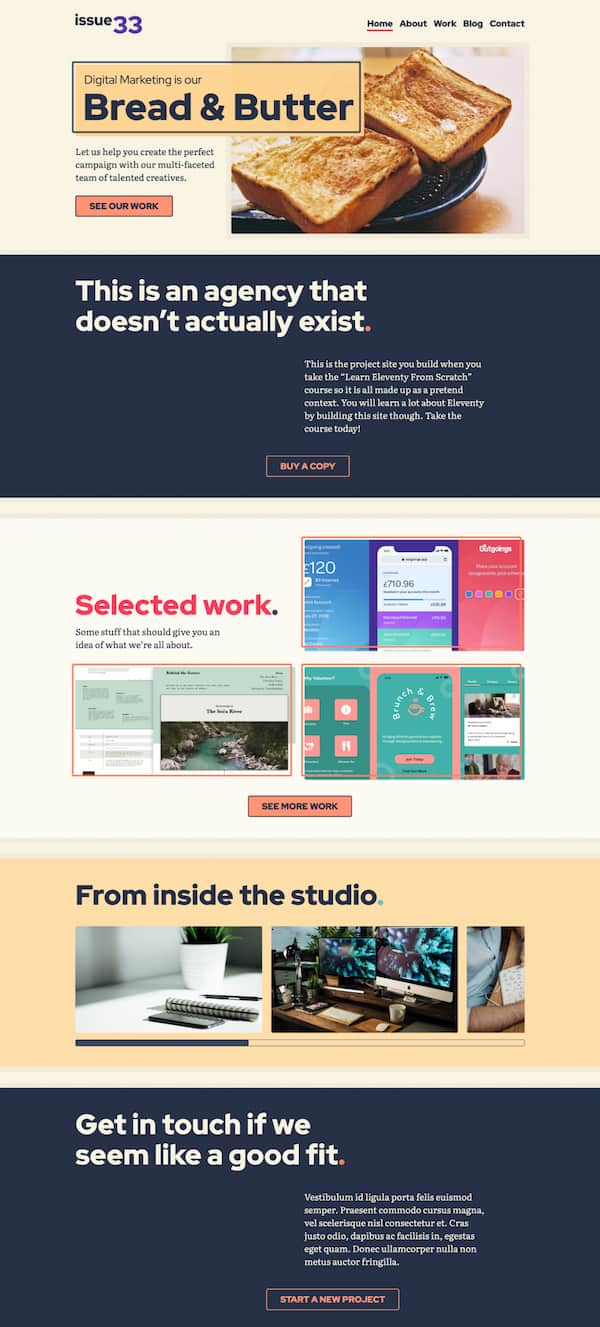
The site that you build for the course is gorgeous. I’ve heard from many people that the CSS knowledge alone is worth the previous cost of admission. Now that it’s free it’s a serious steal.

Kill the King
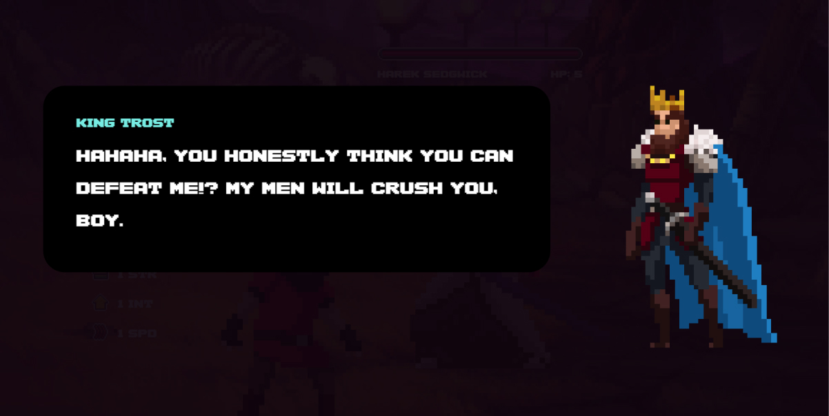
This game by serial CodePen game creator has absolutely exploded in popularity, and I see why. It’s stylish, easy to play, and is made entirely with HTML, CSS, and Vue.
It’s a button-masher with a touch of strategy that exists entirely in CodePen.
The pixel art style is excellent and reminds me of Dead Cells, where the voice acting (Jamie himself using a voice filter) has influences of Hades. The sound design and music choice is epic, plus the evil king has a pretty cool name.

The Vue code is really well organized, so scroll through it. I think it’s a great demonstration if you’re considering building a game with web tech.
One of my favorite details is how the music is muffled for the intro and shop scenes. Jamie doesn’t switch to a different mp3 file, but applies an audio filter to the file. This way it’s happening in the browser and can respond to user inputs.
The characters are animated with the use of sprite sheets. If you check the CSS you’ll find PNG files like these:
![]()
It’s fun to see a classic game animation technique used inside a Vue app.
Check it out and see if you can kill King Trost within the 4-minute time limit.
Play Kill the KingIntro to Shaders
Last year ilithya helped me write a newsletter issue on something I knew very little about: Shaders. I wrote it over the course of two weeks and ilithya was there to answer every question and correct every mistake I made. It was a long piece and deserves a spot along the rest of the articles, so I moved it there.
Check out the article for Introduction to Shaders. It’s a good way to dip your toes in and get familiar with the subject.
Read Introduction to ShadersSo Long, Partner
That’s it for this week. Thanks for hitting the trail with me!
Follow Frontend Horse on Twitter, and on Twitch. If you enjoyed this, I’d be over the moon if you share it with a friend or tweet about it.
It’s the end of the trail for now, but I’ll see you next week. Take care.
Your Neigh-bor, Alex
