Newsletter • Issue 9
Figma for Web Developers
Howdy there, and welcome to the wild web rodeo! As always, we’re riding in an effort to become better frontend developers. This week we’re taking a developer’s glance at Figma, a spectacular design tool.
As a frontend designer we’re dealing with design on a daily basis, and being comfortable with Figma opens up so many possibilities. By learning a bit of Figma you could:
- Handle small design tasks at work
- Mock up a personal website or side project
- Make blog post images
- Create share images for Twitter, Facebook, or Instagram
- Create logos
- Meme coworkers (at your own risk)
If you don’t consider yourself a designer, don’t worry! This issue is written for web developers, so I’ll be using terms we’re familiar with. I won’t waste your time with things that are only useful for designers.
Why Figma?
Why this design tool over all the others? Figma has a ton of features and perks, but these are the big ones:
- Cross platform & web based
- Free (except for medium to big companies)
- Live collaboration
- Version control & single source of truth
Note: I have no association with Figma and they did not pay for any part of this newsletter. I just think it’s a super useful tool for web developers.
Our Resident Expert
I’m by no means a Figma expert, so I reached out to someone who knows much more than me, Ryan Warner. Ryan is a software engineer and interface designer, and has put up with more of my Figma questions than I’d like to admit.
There’s one problem when you come into a field like design and a new tool like Figma: What should I learn? What’s going to provide the most value for me?
I asked Ryan to give us the few Figma skills that would give developers the greatest rewards. That’s what we’ll be learning today, so let’s get to it!
Multiplayer Collaboration
One key aspect of Figma is that the files don’t live on your desktop, but instead in the cloud. Whenever you make a change, everyone with access to the file can see it in real time. I asked Ryan what the biggest benefit was for cloud-based design:
Enabling team communication is the biggest benefit. It has never been easier for developers to be included in the design process from the beginning. Gone are the days of passing around files in Slack or Dropbox and asking questions or commenting on designs in disparate locations. With Figma, anyone can start a discussion about a specific part of a design that is open and available for the whole team to see.
Ryan touches on a lot here. Let’s break down each point.
Early Involvement
Getting developers involved early on and throughout the design phase can save a team from headaches later on. The nature of Figma encourages this kind of collaboration, where developers, project managers, and other stakeholders can be involved from the jump.
Comments and Discussions
The comment feature in Figma lets conversations happen alongside designs. You can create a thread, tag users, and have open discussions that involve the whole team.
Pair Designing
If there’s one killer feature for Figma, it’s being able to work together in real time. Similar to Google Docs, you can see who has the file open and what they’re working on. Click on their name and you get to see what they’re seeing and follow their mouse.
Ryan says:
Pair designing is another huge reason I love Figma and the multiplayer feature. My teammates and I can be working together in the same file in real time.
In a time where so many people are working remotely, the feeling of designing alongside someone is more important then ever.
Side Projects
I designed a website for my local tech meetup, and it was great to have my collaborators jump into the Figma file and suggest changes and improvements. Pair designing and live feedback made the project more fun and the result much better.
I also made all the designs and images for Frontend Horse in Figma. It allows me to ask friends for feedback on designs as I’m making them.
Figma is the perfect tool for side projects. There’s zero cash investment, and you can learn new skills without the pressure that a job typically brings.
GitHub for Design
I think of Figma as design’s GitHub. It’s not a perfect analogy but hear me out.
Version Control
Figma has version control, both through autosaves and optional manual save points. You can roll back to a previous version, and see who made what changes, just like with git.
Single Source of Truth
Just like a shared repository, you’ve got a single source of truth. Even if visual ‘merge conflicts’ arise, Figma will intelligently diff changes in real time. You always know that you’re looking at the latest designs.
Community & Shared Files
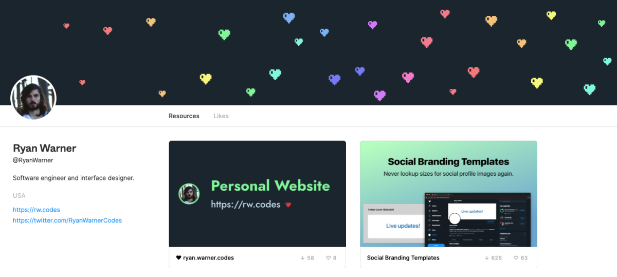
Figma also has a new community feature that allows for Figma files to be published similar to public repos. Check out Ryan’s community page:

Like looking through a GitHub repo, I can check out the files Ryan decided to share with the community: some Social Branding Templates, and the design mocks for his personal site.
Like forking a repo, you can “Duplicate” any community file, and now you can edit your own version however you wish.
The best part? You don’t need to use any commands like with git. It all just works.
Community Resources
Just like Ryan’s Social Branding Templates, there are tons of other free resources open to the community. There’s wireframe kits, Storybook add ons, iPhone mockups, and lots more. Check it out.
Components and Systems
Figma takes a few great ideas from modern web development like components, color variables, text styles, and design systems. Getting the hang of these is so helpful for working on your own or with designers.
Components
In web development we often use components to build larger things from smaller pieces. Those small pieces, like buttons, can be reused throughout the site over and over. If the button needs to be changed, you only need to change it in one place, not in every place it’s used throughout the project.
Figma has components, and it works in much the same way. You can create a button component, and then every clone you make of that button will become a duplicate of the original.

The original is called the “Main” component, and all duplicates become “Instances.” Any changes to the Main affects the instances, but changes to the instances don’t affect the main.
This button component can be nested inside other components, just like how you might build a React or Vue app.
With a few components you can make designing in Figma easier and more consistent.
Color Styles
On the web, it’s common to define colors as variables with SCSS or CSS custom properties. We can do the same in Figma with “Color Styles.”
Text Styles
Text styles in Figma allow you to define typographic properties like for headings, body text, button labels, and whatever else you want. Define the font, weight, size, line height, and kerning.
Learn more about working with styles.
Design System Example
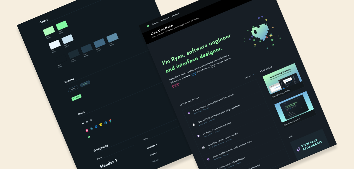
I mentioned that Ryan has shared his personal site’s Figma file with the community, but I didn’t mention that he has a style guide included in it.

Check it out and notice how his style guide helps to inform his site. But as Ryan will tell us, making a style guide isn’t the place you should start.
To Improve Design Skills, Start Small
If you feel like your design skills are limited, Ryan has some great advice.
You don’t need to be a great designer to start visually communicating your ideas. My advice for anyone interested in getting better at design is to open Figma and start putting things on the screen. Don’t worry about it looking good. Don’t worry about your color palette or style guides. Draw some rectangles, type some text, and start externalizing your ideas. The rest will come with time.
Ryan’s right. Just starting with anything is better than nothing. You’ve gotta trot before you gallop.
When starting a design, keep it black and white. It’ll stop you from spending hours picking the perfect shade of blue before you’ve actually designed anything.
Get your ideas on the screen first, then work to add polish to them. The first version will be bad, the second a bit better. You see where I’m going with this.
If you’re interested in design tips for developers let me know and we can cover it specifically in a future issue!
From Comps to Code
As a developer we’re often tasked with turning design comps or layouts into actual HTML and CSS. I asked Ryan what’s the best way to turn Figma designs into code? Does Figma make the design to dev pipeline easier?
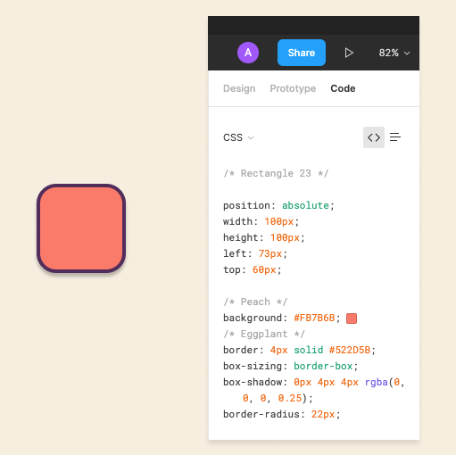
There’s no single best way, but Figma does set us (developers) up for success. Most of the styling tools in Figma map intuitively to CSS. For example, the values for drop shadows map 1-to-1 to CSS box-shadow, x, y, blur, and color. Figma even has a code tab that generates CSS you can copy and paste into your code editor.
The code tab makes going from design mocks to code a lot easier, but there are a couple things to watch out for. Let’s just use this square and its code output as an example.

The positioning values you’re given are often useless unless you’re using some of Figma’s advanced layout features.
I’m using my brand Color Styles on this square, so when I export the code, it adds comments for “Peach” and “Eggplant” above the colors. That helps me swap those out with SCSS variables or something similar when I bring it into my code.
Measuring and Spacing
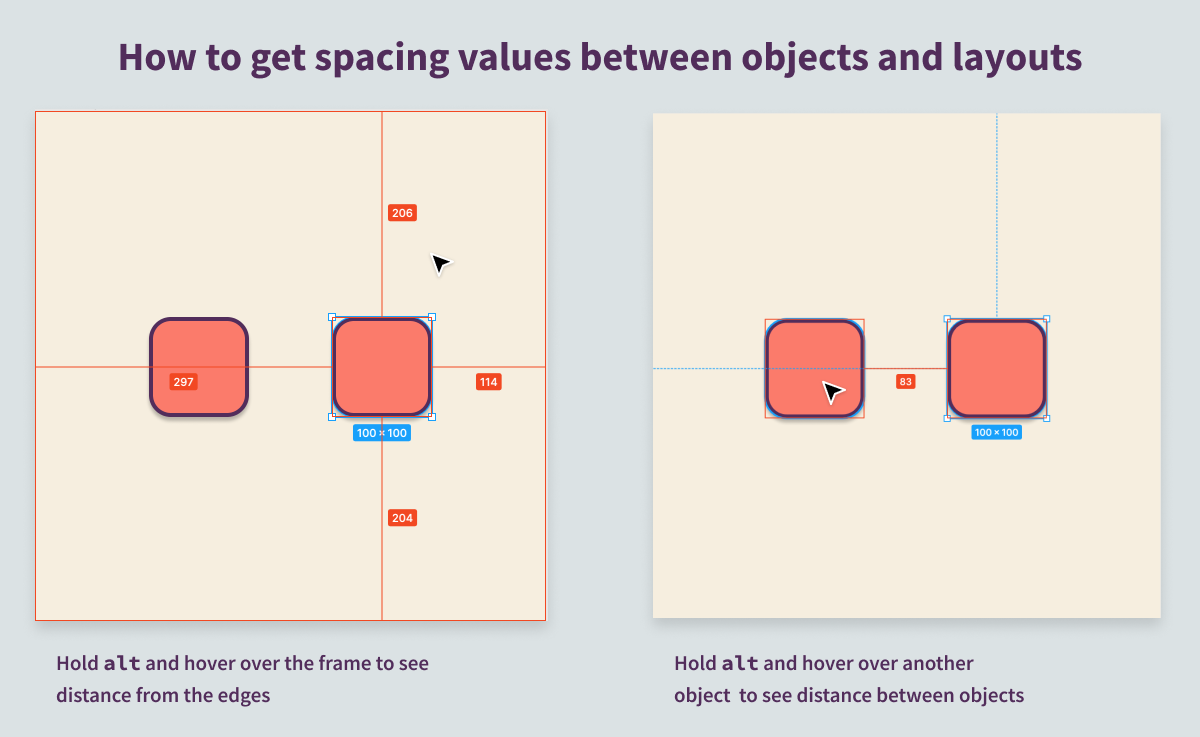
The above CSS is great for styling that individual element, but often you need to know how far components are from one another. With one object selected, hold alt and mouse over other objects to find out how far apart they are. Mousing over the frame shows the distance from the edges.
This one key will help you with a lot of your layout CSS.

Figma provides an excellent Overview of Figma for Developers that goes into a lot of detail.
Resources
If you’re looking to learn more, there’s a ton of great Figma resources out there. I really enjoyed taking this free Figma Design System course and learned a lot of general Figma skills along the way. I’d also read through the already mentioned Overview of Figma for Developers.
So Long, Partner
Well, that’s the end of the trail for this week. I appreciate you riding with me.
Follow @FrontendHorse on Twitter, and if you enjoyed this, I’d be over the moon if you share it with a friend or tweet about it.
Special thanks to Ryan Warner for speaking with us about Figma. Go check out his website and follow him on Twitter.
This is the part where we ride off into the sunset. You take care.
Your Neigh-bor,
Alex