Newsletter • Issue 55
GSAP Plugin Showcase, Astro 1.0, and 3D Range Slider!
Livestream Show!

On Thursday, Ben Holmes of the Astro team is with us to walk us through creating the new Frontend Horse site in Astro 1.0! We’ll learn what’s new in Astro, where it’s headed, and how to build with it.
Thursday, May 5, 12PM EST on Twitch.
GSAP Contest Entries
Last month, GreenSock teamed up with CodeSandbox to put on a creative contest! Each week, contestants had to create something with a different GSAP plugin. I even got to be a judge!
There were many excellent entries, I’m just sharing a few of my favorites here.
 SVG Stroke Animation — r3zv9l.csb.app
Using the DrawSVG plugin, this piece by Christian Alder materializes one layer at a time.
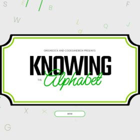
 Knowing the Alphabet — f93upv.sse.codesandbox.io
A wonderful piece by Victor Work that showcases the new GSAP FLIP plugin. Who knew animating the alphabet could be this beautiful?
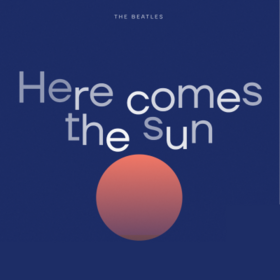
 Here Comes the Sun — lr9qb2.csb.app
Ismael Martínez created a beautiful tribute to the Beatles tune with some great typography and design.
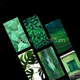
 GSAP Scroll Demo — cpwy8z.csb.app
Another stunner by Victor Work with several dynamic, shifting layouts!
 Firewatch-style Parallax — re4cbu.csb.app
I shared Alistair’s rocky page borders last week, and here we have his SVG parallax landscape. The smooth scroll feels great, but the best part has to be the day/night cycle. Look at those gorgeous colors!
CodePen
I’m a big fan of Jon Kantner’s clever take on common UX elements. This range slider feels like something you’d use in VR to shuffle through options.
Articles
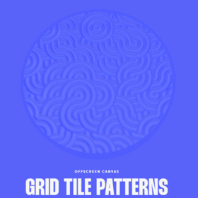
 Grid Tile Patterns — offscreencanvas.com
This newsletter issue from Daniel Velasquez is a beautiful article that introduces you to five different Grid Tile Patterns.
Each has an example, a brief description of the math behind it, and some great resources to get started.
I’m excited to try the Rotating Grids and the Truchet patterns.
Resources
The past few weeks, I’ve shared some wonderful color tools for accessibility, so let’s continue for one more week!
Give this tool a foreground and background color, then it will generate similar colors that are actually accessible for text.
Community Question
Last Week’s Question
What CSS property do you think more folks should know about?
- Caroline shared
line-clamp, which truncates text at a set number of lines. - R. Alex says
color, because of how powerfulcurrentColorcan be. - Ryan says
overscroll-behavior, which helps you capture scroll in modals with just CSS! - Sebastien votes
scrollbar-gutterto avoid layout shifts and even provides an example. - Aleksandr shared
isolation: isolate;, an obscure property that comes in handy for managing z-index. - Jack-Edward says stacked usage of pointer-events.
- Mark says
columnsas an alternative for grid or flex. - Frazer said
display: contents;which allows for passing grid positioning through elements, but presents some accessibility concerns. Still a great property to know about! - And Krzysztof says
@supportsrule.
Do you agree? Did we miss anything? Head over and let us know!
This Week’s Question
[tweet https://twitter.com/FrontendHorse/status/1520444693154353152\]
Head over to Twitter to give your answer and I’ll include it in next week’s issue!
So Long, Partner
That’s all for this week.
Some super cool news: There are now five thousand of you subscribed to this newsletter! Thank you so much for all of the support.
Your neigh-bor,
Alex
