Newsletter • Issue 5
Infinite Scrolling and Slick Animations
Oh, howdy, I didn’t see you there! I was just saddling up to hit the trail. Care to ride with us? There’s a lot to learn in this issue, so I hope you packed a lunch.
This week we’re taking a close look at a beautiful portfolio site menu and a CodePen demo for an impressive carousel library!
Site Showcase
Marvin Schwaibold

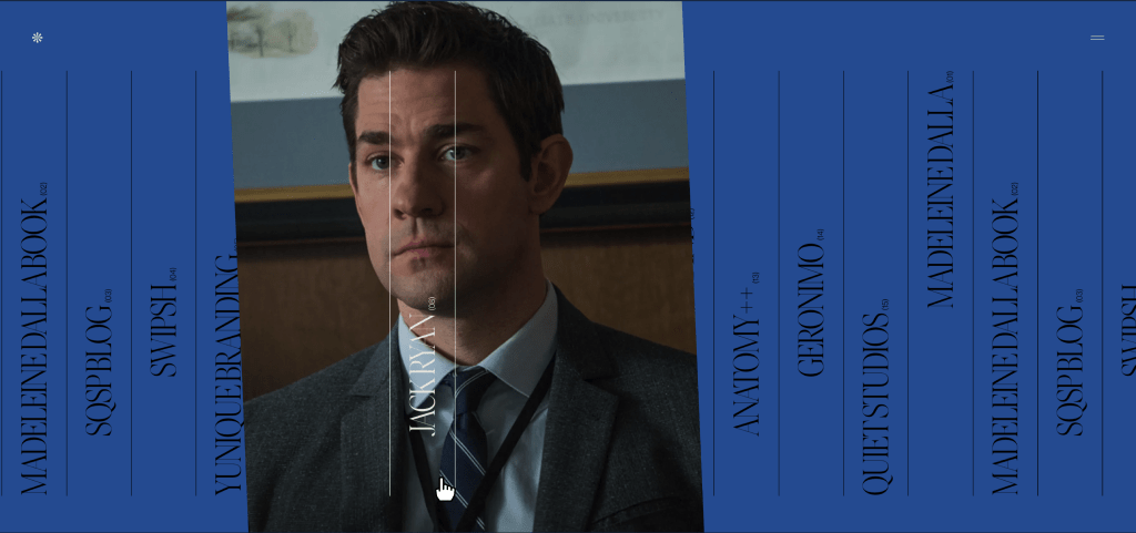
I can’t say enough about the incredible portfolio site of Marvin Schwaibold. I love the font choice and elegant design, the way every element has its own transition when you go to a new page, and the perfect execution.
I spoke with Jesper Vos, the site’s developer, to learn some of his techniques. Jesper was kind enough to show us all the magic that went into making the Projects Page.

Technique: Infinite Scroll
The page seems simple: a list of projects flipped on its side so that as you scroll down, they move from right to left. There are 15 projects on display here, and yet you can scroll forever. The trick here is to double the list to make 30 items. Then, when the user is about to scroll to the end, you instantly snap them back to the start.
It’s hard to wrap your head around, so here’s how you can visualize it. With your dev tools, change the text on one of the items to something noticeable like “HOOOOOOWDY.” Then, start scrolling and notice that at a certain point, it ‘fixes’ itself. Keep scrolling and watch your “HOOOOOOWDY” come right back around.
It’s a great trick you can apply to anything to make it appear infinite. I used it on a couple of CodePens myself!
Technique: Image Layering
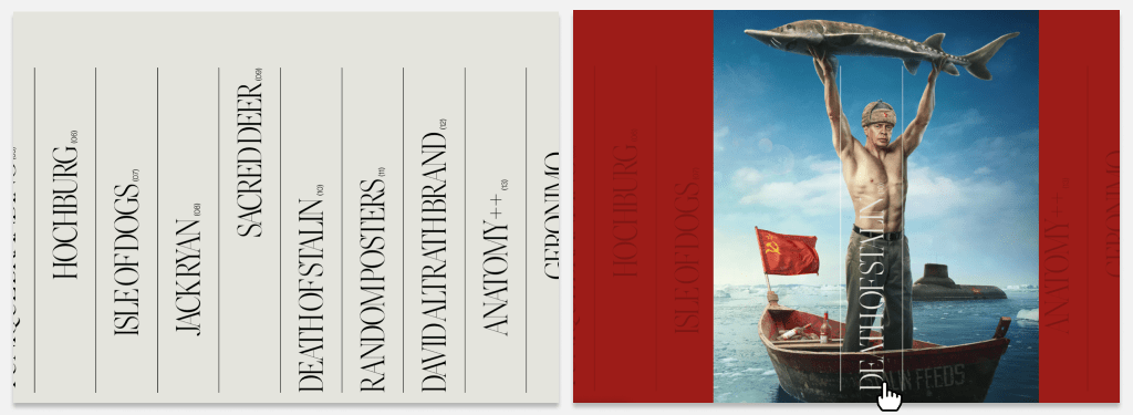
A few changes happen when you hover your mouse over a portfolio piece in the list. Let’s use the portfolio piece “Death of Stalin” as an example.
For one, the background turns red to match the “Death of Stalin” page. That way if you click through, that part of the page transition has already happened.

An image from the movie appears behind the “Death of Stalin” text but in front of the other items. When hovered, the “Death of Stalin” list item gets an active class, which gives it z-index:2;. The corresponding image becomes visible and gets a z-index:1;, and everything else keeps the default z-index of 0. The other items also drop a bit in opacity, letting you focus on the current element.
Technique: Image Physics
My favorite part of this page is the tiny bit of rotation you’ll get on the images based on your mouse’s velocity. Jesper explains that “springy easing gives them that little physical/tactile feeling.” I highly recommend you open your dev tools as you mouse around the page to see the transforms taking place in real-time.
The site was developed by Jesper Vos, designed by @MSchwaibold and motion by @YaelBienenstock. This same team won the Awwwards Site of the Month for March 2020 for their work on Madeleine Dalla. That’s another must-see site with impeccable design and animations!
The entire site has wonderful page-transitions on the images and text. If you’re interested in learning that technique, this Codrops article seems like a great place to start.
Codepen
Mustache Guy
This CodePen by We The Collective is a fun demo to show off their new carousel library. Since Carousels & Horses go together like Peanut Butter & Jelly, we just had to check it out.

I’ve gotta start with the excellent illustrations. The hairstyle slideshow feels like looking through old photos of your dad over the decades.
“It was the 60’s!” “There’s no excuse, Dad. No excuse.”
The illustrator, Ariel Hitchcock, did a fantastic job, especially on the hover-state illustrations. I recommend hovering over each Mustache Guy to find his hidden attire.
The Mustache Guys are all SVG, brought to life with CSS animations. The carousel uses their new library, wtc-controller-carousel, as well as another of their packages, wtc-tween. I reached out to Liam of We the Collective to discover why his team decided to write their own carousel library.
The carousel library is meant to fill a really specific requirement, which is to have a responsive, infinite carousel of elements. There are other libraries that can accomplish this, but they clock in at huge file sizes. We built this library because we’d been doing this from scratch over and over again. We also have a number of other libraries that we built to do different things (like galleries) that are lean, simple-to-use, and fully accessible.
I couldn’t agree more with his reason to make a library. My hatred for doing the same task, again and again, is the entire reason I picked up programming. His team has done the same thing multiple times, so now they save time and we all benefit from it being open sourced.
One of my favorite parts of the pen is when you click the “Accelerate” button. The carousel starts speeding up until it’s a blur, while the sides shrink down. It then switches to one Mustache Guy at a time, and the whole effect is so good, I had to know how it worked.
This library has a property called
speed, which alters the speed at which it runs. We just tween that from the base speed to the speed at which this slideshow effect would happen while at the same time tweening down the width to a single element.
For the tweening, the developer, Marlon Marcello, is using another custom library, wtc-tween. There’s something to be said for having your own libraries to suit your specific needs!
Check out this CodePen and then take their carousel library for a spin.
Around the Campfire
I’d like to start ropin’ in conversations from other parts of town. Cause at the end of the day, there’s nothin’ nicer than a warm, friendly community.
Let it be known that this is now canon. If Frontend Horse becomes a podcast, it’ll be voiced by Sam Elliott.
I’ll be on the lookout for more tweets to rope in next week. Just give a holler @FrontendHorse, and I’ll hear it.
So Long, Partner
Well, that’s the end of the trail for this week. I appreciate you riding with me.
Follow @FrontendHorse on Twitter, and if you enjoyed this, I’d be over the moon if you share it with a friend or tweet about it.
Special thanks to Jesper Vos and Liam Egan for speaking with me about their work.
This is the part where we ride off into the sunset. You take care.
Your Neigh-bor,
Alex
