Newsletter • Issue 18
CSS Grid Can Do That??
Howdy partner, and welcome to the trail! This week we’re looking at some CSS Grid pieces you might not have thought possible! Our friend Andy Barefoot makes gorgeous and responsive layouts by utilizing a few clever CSS Grid techniques.
When everyone is going for a standard ‘card’ layout, it’s refreshing to see designs that are otherwise saved for print or other mediums. Making a design interesting and responsive is possible, and Andy’s work shows us how.

In these first two pieces he’s using a great technique to get the stagger effect. He makes items span across two columns, then every other row starts in the second column. We break it all down with animated demos in the article.
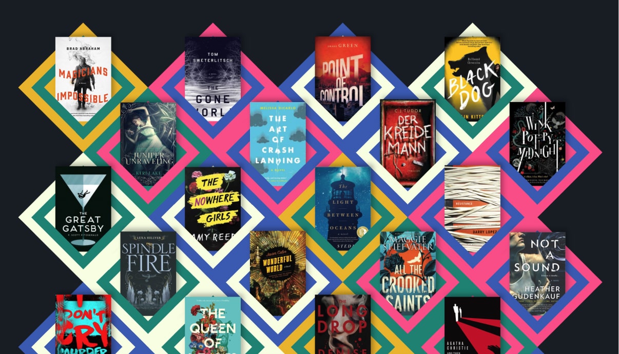
We also break down how Andy made this great website layout by skewing the grid and creating transparent ‘holes’ that reveal the image beneath.

Read on to learn the techniques of Andy Barefoot.
And for you lovely subscribers, here’s two pieces I didn’t fit into the article but really wanted to show you. They use similar CSS Grid techniques to what we cover in the article.


Hopefully you’re inspired to hop in the saddle and try out some of these tricks!
Continue ReadingUntil Next Time
Thanks for hitting the trail with us! Special thanks to Andy Barefoot for speaking with us about his work! Go check out his CodePens and follow him on Twitter.
Follow @FrontendHorse on Twitter, and if you enjoyed this, I’d be over the moon if you share it with a friend or tweet about it.
This is the part where we ride off into the sunset. You take care.
Your Neigh-bor,
Alex