Thinking Outside the Box with CSS Grid
Featuring Andy Barefoot
The support of CSS Grid in modern browsers has opened up layout possibilities like never before. We can create more complex designs with fewer elements than we could with Flexbox alone. But when you think of CSS Grid, you generally think of a boxy layout, right?
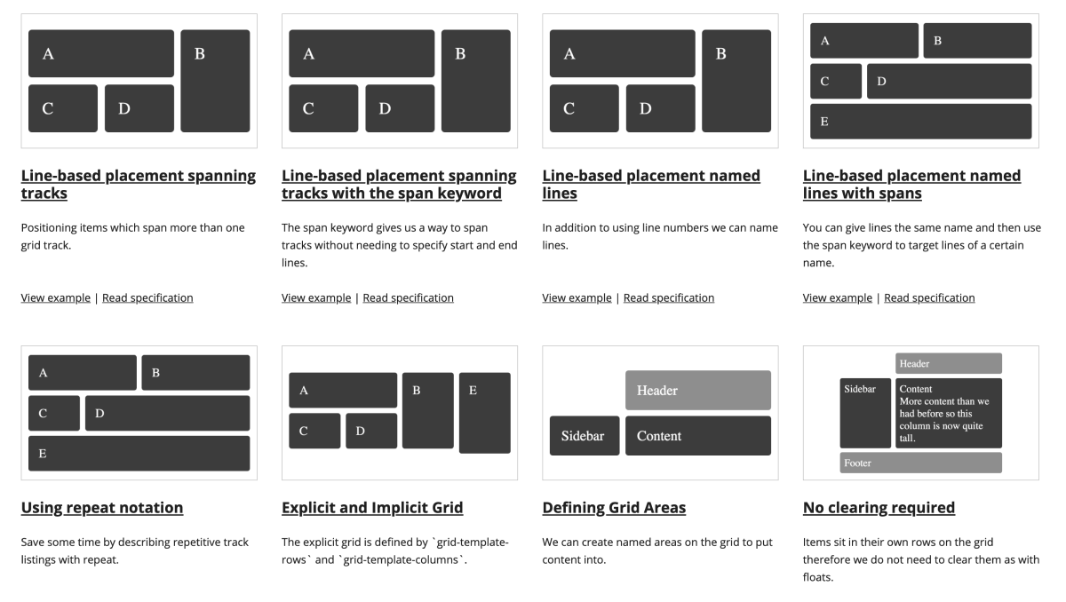
Some of the layouts on Rachel Andrew’s excellent Grid by Example.
Andy Barefoot creates gorgeous and responsive layouts that feel so different from your typical web design, and he uses CSS Grid to do it. He’s pushing the medium further, and I hope designers and developers are inspired to design and code the sites you didn’t think were possible.
Responsive Book Grid
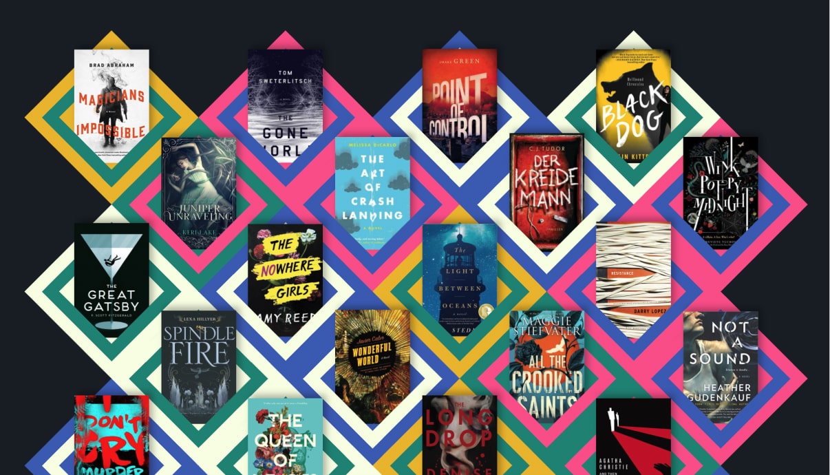
Before we get into the technical aspects of this pen, I want to pause and appreciate this piece’s brilliant design. The shapes and color combinations are excellent, and he’s chosen some gorgeous book covers that add to the quality feel.
Here’s the actual pen in action.
We’ll break down these techniques:
- How he sets up the grid
- How he fits the diamonds together
- How he makes the diamond shapes
Setting up the Grid
First look at the minimal HTML that we’re working with. Andy gets a lot done with very few DOM elements.
<ul>
  <li>
    <img src="/book01.jpg" alt="" />
  </li>
  <li>
    <img src="/book02.jpg" alt="" />
  </li>
  <!-- Repeat ~70 times   -->
</ul>
Let’s touch on the CSS properties that set up the grid, along with one of the seven media queries that make it responsive.
/*
 Set default number of columns for smallest viewport.
 3 columns = 1 item per row
 */
:root {
  --columns: 3;
}

/* Make equally sized columns based off --columns variable */
ul {
  grid-template-columns: repeat(var(--columns), 1fr);
}

/* Each list item spans 2 columns */
li {
  grid-column-end: span 2;
}

/*
  This is what staggers every other row to the right.
  Default is 2n, or every other for very small screens.
 */
li:nth-child(2n) {
  grid-column-start: 2;
}

/*
  The media query for 4 items per row.
*/
@media (min-width: 1200px) {
  :root {
    --columns: 9;
  }
  li:nth-child(6n-2) {
    grid-column-start: auto;
  }
  li:nth-child(8n-3) {
    grid-column-start: 2;
  }
}
The media query makes the first item of all even rows begin in the second column. That give us something like this.
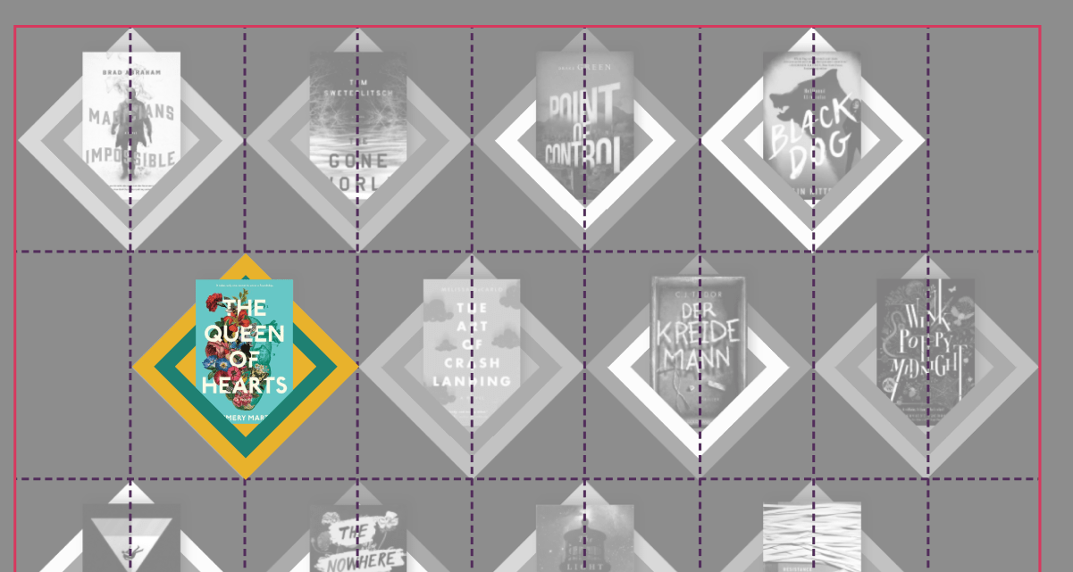
Here the grid’s boundaries are shown in red, and each column and row represented with a dotted line. Next, we’ll see how he brings the diamonds together.
Fitting the Shapes together
So we see how the grid is set up, but how does he fit them perfectly together like this?
Two steps:
- Shift every other row so that it starts in the second column with
grid-column-start: 2. - Set
margin-top: -50%on all list items to move them up by half their height.
Here’s a demo to see it in action.
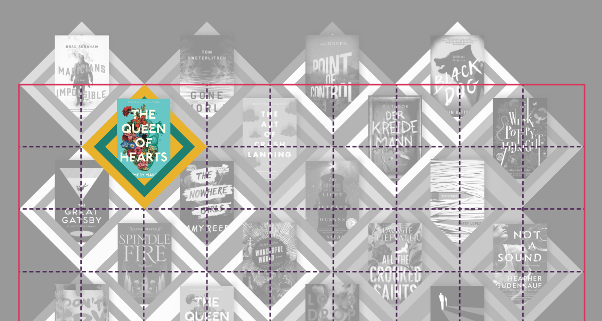
You can see how Andy takes the grid of diamonds and shifts them to fit snugly together. The white dotted line outlines each grid item, so you can see how they overlap one another.
Making the Shapes
Now that we know how Andy’s arranging the shapes let’s talk about how he’s creating them. He’s making the shape behind the book with the li:before pseudo element, and the V shape at the bottom with the li:after element. Hover over this demo to separate the pieces.
Andy’s making each shape with a clip-path, which means he doesn’t need to worry about any transforms like rotation. Then he’s doing this great trick where you can apply two backgrounds to the same element.
background-size: 50% 100%;
background-position: left, right;
The first value of background-size sets the width to half of the shape. Then by using background-position: left, right; he’s creating two backgrounds, each pinned to a side. The order matters here, as it corresponds to the order of the background-image property:
background-image: linear-gradient(45deg, var(--pink) 40%, var(--green) 40%),
  linear-gradient(-45deg, var(--pink) 40%, var(--green) 40%);
Andy learned the technique by digging into the code of one of Lynn Fisher’s excellent Single Div pieces. It’s also what gave him the inspiration for the design.
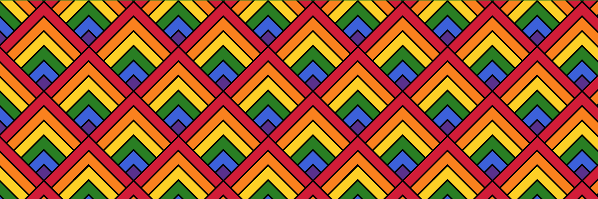
A pattern created by Lynn Fisher with A Single Div.
Isometric Shoe Display
Someone else might make a joke about a man named Barefoot making a gallery of shoes, but I’m far too mature for puns.
Once again, Andy comes up with a brilliant way to display products on the web.
The cubes might make it difficult to tell how he’s pulling this one off, so let’s add some borders to the elements.
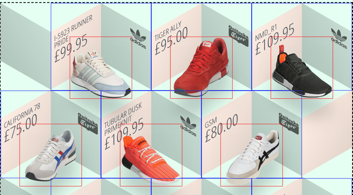
Here I’ve placed a black dashed border around the grid, a blue line around each list item, and a red border around the image inside that list item. You can see Andy’s using the technique where every other column gets shifted to the right, creating the same staggering effect we saw with the books. Here he’s also shifting the shoe images down with absolute positioning and a CSS transform.
What really sells this piece is the background image he’s using to create the cubes.
It repeats along with the number of columns thanks to this line of CSS.
background-size: calc(200% / (var(--columns)));--columns is set with media queries just like with the grid of books from before.
Here’s Andy on creating the shapes with some nice touches:
I created the image in Affinity Designer using a 30 degree triangular grid. The diamonds have a slight colour gradient applied across the short diagonal so that the colour is a little darker in the “corners” to make the 3D effect pop a bit more.
Then he optimized it with SVGOMG and made it a CSS background with Mike Foskett’s converter. Two great resources that deserve a spot in your bookmarks folder.
Masked Portrait Grid
Andy’s personal website is one of my favorite developer portfolios. Instead of the typical move of stacking the desktop design for mobile, the site has three different versions: desktop, tablet, and mobile.
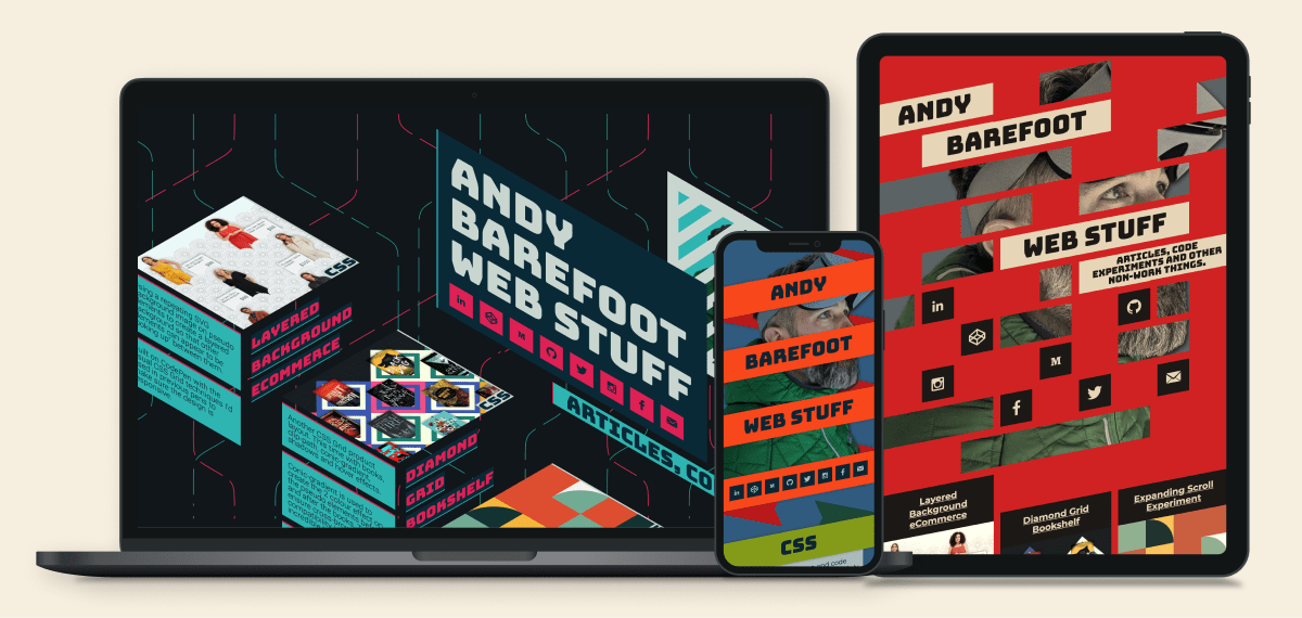
The three layouts of AndyBarefoot.com. Each one is built with CSS Grid.
I especially love the design of the tablet version, so let’s focus on how he created that one.
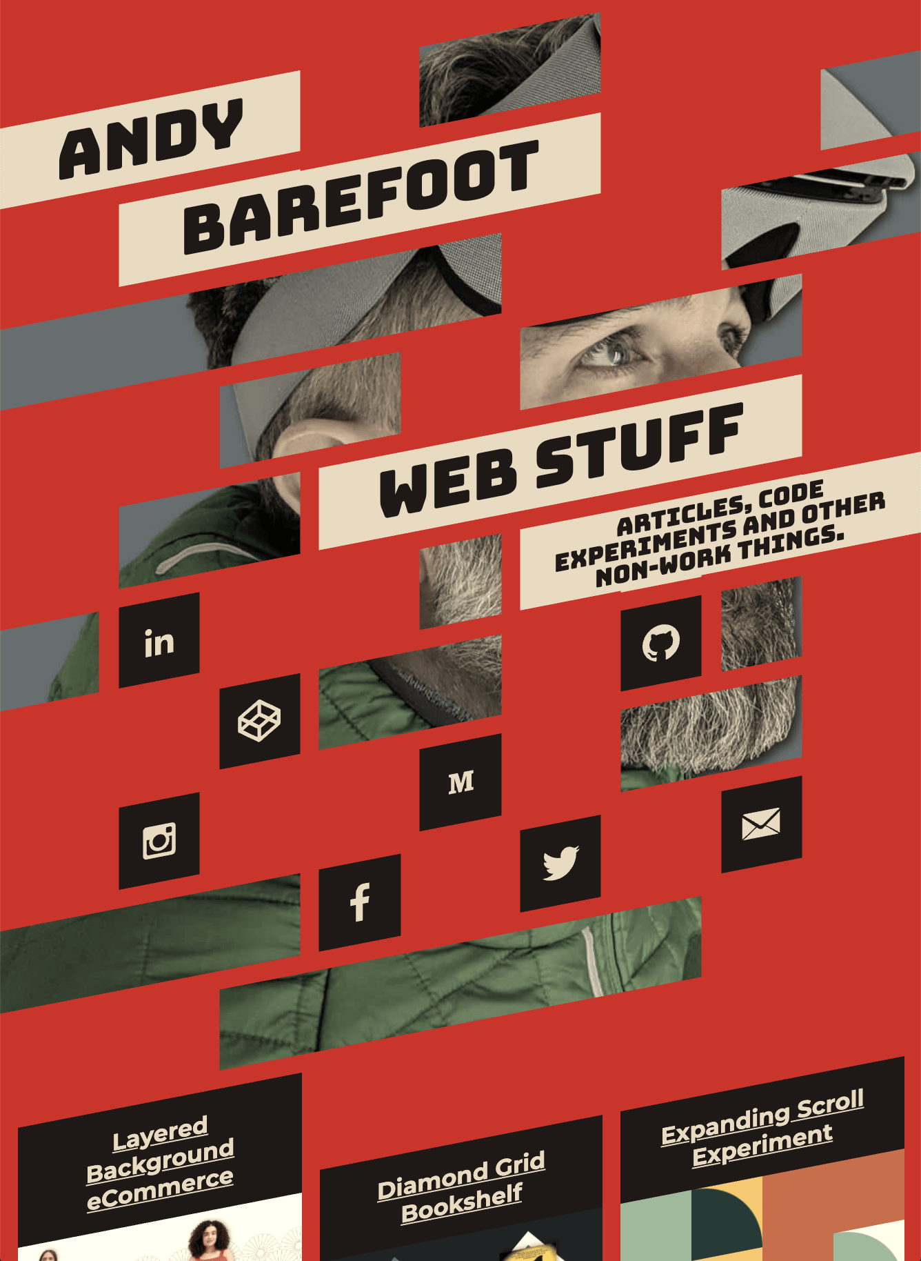
Here’s an animated breakdown of the steps that go into this awesome layout. The white dotted lines are the boundaries for each li in the piece. This is just a rough recreation to show you the general techniques. Dig through Andy’s site at ‘tablet’ sizes for the real deal.
The ‘steps’ for the above breakdown:
- Tint the image with
filter: sepia(40%); - Create a grid on top of the image with red elements
- Skew the grid
-11degand shift it up - Add
gapso there’s space between the items - Start placing transparent items that span multiple columns
- Place items that contain Andy’s name and span multiple columns
- Add a
box-shadowto each element to fill in thegap
Andy’s using vw for every unit to make sure it’s responsive, and his eyes are always framed perfectly through that hole in the grid.
Once again, we have to talk about the great design of this piece. Here’s Andy on the inspiration for the design.
Aesthetically I started off going for something like the old Soviet propaganda posters with the red and cream colours and the sepia filter on all the images. With my face behind the mask striking a heroic pose like a soviet hero fresh from toiling in the CSS mines. Or something.
Ah yes, the old Hammer and CSSickle. It’s great inspiration and a great end result.
Wrap Up
We checked out three awesome pieces that all use CSS Grid in novel ways. By staggering the starting column, or skewing the entire grid, you can get some pretty fantastic results. I’m excited to see the new ways developers utilize CSS Grid as it gets implemented on more and more production sites.
Thanks so much to Andy Barefoot for speaking with me and letting me dig into his incredible work. Spend some time digging through his great CodePen demos, check out his brilliant website, and follow him on Twitter.