The Linear Look
There’s one style that seems to be taking over the tech SaaS world, and it’s the one popularized by Linear’s homepage.
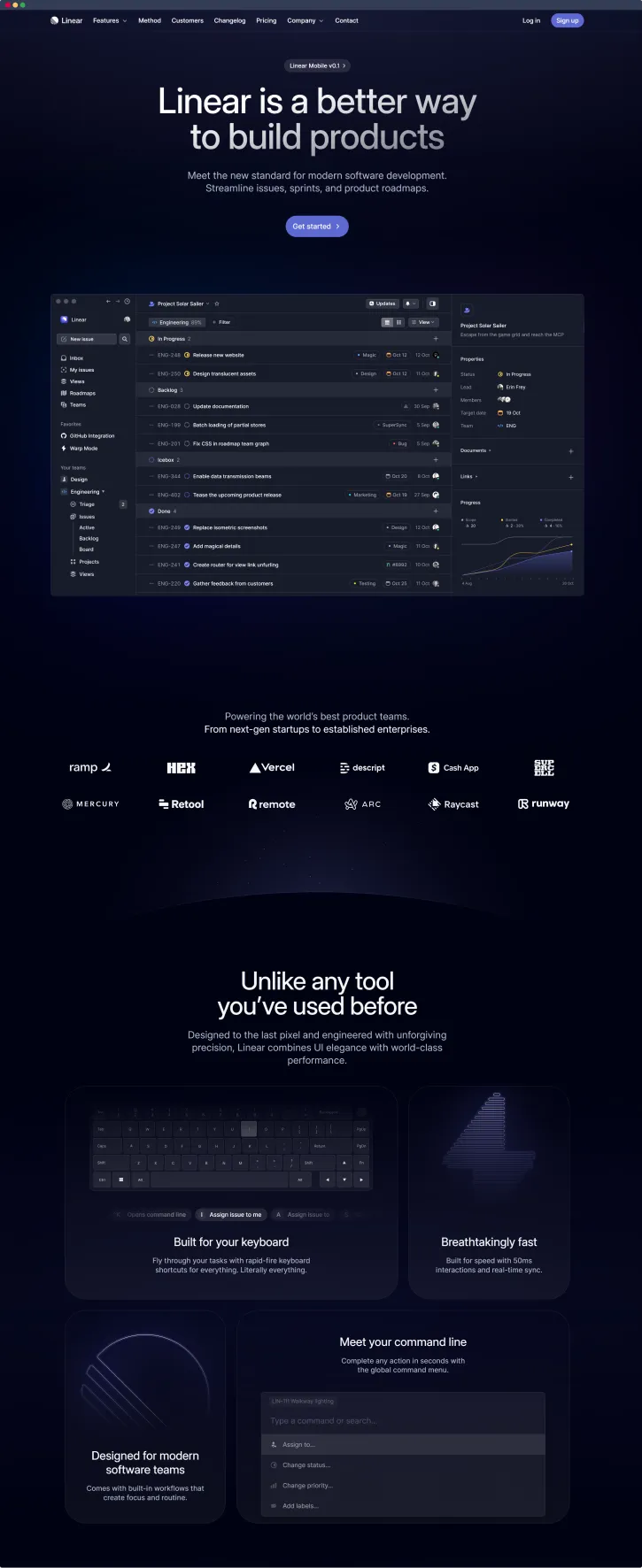
Dozens of sites have put their own spin on it and now it’s a certified trend.
This post is my attempt to identify the main ingredients for this dish as well as catalogue the companies who have cooked up their own versions. I’ll also share my list of sites I’ve found that follow the trend.
The Ingredients
These are the elements that appeared on enough examples to become part of the trend.
Dark backgrounds
Just about all of these examples have a dark background so that the lighting effects really stand out.
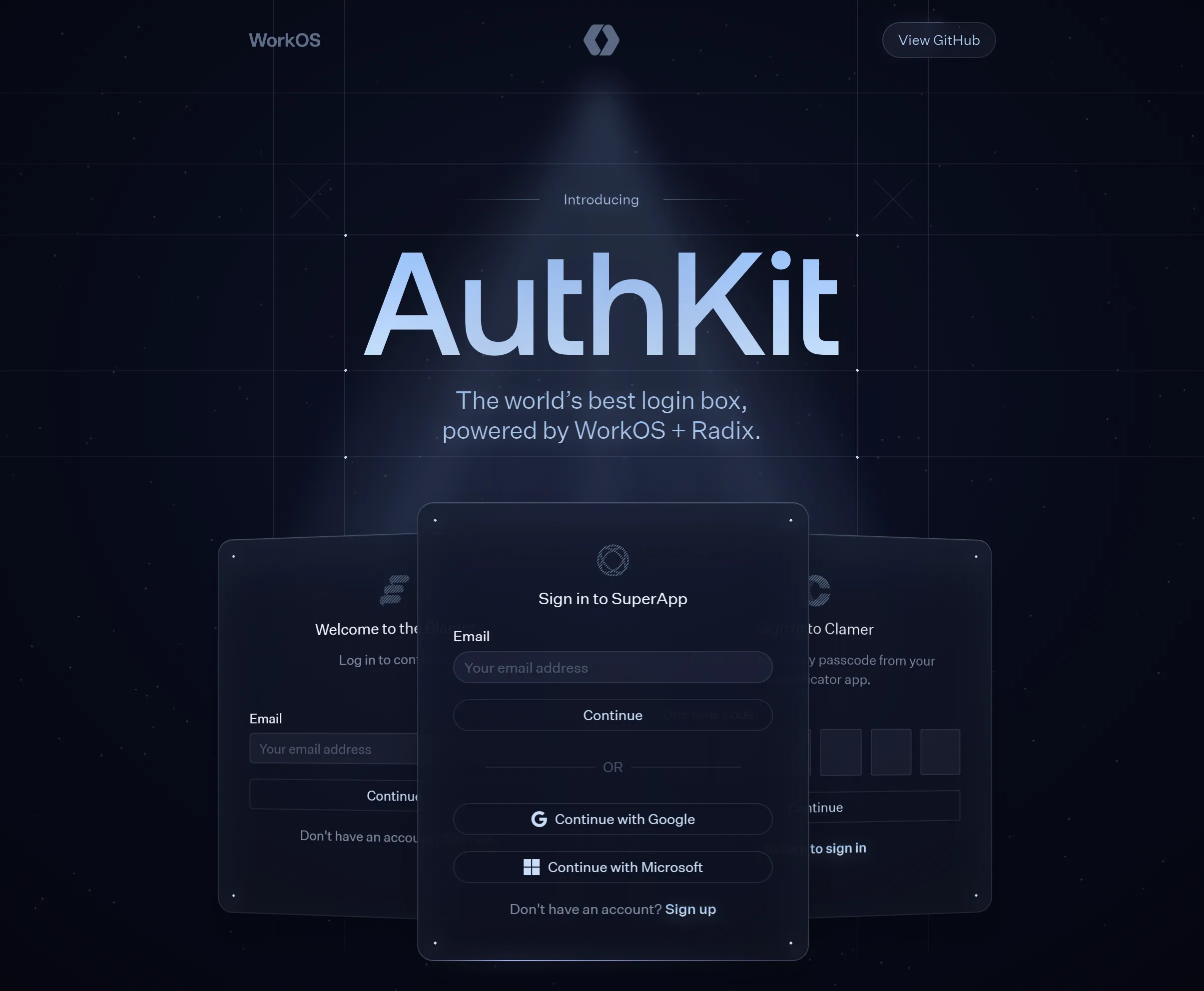 AuthKit
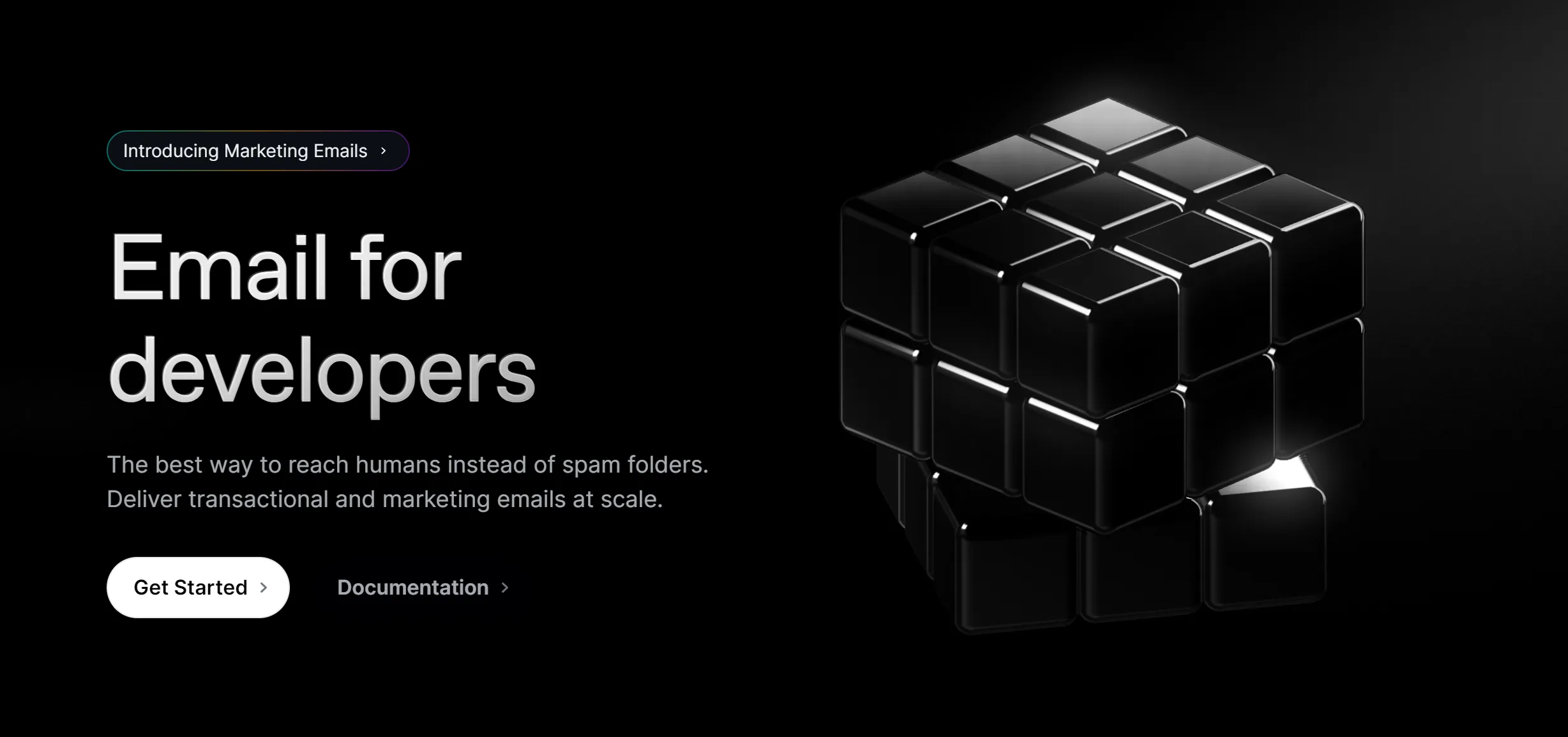 Resend
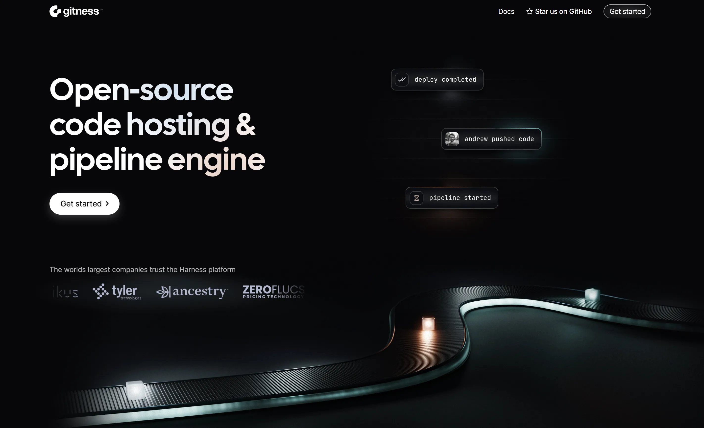 Gitness
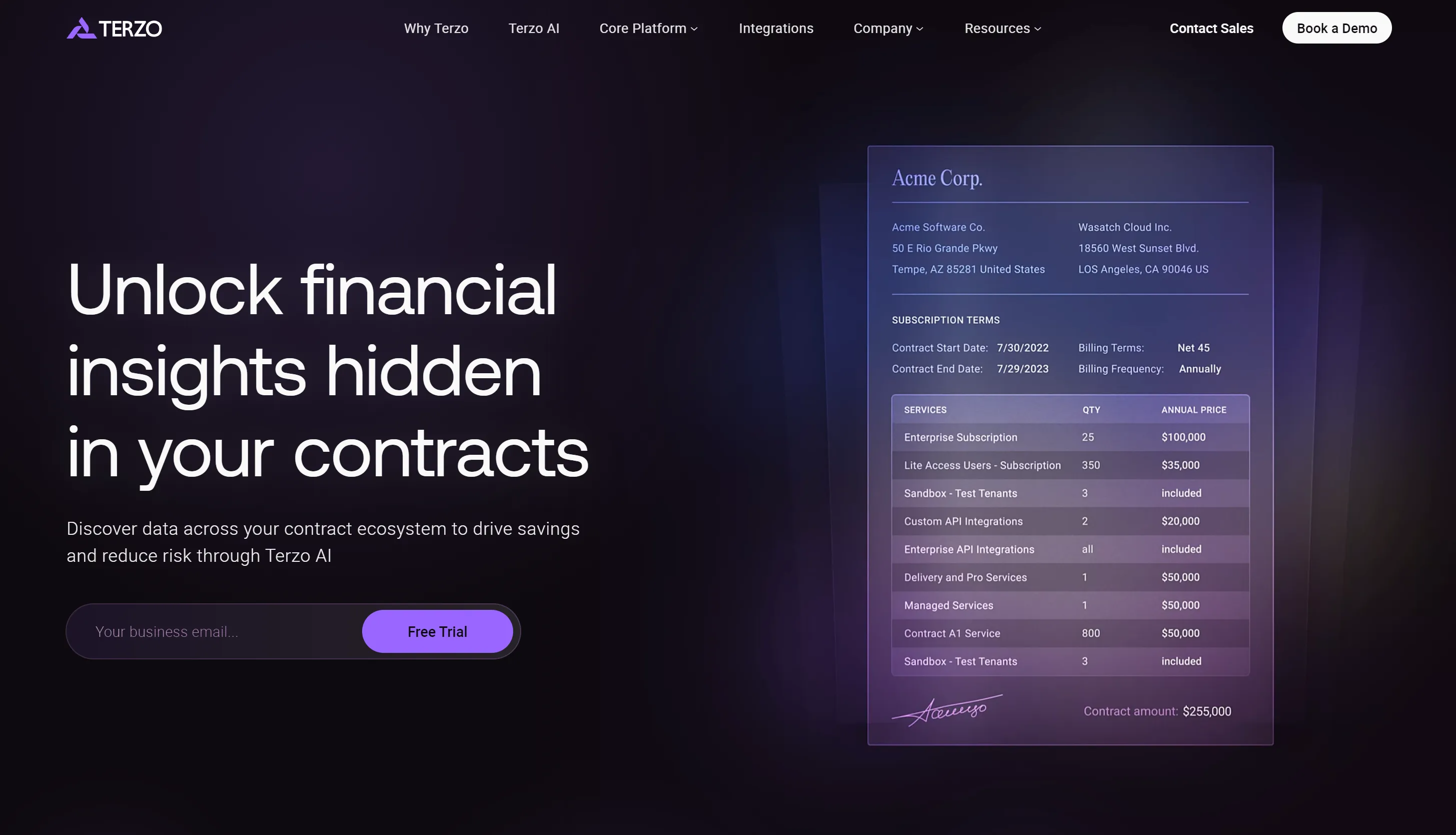 Terzo
Terzo
Colorful blurry glows
To add a bit of interest, these sites have little spills of color everywhere.
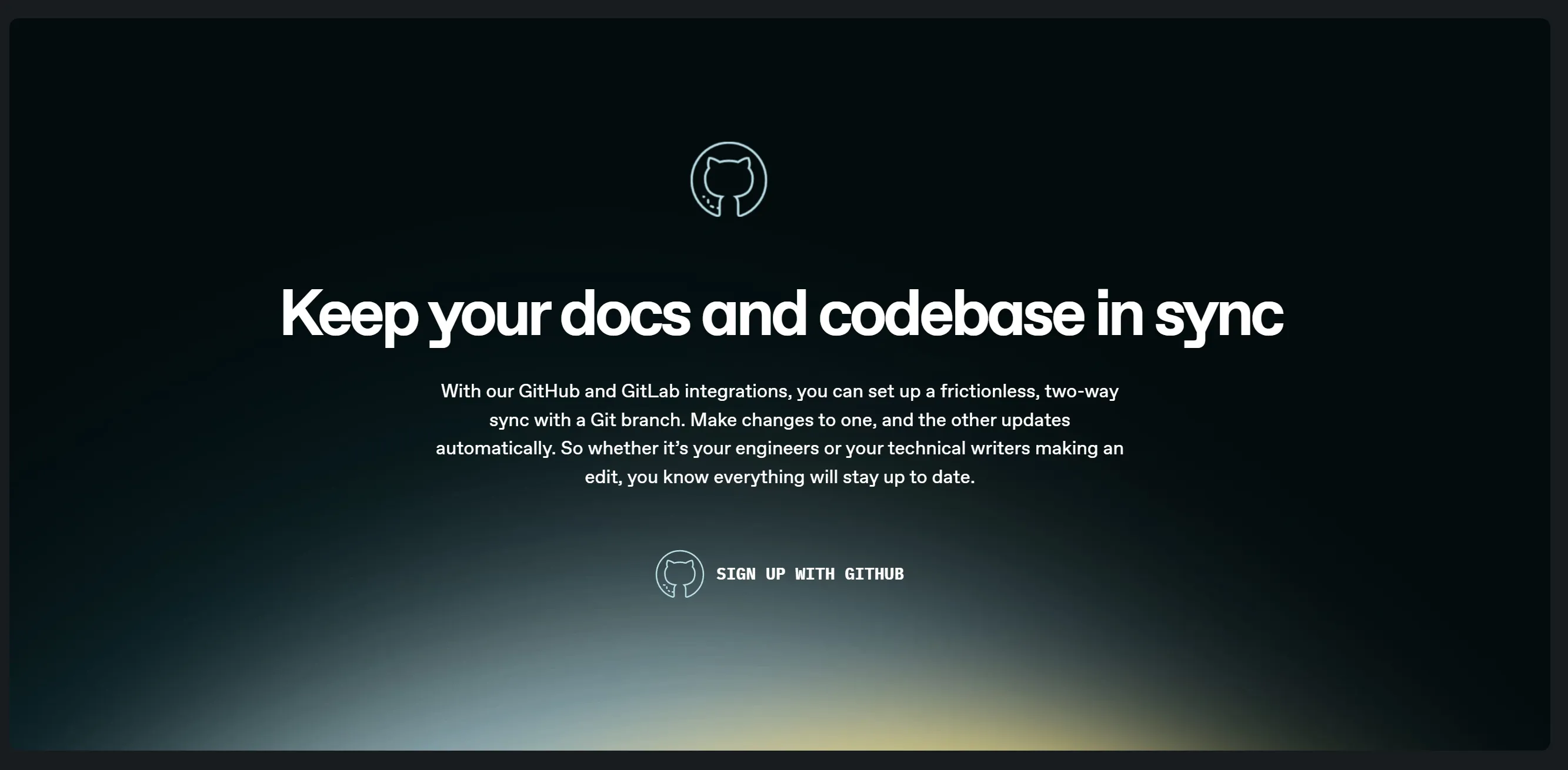 Gitbook
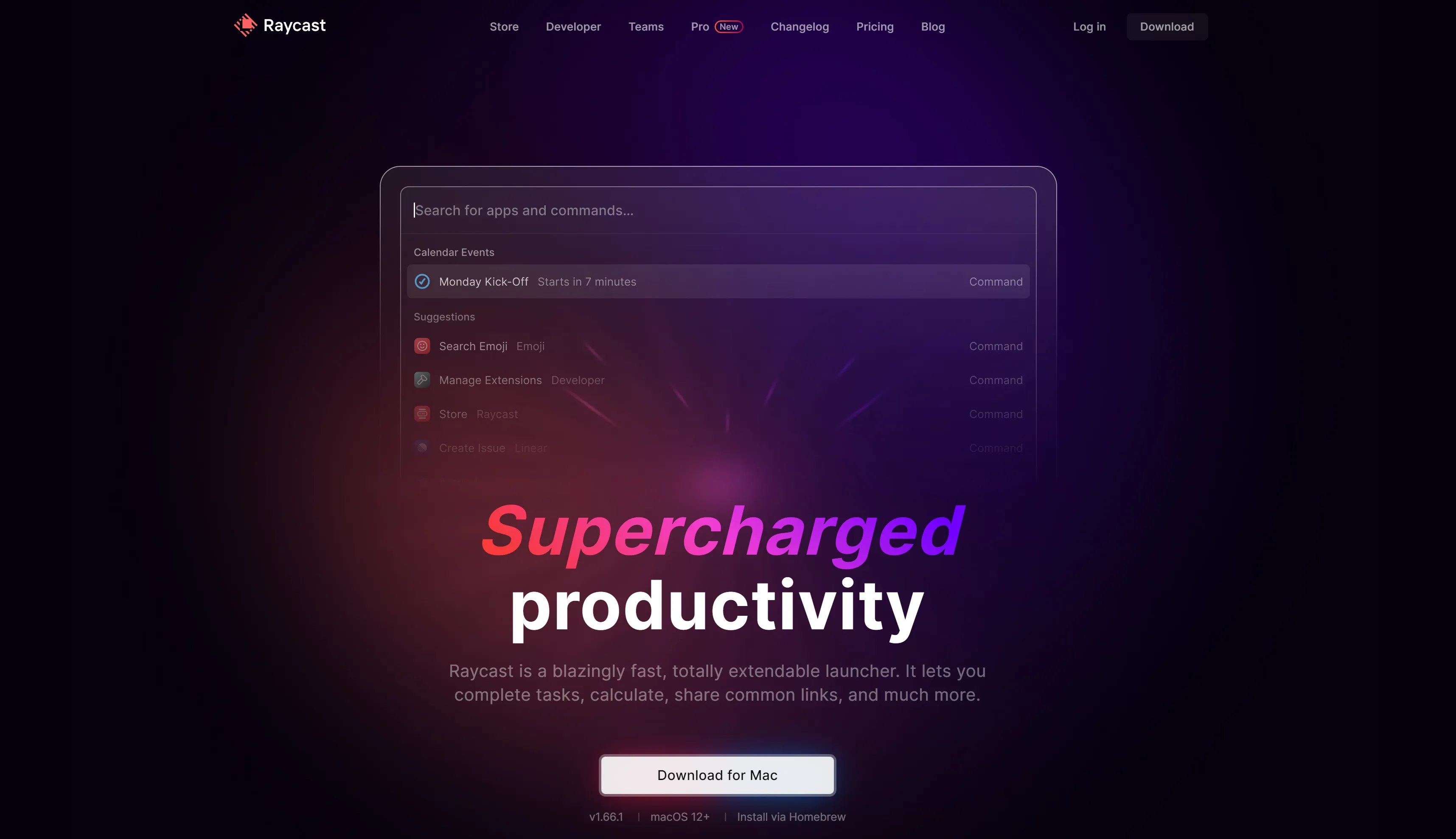 Raycast
Bento box grids
This one started on Apple’s marketing pages a few years ago, and it’s become a staple of the Linear Look.
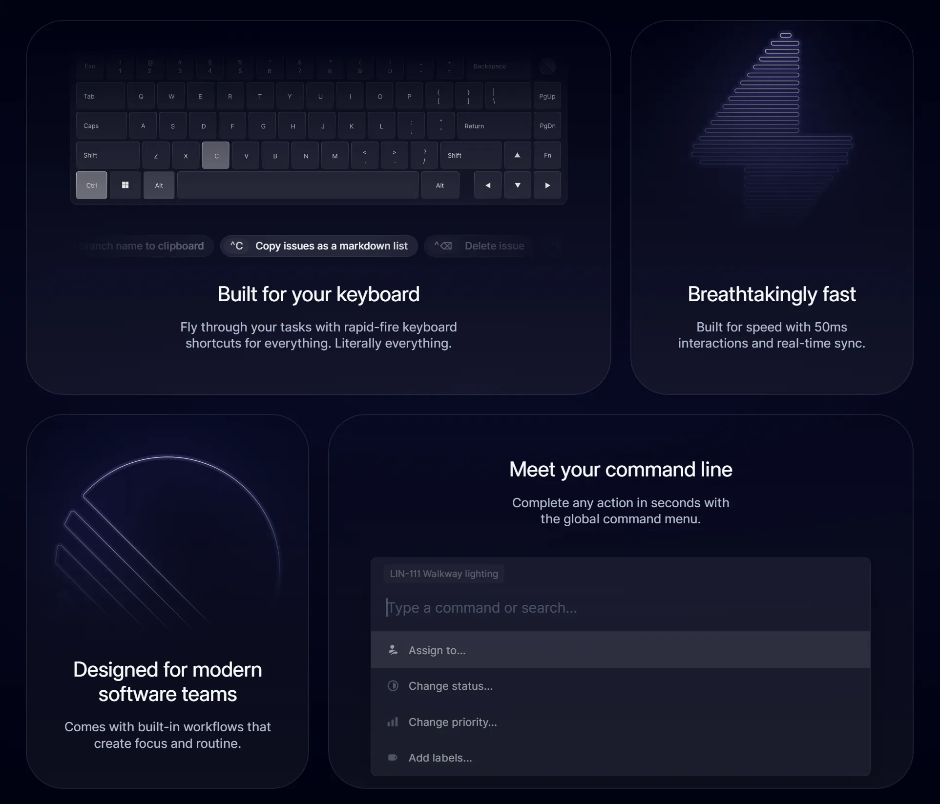 Linear
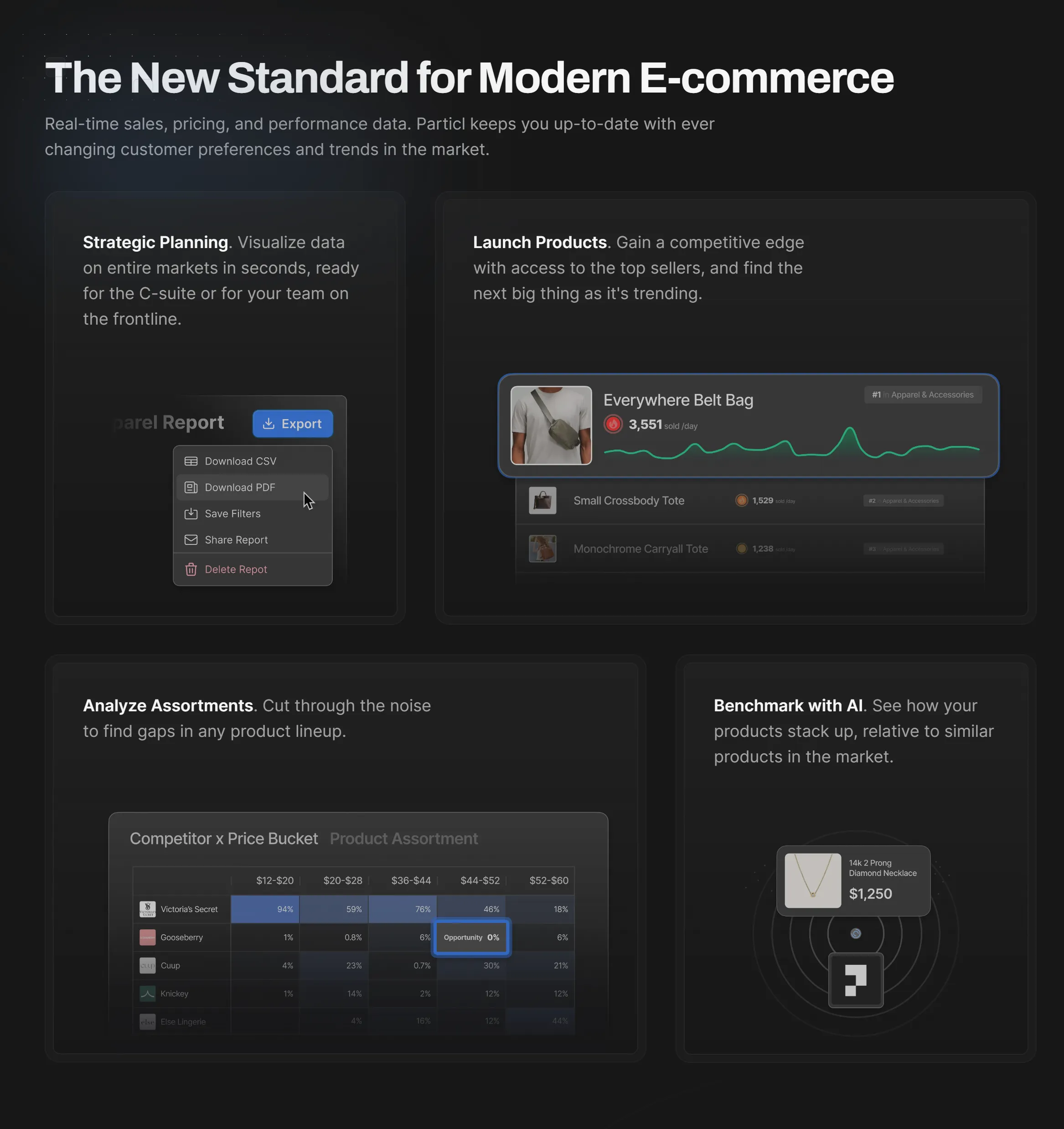 Particl
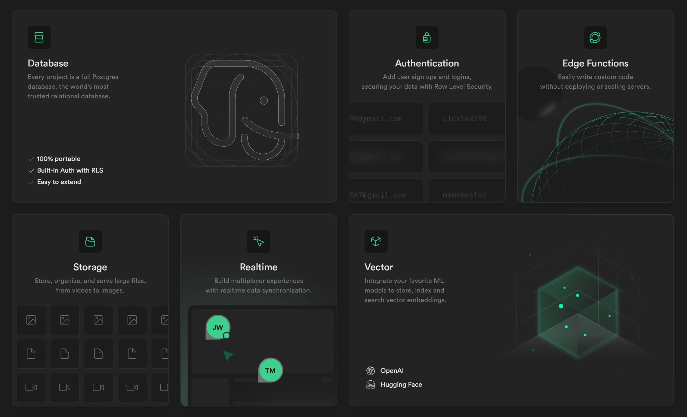 Supabase
Screenshots instead of photos
You’d be hard-pressed to find a stock photograph or flat illustration of a person on any of these sites.
Instead we see stylized product UIs, code snippets, and gorgeous vector illustrations.
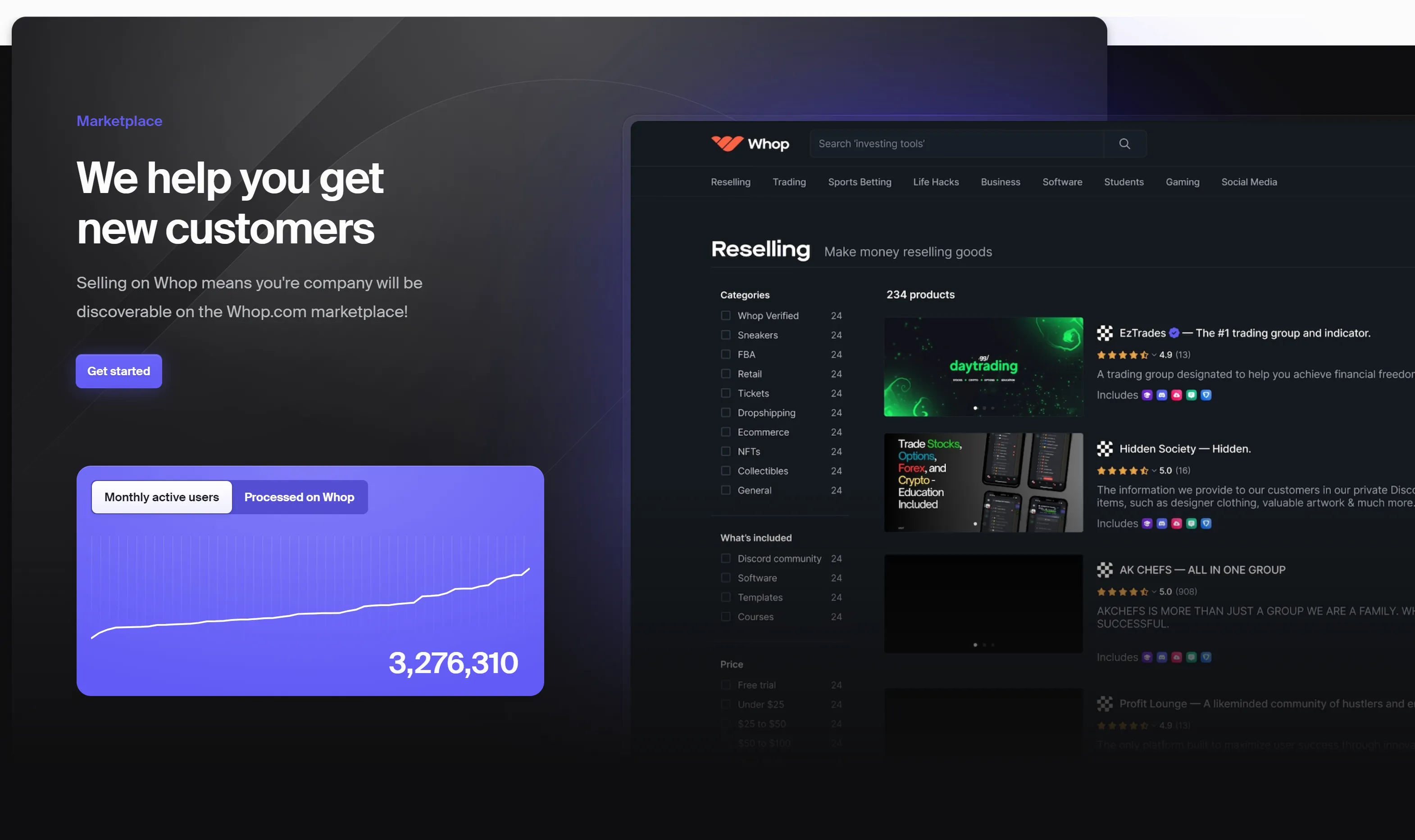 Whop
Whop
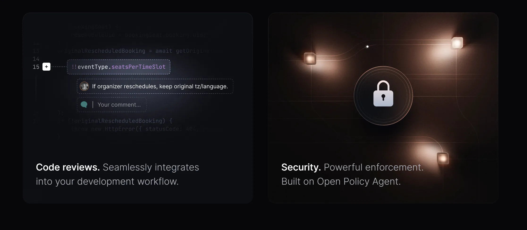 Gitness
Super thin lines
This style has a lot of SVG lines and borders on divs, and they’re all super thin and sleek.
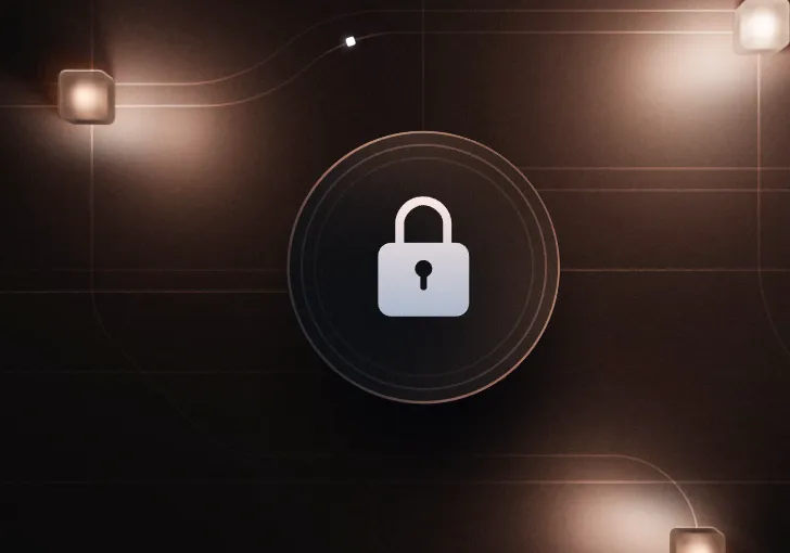 Gitness
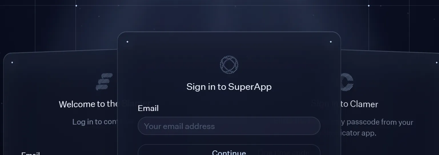 AuthKit
Circuitry style graphics
While sites like AuthKit create entire circut boards on their site, they’re not the only site to feature circuit-style lines.
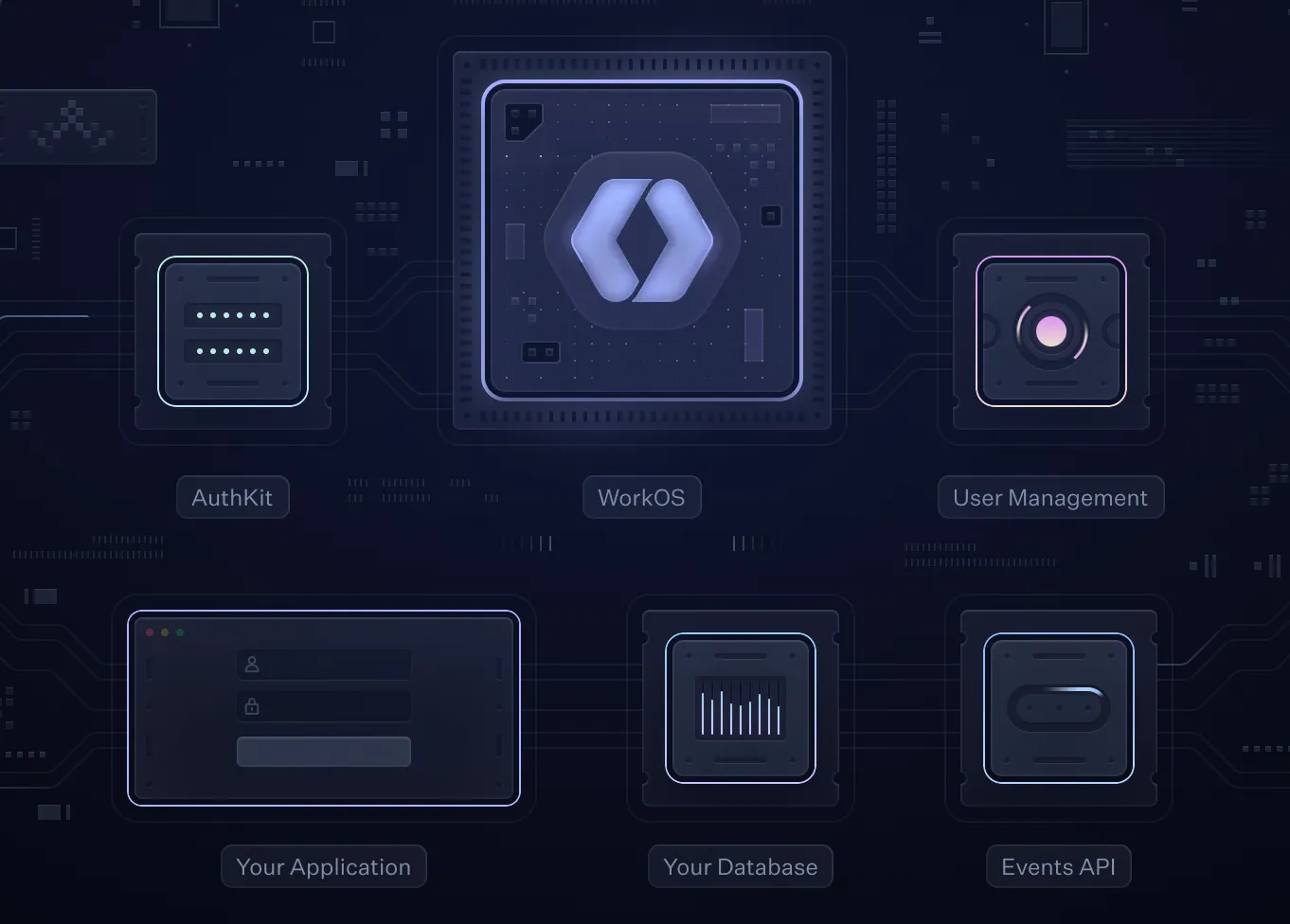 AuthKit
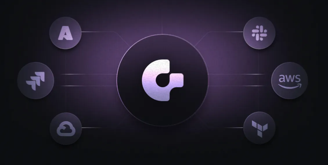 Gitness
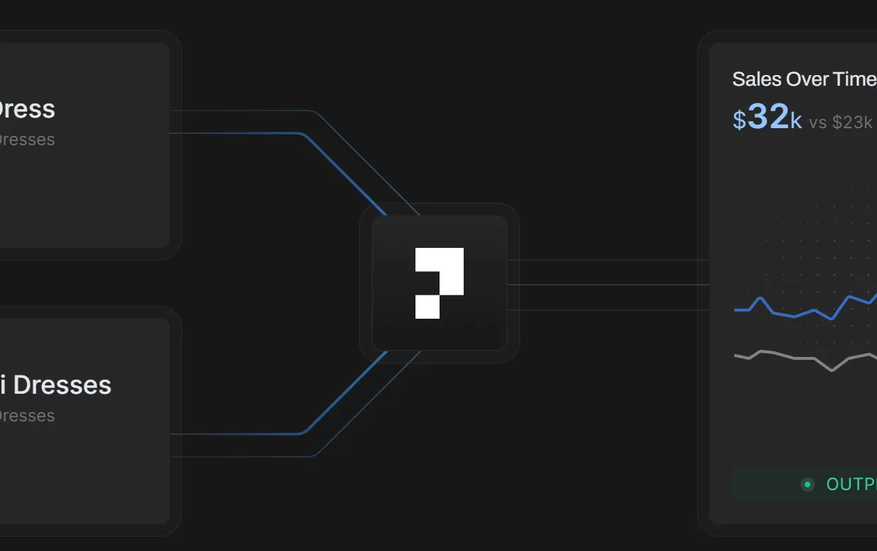 Particl
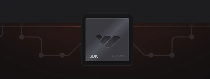 Whop
Whop
Grid background patterns
Grid patterns add a sense of structure and order to the designs, and I like sites like Raycast use them subtly.
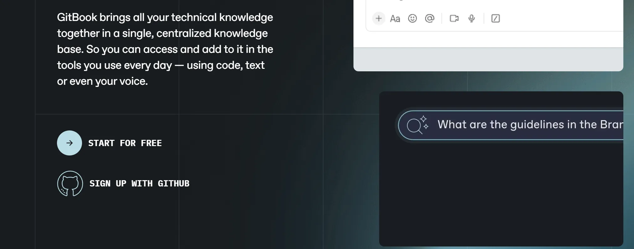 Gitbook
 Particl
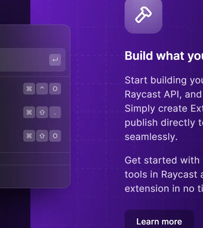 Raycast
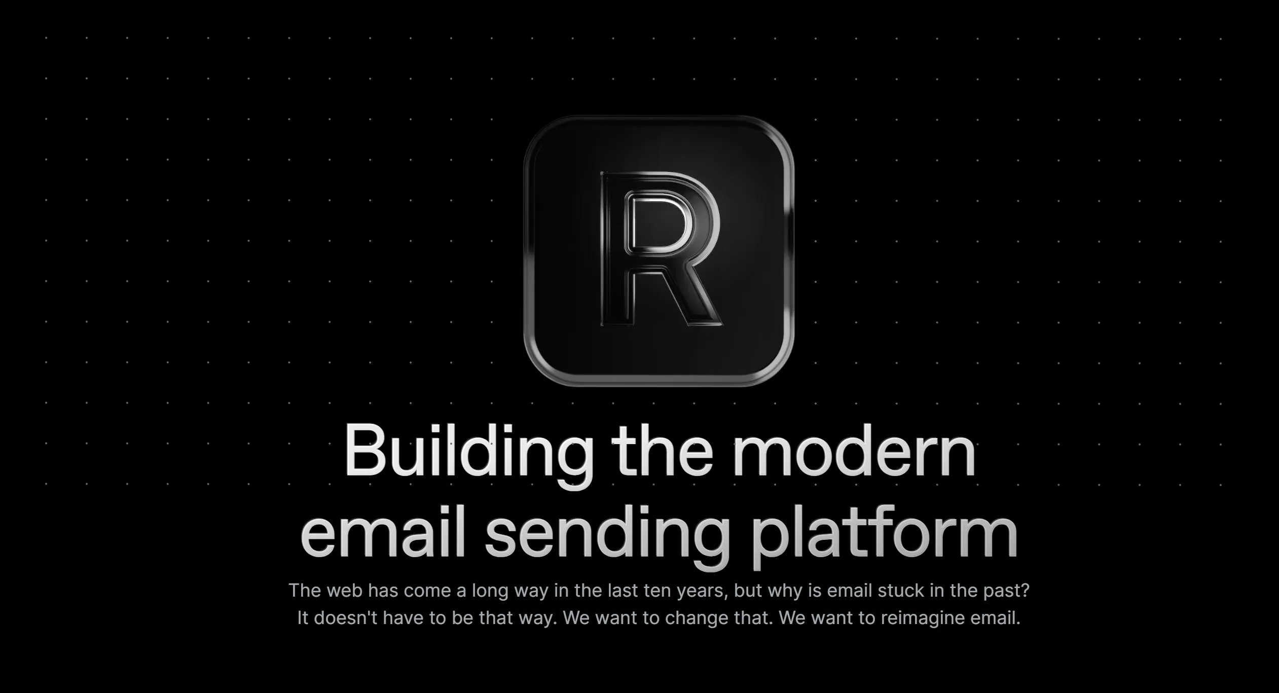 Resend
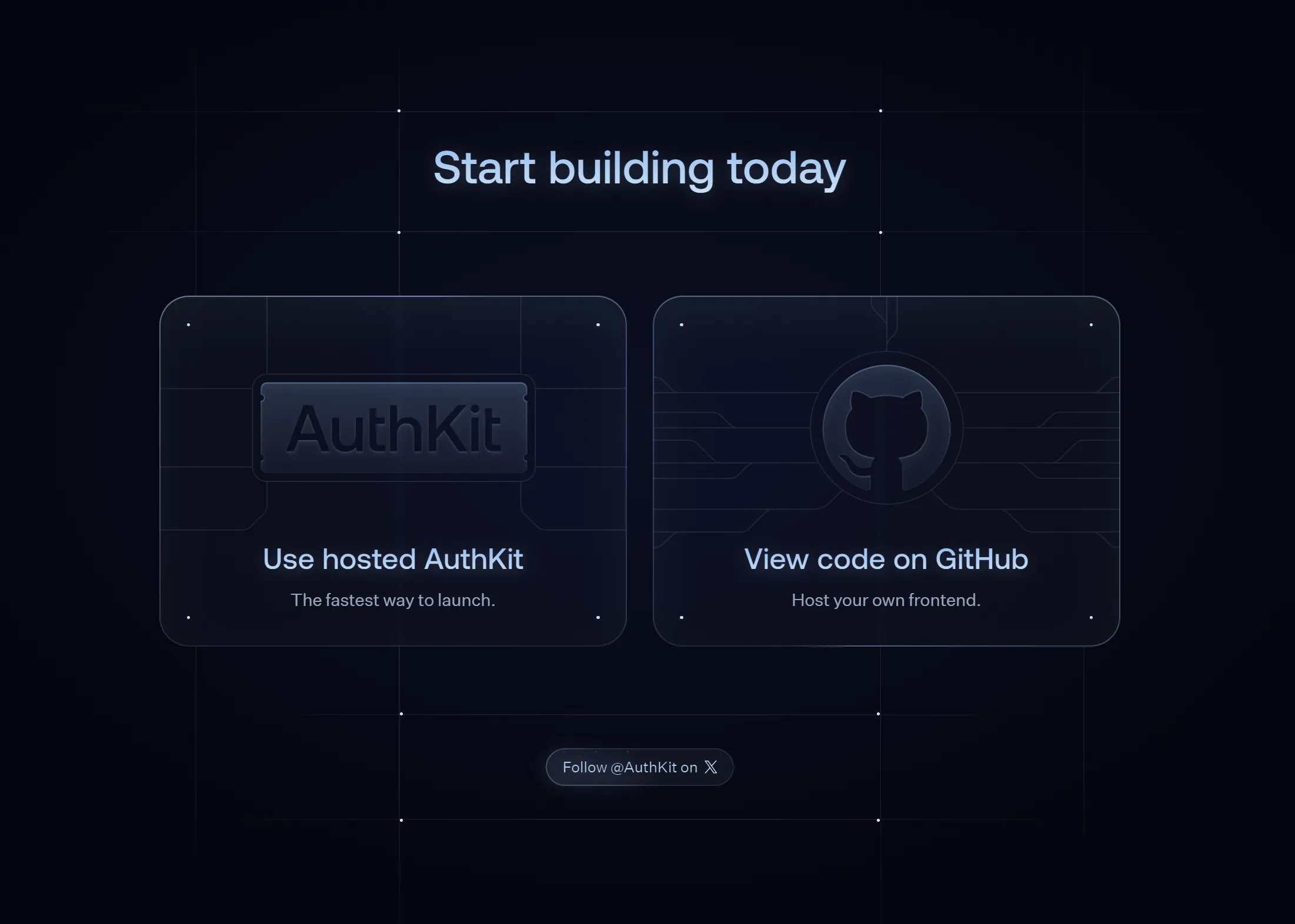 AuthKit
Border highlights
A lot of these have specular highlights on one part of the border some of these are animated.
 Gitness
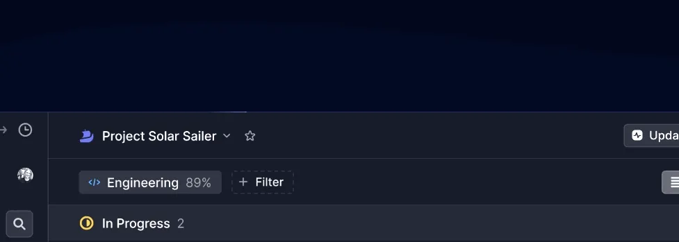 Linear
Glassmorphism
You see this all over MacOS now, so it makes sense that it’s spreading to web design. Some surfaces aren’t just transparent, but they blur the objects behind them, too.
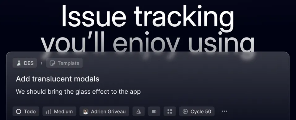 Linear
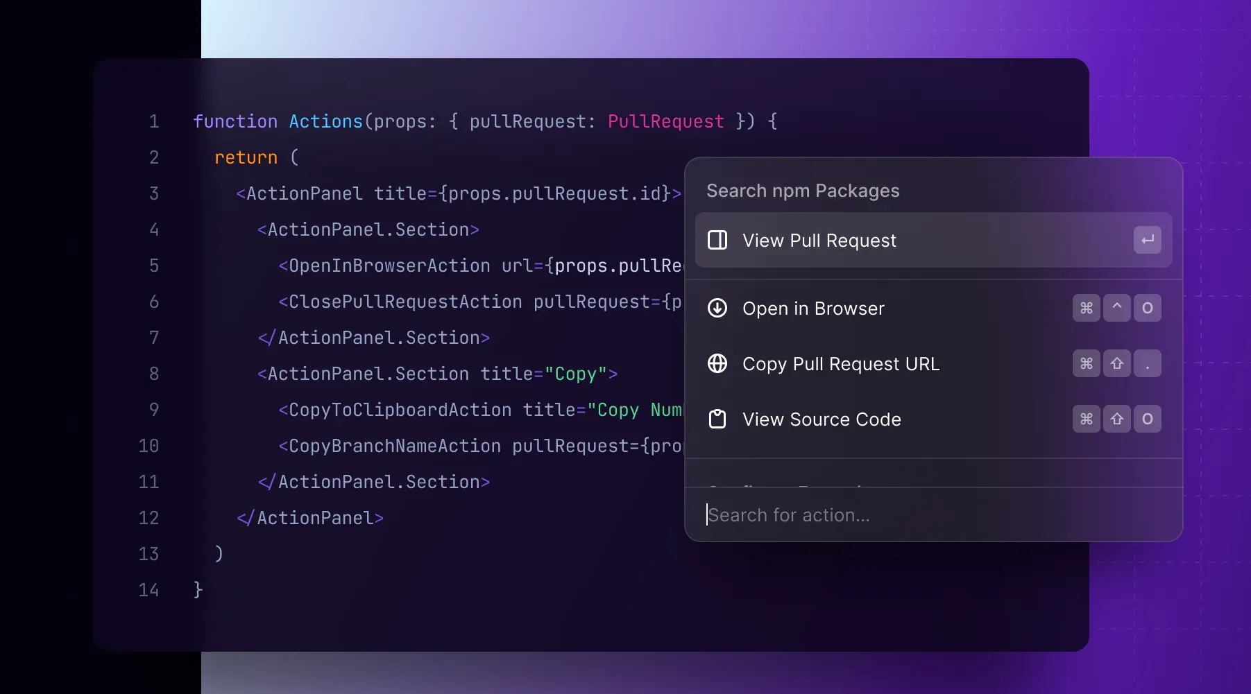 Raycast
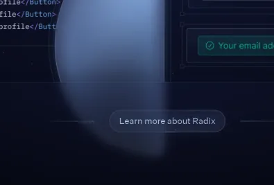 AuthKit
You can do this yourself with the backdrop-filter property:
.frosty-glass {
  backdrop-filter: blur(6px);
}
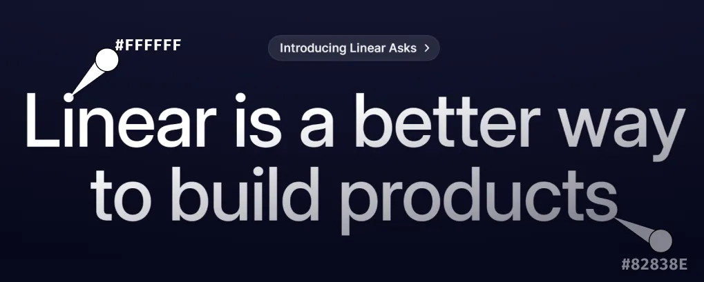
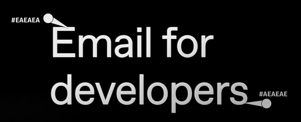
Subtle gradient headings
Some of these gradients are so subtle I needed to use the eyedropper just to make sure I wasn’t imagining it.
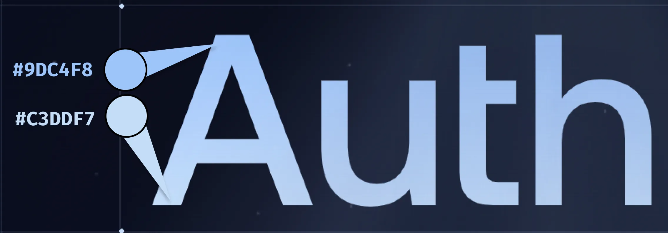 AuthKit
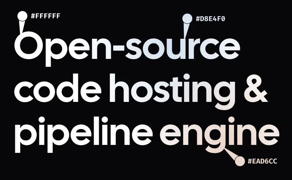 Gitness
 Linear
 Resend
Sans-serif fonts
Every single one of these sites uses a sans-serif font. While this is a super common choice for websites, it seems to be an absolute law for this style. See above for examples.
The Full Site List
Here’s my list of gorgeous sites that seem to fall into this style:
- https://linear.app/
- https://particl.com/
- https://reflect.app/
- https://authkit.com/
- https://nuxtlabs.com/
- https://resend.com/
- https://railway.app/
- https://clerk.com/
- https://vercel.com/
- https://supabase.com/
- https://whop.com/sell/
- https://resend.com/forward
- https://nuxt.studio/
- https://gitbook.com/
- https://raycast.com/
- https://million.dev/
- https://terzo.ai/
- https://gitness.com/
- https://fig.io/
- https://idx.dev/
Dear time traveler: If you’re reading this after February of 2024, there’s a chance some of these sites no longer fit this particular aesthetic. Use the Wayback Machine to travel back and see the site in (most of) its glory. Also, how do I look in the future? Did I age well, or was the face cream a waste of money?
Did I miss anything?
I’m just an observer here, so if I’m missing some secret sauce or if there’s a great site following this style, please let me know!