Making GIFs into Letters with Clip Paths
Featuring Ryan Mulligan
The CSS clip-path is one of those features that unlocks so many possibilities once you understand how to use it. For his piece, Supa Dupa Fly, Ryan Mulligan used some fantastic clip-path manipulation, plus a few other fun tricks I want to dive into.
To see the effects, hover over the CodePen below, or tap if on mobile.
I asked Ryan to teach us his excellent tips, techniques, and resources to make our work just a bit more fun.
Clip Paths
The most notable technique here is the clip-path property used to create each letter.
If you’re not familiar with clip-path, here’s MDN’s definition:
The clip-path CSS property creates a clipping region that sets what part of an element should be shown. Parts that are inside the region are shown, while those outside are hidden.
So when you hover over the GIFs, each GIF has a specific bounding shape that tells the browser what parts to show and what to hide.
Let’s set everything aside for a second and just focus on the clip-path animation. Here’s a slowed-down and simplified version of the CodePen. Hover over and watch the points shift into place.
To animate between clip-paths, both paths must have the same number of points. Let’s take a closer look at how he constructed the U.
Here’s a diagram showing the beginning and end clip-path states. Notice how Ryan’s placed the points logically around the outside, knowing the transition he wanted.
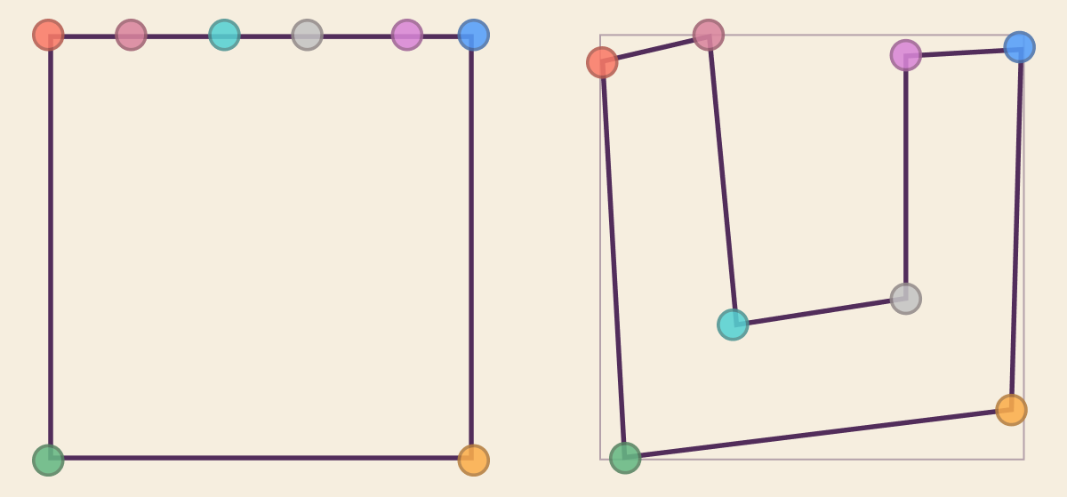
Now let’s look at the code that creates these two clip paths. Each point in the polygon is an x and y coordinate, with 0 0 at the top left and 100% 100% at bottom right.
/* The Square */
.u {
  clip-path: polygon(
    0 0,
    0 100%,
    100% 100%,
    100% 0,
    84% 0,
    61% 0,
    41% 0,
    19% 0
  );
}

/* The Letter 'U' */
.its-my-window:hover .u {
  clip-path: polygon(
    0 6%,
    5% 100%,
    96% 88%,
    98% 3%,
    71% 5%,
    71% 62%,
    31% 68%,
    25% 0
  );
}
Don’t worry about reading the polygon code, it’s not something you need to code by hand. To create these, Ryan used Clippy, an excellent GUI for making clip-paths. Ryan calls it a “must bookmark!”
Choppy Animations
The ways the letters jolt around reminds me of stop-motion paper, and it’s not something we usually see on the web!
People tend to stick to smoother eases for most animations, but Ryan uses a step ease here, which gives the piece a different feel. Let’s compare the step ease next to a linear ease so we can really see the difference.
The steps() class of easing functions breaks up the transition into what feel like ‘frames’ of an animation. The fewer the steps, the choppier it will feel.
Here’s the animation code for moving the letters around. By using the transform properties translate, scale, and rotate, he gives the letters a back and forth bounce.
@keyframes letter {
  25% {
    transform: translate(-5%, 5%) scale(1.05) rotate(-5deg);
  }
  50% {
    transform: translate(5%, -2%) rotate(2deg);
  }
  75% {
    transform: translate(10%, 0%) scale(1.02) rotate(8deg);
  }
  100% {
    transform: translate(0%, -5%) rotate(4deg);
  }
}
Also, notice that the colors are smoothly transitioning on the right, where on the original “D” they’re making sudden, jittery changes. That’s because the ease isn’t just being used for motion, but the colors as well. We’ll dig into this next.
@keyframes colors {
  0% {
    background-color: #a6e630;
  }
  50% {
    background-color: #f5e82f;
  }
  100% {
    background-color: #4cb8f5;
  }
}
Sequential Color Changing
We see that Ryan’s transitioning between three colors in his keyframes, #a6e630 , #f5e82f , and #4cb8f5 . But you might also notice that each letter changes color one after the other. If you follow the color blue with your eyes, you’ll see it appear to step right-to-left, and upwards.
Here I’m simplifying his code and pulling off the animation-delay, which is what’s responsible for the stepping.
.its-my-window:hover .letter {
  animation-delay: calc(var(--i) * (var(--duration) / -3));
}
We see that in the delay, he’s using two CSS Custom Properties, --i and --duration. Ryan’s writing the template in Pug, but in the compiled HTML you can see that each letter has its own value for --i inlined.
<div class="letter s" style="--i: 0"></div>
<div class="letter u" style="--i: 1"></div>
<div class="letter p" style="--i: 2"></div>
<div class="letter a" style="--i: 3"></div>
<div class="letter d" style="--i: 4"></div>
<div class="letter u" style="--i: 5"></div>
<div class="letter p" style="--i: 6"></div>
<div class="letter a" style="--i: 7"></div>
<div class="letter f" style="--i: 8"></div>
<div class="letter l" style="--i: 9"></div>
<div class="letter y" style="--i: 10"></div>
<div class="letter o" style="--i: 11"></div>
With this, Ryan can give each letter a different place to start in the animation, or a unique animation-delay. They’ll keep the difference for the rest of the animation, always being a couple hundred milliseconds apart.
Here’s a simplified and slowed demo to show the concept with color.
Ryan explains why is calc() function will always return a negative number.
Using a negative value will begin the animation immediately, but at a point in the animation based on the delay. If you use a positive delay value, the animation waits for that delay and then starts to loop.
So, to reiterate, animation-delay: -900ms; will start the animation right now as if it was already running for 900ms.
Ryan says he usually does this with a Sass @for loop, but I think it’s great that by using CSS Custom Properties, we can do it all in the browser.
Wrap Up
Supa Dupa Fly is an excellent demo with some solid techniques. We learned a lot from this one CodePen!
First, we checked out Ryan’s awesome use of clip-path to make the letters. Remember, to smoothly transition between clip-paths, they need to have the same number of points.
Then we checked out the intentionally jumpy animations he put on the letters and colors. The step() function adds a different feel and opens up a lot of fun possibilities.
Last, we looked at how Ryan is using the index of the elements to offset the animations’ timing. We saw that setting animation-delay to a negative number makes it start immediately, with the animation in progress based on the value.
Oh, one last thing before we ride off. Go ahead and swap out the Missy Elliott GIF for whatever you’d like.