Gooey Warping SVG Numbers
Featuring Fabio Ottaviani
This morphing number CodePen from Fabio Ottaviani is a clever use of two great techniques.
Both techniques make use of SVG’s powerful feature set. SVG paths feature helper functions we can tap into, and SVG filters can modify our graphics in seemingly limitless ways.
We’ll first learn how Fabio is handling the animation, then we’ll look into the three filters he combined for the awesome gooey effect.
Moving the Circles
Let’s first turn off the gooey effect with the handy checkbox Fabio provides.
Now we can see the stack of SVG circles, each one being moved to a different position along the path of the number.
Creating the Circles
Here’s the init() command that creates the circles, and starts the interval that triggers each animation every 1.2 seconds.
const opts = {
  num: 31,
  radius: 20,
};

const init = () => {
  const circles = document.querySelector(".circles");
  const namespace = "http://www.w3.org/2000/svg";

  for (let i = 0; i < opts.num; i++) {
    const circle = document.createElementNS(namespace, "circle");
    circle.classList.add("circle");
    circle.setAttribute("r", opts.radius);
    circle.setAttribute("cx", 128);
    circle.setAttribute("cy", 128);
    circles.appendChild(circle);
  }

  let n = 10;
  setInterval(() => {
    n = n - 1;
    animate(n);
    if (n === 0) n = 10;
  }, 1200);
};
init();
Not much to break down here: create 31 circles, each with a radius of 20.
Fabio moves the circles into shapes of numbers with SVG paths. If we take a look at the SVG, we see that it’s a stack of paths, one for each number.
Let’s look at the setInterval() from init() once again.
setInterval(() => {
  n = n - 1;
  animate(n);
  if (n === 0) n = 10;
}, 1200);
Every 1.2 seconds, we’ll call animate() and pass it a number, n, between 0 and 9. I’ve added some comments.
const animate = (n) => {
  // Get all number paths
  const paths = document.querySelectorAll(".path");
  // Get all of the red and white circles
  const circles = document.querySelectorAll(".circle");
  if (!paths[n]) return;
  // Get the length of this path
  const length = paths[n].getTotalLength();
  // Determine spacing needed between each circle
  const step = length / opts.num;

  // Loop through each circle
  for (let i = 0; i < opts.num; i++) {
    // Get the x,y coords for this circle along the path
    const { x, y } = paths[n].getPointAtLength(i * step);

    // Move the circle
    gsap.to(circles[i], {
      cx: x,
      cy: y,
      ease: "power3.out",
      fill: i % 2 === 0 ? "red" : "white",
      delay: i * 0.024,
    });
  }
};
The two key functions here are getTotalLength() and getPointAtLength(), which both exist on SVGGeometryElements.
getTotalLength() returns a float for the length of the path.
getPointAtLength() takes a distance along the path and returns x and y coordinates.
With these functions we can see that there’s nothing special about the numbers. You can apply this same effect to any SVG path!
The rest is pretty standard GSAP, so let’s move on to the nifty SVG filters!
Gooey Effect
The filter has three steps to it. Play with this demo and see the effect each one has on the outcome.
Notice how the other two have no effect when you remove Blur. That’s because each filter builds upon the one before it.
Gaussian Blur
The feGaussianBlur filter is very straightforward. It gives you a predictable result and only has one property to change: stdDeviation. The higher the stdDeviation, the blurrier your image is.
Notice that the edges are no longer crisp, but semi-transparent. That’s important for the next filter.
Color Matrix
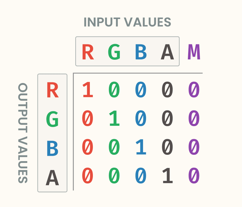
The feColorMatrix filter can be daunting when you first see it. Where feGaussianBlur only has the one value to tweak, feColorMatrix has a 5x4 matrix of values that align to RGBA x RGBA, with an extra value at the end.
Typically, feColorMatrix is used to get effects like duotone or black and white images. I found two great articles by Michelle Barker and Una Kravets covering that use case.
However, this matrix is pretty different from what those articles cover. Let’s find out why.
Here’s what a standard color matrix looks like.
<feColorMatrix
  in="SourceGraphic"
  type="matrix"
  values="1 0 0 0 0
          0 1 0 0 0
          0 0 1 0 0
          0 0 0 1 0"
/>
Think of it as, “based on the RGBA input, what should the RGBA output be?”
Here it is in a handy visualization.

Each number in the RGBA columns act as a multiplier. The matrix above won’t have any effect on the image. That’s because where red comes in, we multiply it by 1 for the red output. So the amount of red in our image won’t change.
For the green input value, the multiplier of 1 in the green row makes it output the same value, and so on for blue and alpha.
The final column gets added to the output, and can shift an output higher or lower.
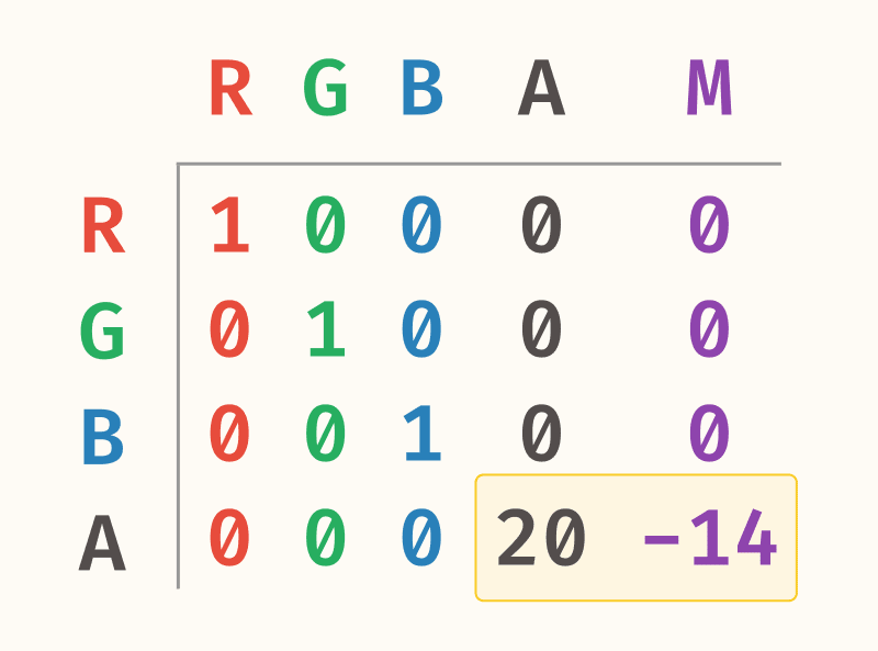
Here’s the matrix Fabio is using for his filter.
<feColorMatrix
  in="blur"
  type="matrix"
  values="1 0 0 0 0
          0 1 0 0 0
          0 0 1 0 0
          0 0 0 20 -14"
/>
The matrix uses the output of the blur filter to make its changes. Everything stays the same except for the alpha layer.

The best way to learn is by playing. Go on and give these values a tweak, especially the last two, to see the effect they’re having.
First he greatly increases the spread of the alpha, then in the multiplier he shifts it back so that the edges are crisp, and the shape is smaller.
Composite
Last, Fabio combines the Color Matrix and gaussian blur filters with an feComposite filter.
These operators create results similar to boolean options you’d find in Illustrator or Figma. It takes two input images and combines them with the operation you choose.
<feComposite in="SourceGraphic" in2="filter" operator="atop" />By using atop, Fabio uses the result of the blur + color matrix as a mask, applying that to the SourceGraphic which is the original SVGs. This is what makes the edges smooth and blurry, but the insides stay a crisp vector.
Wrap Up
We dug into some pretty great SVG techniques in this one! We learned how to put shapes on any SVG path, as well as a few great SVG filter tricks!
I hope you enjoyed the interactive demos. I always have a blast creating them.
Huge thanks to Fabio Ottaviani for the brilliant CodePen.