Creating Generative SVG Grids
Featuring Alex Trost
Everyone would love to be an artist, but it becomes a series of difficult decisions for me.
What shapes do I use? Where do I put those shapes? What colors should I use? Jeez, how big should the canvas even be?
I shouldn’t be blocked from creating art if those decisions overwhelm me, and with generative art, I’m not!
We use randomized values to make the difficult decisions, then regenerate until we’re happy with the result.
What We’re Making
We’re going to make a grid of blocks with a random number of rows and columns.
Each block has a randomly chosen design and colors from a shared color palette.
For this tutorial, I assume you understand the broad concept of generative art, along with HTML, CSS, and JS basics.
Tools We’ll Use
We’re pulling in a few different JavaScript libraries to make things easier on us.
Drawing the Grid
We’ll start by drawing our basic grid of squares.
First, let’s set a random number of rows and columns.
numRows = random(4, 8, true);
numCols = random(4, 8, true);
Passing true as the third parameter to random() gives us back an integer rather than a float.
Then create the SVG that we’ll be drawing all the designs within. For that, we’re using the SVG function from SVG.js.
On it, we can chain functions that modify it in some way.
draw = SVG() // Create the SVG
  .addTo(".container")
  .size("100%", "100%")
  .viewbox(`0 0 ${numRows * squareSize} ${numCols * squareSize}`);
Now, let’s loop through and build the grid.
for (let i = 0; i < numRows; i++) {
  for (let j = 0; j < numCols; j++) {
    generateLittleBlock(i, j);
  }
}
This calls generateLittleBlock(), which will handle more soon. For now, it just takes the current row and column and turns that into x and y coordinates.
function generateLittleBlock(i, j) {
  const xPos = i * squareSize;
  const yPos = j * squareSize;

  drawBlock(xPos, yPos);
}
Then we call drawBlock(), which creates one <group> and puts a single <rect> inside it.
function drawBlock(x, y) {
  // Create group element
  const group = draw.group().addClass("draw-block");

  // Draw Block
  group.rect(squareSize, squareSize).fill("white").stroke("black").move(x, y);
}
Now we’re rendering a bunch of simple squares to our randomly sized grid.
Before we dive into complex block designs, let’s get our colors sorted.
Colors
The colors really make or break this piece, so we’ve got to pick some good colors and use them well.
Color Palettes
Picking completely random color values wouldn’t give us a beautiful result. Instead, let’s fetch a JSON file that contains an array of popular color palettes. Each time we build a new grid, we’ll pick a random one from that list.
colors = await fetch(
  "https://unpkg.com/nice-color-palettes@3.0.0/100.json",
).then((response) => response.json());

/* Result:
[
  ["#69d2e7","#a7dbd8","#e0e4cc","#f38630","#fa6900"],
  ["#fe4365","#fc9d9a","#f9cdad","#c8c8a9","#83af9b"],
  ...
]
*/
We’re picking a random color palette in this demo then giving each square a color from that palette.
Feel free to use your own collection of your favorite color palettes instead.
Create Background Color
Now we create a background color that goes with the colors of the grid but doesn’t reuse an existing color or distract too much.
This is where we pull in the TinyColor library.
// Set background color
const bg = tinycolor
  .mix(colorPalette[0], colorPalette[1], 50)
  .desaturate(10)
  .toString();

// Make Lighter version
const bgInner = tinycolor(bg).lighten(10).toString();
// And darker version
const bgOuter = tinycolor(bg).darken(10).toString();

// Set to CSS Custom Properties
gsap.to(".container", {
  "--bg-inner": bgInner,
  "--bg-outer": bgOuter,
  duration: 0.5,
});
We first mix() together the first two colors in the palette array, then desaturate() so it’s not as vibrant.
Then we create a light and dark version for the two values of our background’s radial gradient.
.container {
  background-image: radial-gradient(var(--bg-inner) 0%, var(--bg-outer) 100%);
}
Let’s add it to our working demo:
Awesome! Our background has a nice subtle gradient with a color that relates to the rest of the palette.
Get Two Different Colors
We want each block to use two different colors from the palette. Here’s a little function to do just that.
function getTwoColors(colors) {
  let colorList = [...colors];
  // Get random index for this array of colors
  const colorIndex = random(0, colorList.length - 1, true);
  // Set the background to the color at that array
  const background = colorList[colorIndex];
  // Remove that color from the options
  colorList.splice(colorIndex, 1);
  // Set the foreground to any other color in the array
  const foreground = random(colorList);

  return { foreground, background };
}
Then, as we create each block, we destructure the object to get our two colors.
const { foreground, background } = getTwoColors(colorPalette);Great! That’s everything with our colors set. Now let’s get creative with some potential designs!
Creating Blocks
To start, just come up with one or two designs you want to implement. You’ll come up with plenty of ideas once you get going.
Here are a few design ideas to get you started.
Let’s build the circle first.
Building a Simple Block
To create the different styles, we make individual functions that return a specific design. Each function takes in the same four arguments.
function drawCircle(x, y, foreground, background) {
  // ...
}
The x and y coordinates give the top-left point of our block. foreground and background come from our getTwoColors() function.
There’s also a global variable, squareSize, that defines the width and height of our blocks. We can use it to keep the designs proportional. It’ll really come in handy later when we make bigger blocks.
function drawCircle(x, y, foreground, background) {
  // Create group element
  const group = draw.group().addClass("draw-circle");

  // Draw Background
  group.rect(squareSize, squareSize).fill(background).move(x, y);

  // Draw Foreground
  group.circle(squareSize).fill(foreground).move(x, y);
}
We’ll swap this function for drawBlock and place it in a new array where we’ll put all of our different draw functions.
function generateLittleBlock(i, j) {
  const { foreground, background } = getTwoColors(colorPalette);

  // We'll add our style options to this array.
  const blockStyleOptions = [drawCircle];
  // Then choose one randomly
  const blockStyle = random(blockStyleOptions);

  const xPos = i * squareSize;
  const yPos = j * squareSize;

  // And execute it!
  blockStyle(xPos, yPos, foreground, background);
}
Our drawCircle and getTwoColors functions are working perfectly!
Now let’s try out a more complicated block style.
Building a Complex Block
This next block has more parts and will teach us a couple concepts like masking.
Toggle this example to remove the mask and see how the block is made.
We’re creating two circles and putting their centers at the corners of our background square. Just slightly more complex than our drawCircle() above.
function drawOppositeCircles(x, y, foreground, background) {
  // Create group element for this block
  const group = draw.group().addClass("opposite-circles");

  // Create a group specifically for our circles
  // This will come in handy later
  const circleGroup = draw.group();

  // Draw Background
  group.rect(squareSize, squareSize).fill(background).move(x, y);

  // Draw Foreground circles
  circleGroup
    .circle(squareSize)
    .fill(foreground)
    .center(x, y + squareSize); // Bottom Left

  circleGroup
    .circle(squareSize)
    .fill(foreground)
    .center(x + squareSize, y); // Top Right

  // Add the circleGroup inside our first group
  group.add(circleGroup);
}
Let’s use a mask to cut off the parts where the circles extend past the block’s boundaries.
function drawOppositeCircles(x, y, foreground, background) {
  const group = draw.group().addClass("opposite-circles");
  const circleGroup = draw.group();

  group.rect(squareSize, squareSize).fill(background).move(x, y);

  // Same size and location as our background rect
  const mask = draw.rect(squareSize, squareSize).fill("#fff").move(x, y);

  circleGroup
    .circle(squareSize)
    .fill(foreground)
    .center(x, y + squareSize);

  circleGroup
    .circle(squareSize)
    .fill(foreground)
    .center(x + squareSize, y);

  // Assign the mask to the circleGroup
  circleGroup.maskWith(mask);
  group.add(circleGroup);
}
Because the mask has the same dimensions as the background square, it will crop the circles exactly how we need them.
Last, let’s add a variation that gives us circles in either the top-right and bottom-left, or top-left and bottom-right.
We can use random() to choose from two arrays of offset values.
function drawOppositeCircles(x, y, foreground, background) {
  const group = draw.group().addClass("opposite-circles");
  const circleGroup = draw.group();

  group.rect(squareSize, squareSize).fill(background).move(x, y);

  const mask = draw.rect(squareSize, squareSize).fill("#fff").move(x, y);

  // Choose one of these options
  const offset = random([
    // top left + bottom right
    [0, 0, squareSize, squareSize],
    // top right + bottom left
    [0, squareSize, squareSize, 0],
  ]);

  // Use new offsets when placing circles
  circleGroup
    .circle(squareSize)
    .fill(foreground)
    .center(x + offset[0], y + offset[1]);

  circleGroup
    .circle(squareSize)
    .fill(foreground)
    .center(x + offset[2], y + offset[3]);

  circleGroup.maskWith(mask);
  group.add(circleGroup);
}
That’s it! We added some complexity with additional shapes, a mask, and random placement.
All we need to do is add it to our blockStyleOptions array, and it becomes available for selection!
Variations
We just added a minor variation to our Opposite Circles block, but there’s much more we can do.
In our finished example, most blocks have at least one variation. Circles can appear filled or hollow, the + can be an ×, dots can number 4, 9, or 16, and so on.
These small changes add complexity to our piece and take minimal effort.
The trick is using Math.random() to get a random number between 0 and 1. Then use that value to determine what happens to your shape.
function drawCircle(x, y, foreground, background) {
  // ...

  // 30% of the time add an inner circle
  if (Math.random() < 0.3) {
    group
      .circle(squareSize / 2)
      .fill(background)
      .move(x + squareSize / 4, y + squareSize / 4);
  }
}
That’s the main concept, but you can take it as far as you’d like.
I won’t detail every block style because a lot is repeated, and you can see how it’s built in the final version.
However, there are a couple things to note about the drawLetterBlock function.
Typography Blocks
I intentionally used a monospace font so that each letter took up around the same height and width. Source Code Pro has the benefit of being monospace without feeling like a monospace font.
SVG typography is a bit different from HTML/CSS typography. It’s more powerful in some ways, and more difficult in others.
Luckily, with SVG.js we can place the center of the letter exactly where we want it.
const character = random(selectedCharacters);

const text = group.plain(character);

text.font({
  family: "Source Code Pro",
  size: squareSize * 1.2,
  weight: 800,
  anchor: "middle",
  fill: foreground,
  leading: 1,
});

// Place in center of block
text.center(x + squareSize / 2, y + squareSize / 2);
One Big Block
To add a point of interest, let’s give the viewer one large block to focus on.
Lets create this larger block last and place it in a random location on top of the other squares.
- Make global
squareSizetwo or three times larger - Pick a random position that doesn’t overflow the grid
- Draw large block
- Reset global
squareSizeto original value
It’s a very naive implementation, but it works good enough!
The best part is we can use the same functions from our generateSmallBlock()
It picks a random spot on the grid and a random size for the bigger block.
function generateBigBlock() {
  const { foreground, background } = getTwoColors(colorPalette);

  // Removed the Dots option because it
  // didn't look good big
  const blockStyleOptions = [
    drawCross,
    drawHalfSquare,
    drawDiagonalSquare,
    drawCircle,
    drawQuarterCircle,
    drawOppositeCircles,
    drawLetterBlock,
  ];

  let prevSquareSize = squareSize;

  // Random multiplier (2 or 3 squares)
  const multiplier = random([2, 3]);
  // Make squareSize bigger
  squareSize = multiplier * 100;

  // Random X position
  const xPos = random(0, numRows - multiplier, true) * prevSquareSize;
  // Random Y position
  const yPos = random(0, numCols - multiplier, true) * prevSquareSize;

  // Get random square style
  const blockStyle = random(blockStyleOptions);
  blockStyle(xPos, yPos, foreground, background);

  // Reset squareSize
  squareSize = prevSquareSize;
}
Ideally, you’d create this in place of the blocks it’s covering over, but I honestly didn’t want to figure out that math.
If you do, let me know, I’d be interested to see how you solve it!
Render Quality
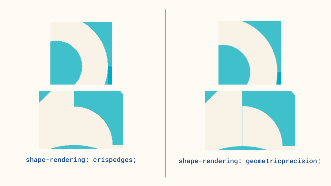
Even though we’re putting our rect shapes right next to each other, we’ll often get thin lines between each block. The way to solve this is with the shape-rendering property.
svg * {
  /*    Removes little gaps between the shapes */
  shape-rendering: crispEdges;
}
Unfortunately, this fix doesn’t do our circles any favors. There’s another value for shape-rendering that gives us antialiasing and smooths out our circles but brings back our lines. Here’s a comparison between the two properties.

In the top example, crispedges gives us some ugly curves, but there’s no line between the blocks in the bottom one. Using geometricprecision gives a buttery smooth curve but reintroduces that thin line between blocks.
Depending on your specific project, it’s a tradeoff you’ll have to make. Knowing about the property is half the battle.
Animation
To make creating a new grid less jarring for the viewer, lets add a small bit of animation with GSAP.
Let’s plan out the effect.
- Fade and shrink old grid
- Once invisible, remove old grid from DOM
- Create new grid with
opacityset to0 - Reveal and grow new grid
Here’s the function that handles steps 1 and 2.
function generateNewGrid() {
  // Fade out SVG
  gsap.to(".container > svg", {
    opacity: 0,
    scale: 0.8,
    duration: 0.25,
    onComplete: () => {
      // Remove previous SVG from DOM
      document.querySelector(".container").innerHTML = "";
      // Start new SVG creation
      drawGrid();
    },
  });
}
It fades and shrinks the SVG over 0.25 seconds. Once the animation completes, we remove the SVG from the DOM and kick off step 3 with drawGrid().
When we create the new SVG, it starts out with an opacity of 0 so that we can fade it in with a little bounce.
function drawGrid() {
  // ...

  gsap.fromTo(
    ".container > svg",
    { opacity: 0, scale: 0.8 },
    { opacity: 1, scale: 1, duration: 0.4, ease: "back.out(1.7)" },
  );

  // ...
}
Along with the background transition we covered earlier, the animations bring a nice polish.
Taking it Further
There’s lots you can do to extend what we’ve built so far.
- Add even more shape styles!
- Make specific block styles that aren’t square, spanning 2x1, 3x1, etc.
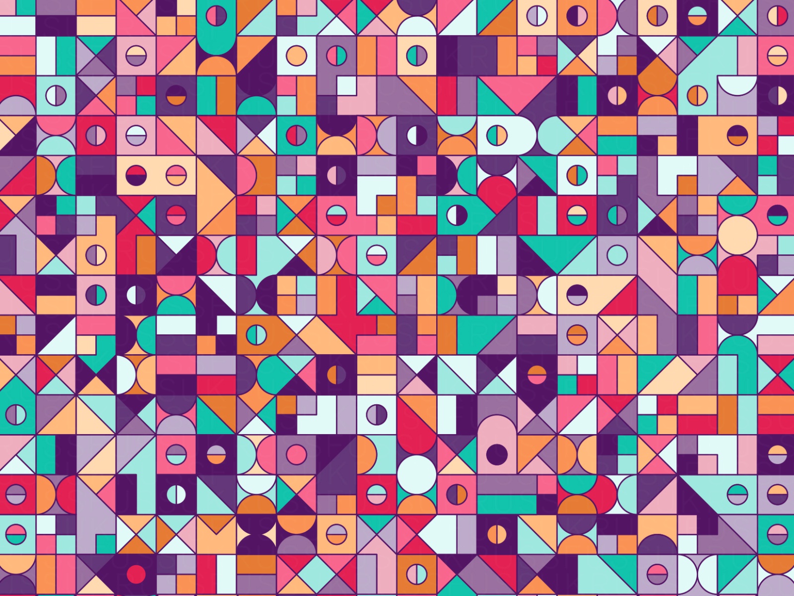
- Add a stroke to your elements like this great piece from Russ Parker.

For the stroke’s color, find which of the colors in your palette is the darkest by using TinyColor’s getBrightness().
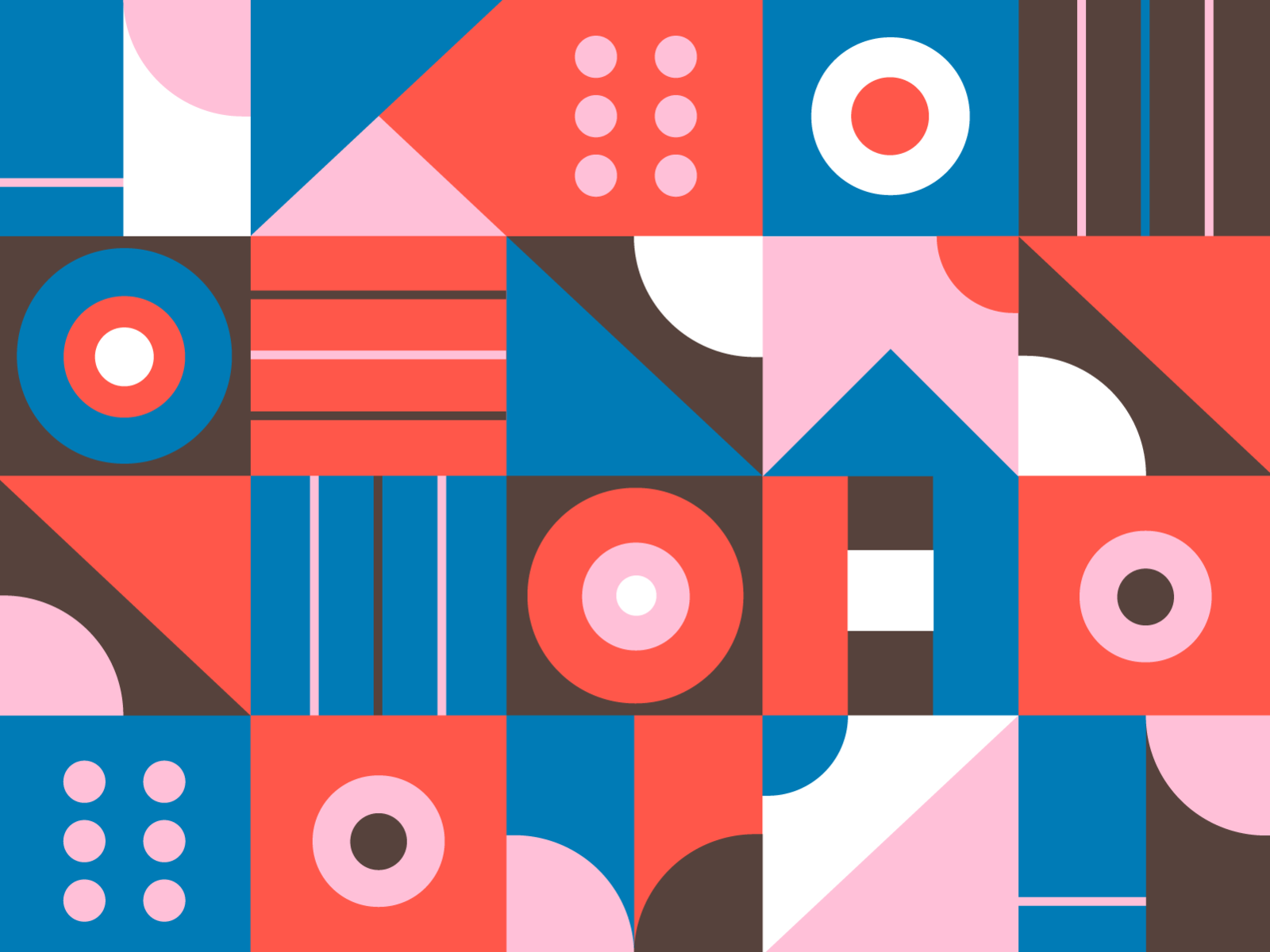
- Use three colors per block, like this piece by Kemal Sanli.

- Add more blocks to your grid, like 50x50.
- “Seed” the randomization so people can save and share their favorites.
- Add some SVG filters to the piece to make it feel more painterly or warped.
In short, there’s a ton you can do, so please let me know if you end up taking this to the next level!
Wrap Up
We’ve covered quite a few nice techniques that can bring a bit of interest to an art piece, or even a website design!
We saw how we can create isolated functions to draw SVGs, how to work with color palettes, how to add variations, animations, and lots more.
If you enjoy creative coding, you’ll love our newsletter and Twitch shows. Plus, our community Discord has an entire channel dedicated to generative art. We’d love to have you!
Thanks for reading, and thanks again to George Francis for teaching us these principles.