Amazing Animation Techniques with GSAP
Featuring Pete Barr
Brilliant animations can turn a static design into a fantastic experience, but it doesn’t come easy. Motion designers might fiddle with an animation for weeks until it feels just right. When it does, we as viewers instinctively know it.
Pete Barr is an expert animator, and it’s always a treat when he creates a new CodePen. In his Swissted series, he breathes life into designer Mike Joyce’s brilliant posters by recreating them in code and crafting animations. Each poster has a clever sequence of animations, always delivering a satisfying result.
We’re hitting the trail to learn from Pete, studying a few of his best techniques from the Swissted series. If you want to improve your animation skills, this will be a gold mine for you.
I recommend checking out the full collection, then coming back here to learn the techniques. Here’s one to start us off.
GSAP
Along the trail, we’ll see one constant through all of these pieces: Pete’s using the JavaScript animation library GSAP in every one. It’s an incredibly powerful library and makes creating animations easier and more performant. If you’re not familiar, check out the official Getting Started with GSAP guide.
SplitText
To achieve some of these animations, Pete needs to split his text into individual elements. If you have an element like this:
<p class="text">Horse</p>You can only animate everything between the <p> tags (the entire word horse) because it’s a single DOM node. You can’t animate parts of a DOM node independently, so Pete uses the GSAP SplitText plugin, to break the string up into characters and words.
With one line of JavaScript, SplitText turns our single element into multiple elements. Then we can animate each letter like in this demo:
Using GSAP’s stagger property is critical here to delay the next letter’s animation just a bit.
Cylinder Rotation Effect
In some of these pieces, letters animate in as if rotating on an invisible cylinder. Check out how ‘radiohead’ enters and leaves in this CodePen.
Pete starts with SplitText, then changes the transform-origin of each letter. The browser default makes it the center of the element, but we set it behind the letter in 3D space to get this effect.

Now, if we rotate from that origin point, we get that excellent cylinder effect.
Be sure to tweak the above CodePen to see what the properties do. If you comment out transformOrigin: "center center -100px", you’ll see it animate from the natural center of the letter. Change -100px to -200px for a bigger rotation.
Easing
In animation, easing determines the speed at which objects move throughout the animation. Here’s a small demo with some of the most common eases.
Each ease gives a different feel and communicates something to the viewer. Picking the right ease for the job is essential. You wouldn’t use “Elastic” for a bank’s website, but it might work perfectly on an energetic site for children.
If using GSAP, the best way to figure out what ease you’re going for is with the GreenSock Ease Visualizer. Pick from the interactive list, tweak the values, and when it looks good, copy the code right into your GSAP function.
Look through Pete’s pieces, and you’ll find that his skilled use of eases is part of what sets his work apart. When none of the default eases meet his needs, Pete will create a custom ease as he did for the big box in Firehose.
Notice how the box slows down and speeds up as it rotates? Pete explains.
I wanted the main black shape to rotate infinitely but slow the rotational speed down when the ball started to fall and bounce to a stationary corner position; then the main shape rotation would start to speed up again. This adds a little focus to the ball animation and helps separate the bouncing part of the animation from the next rolling motion.
Luckily, GreenSock Ease Visualizer helps with custom eases, letting you manipulate bezier curves to create code for your ease. Here’s the ease Pete made for the black box in Firehose. You’ll see the code is identical to the points in an SVG path.
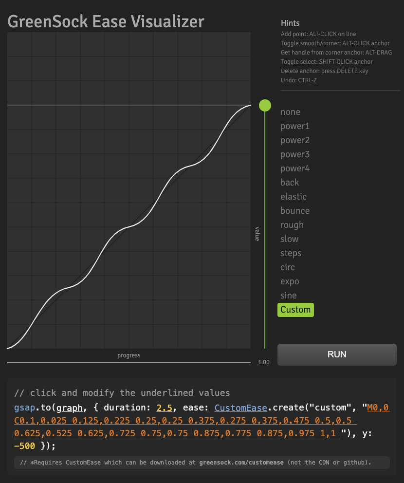
You can paste your own path string into the Ease Visualizer and use it as an editor to tweak it further.
Infinite Elements
To make things last forever without creating a ton of DOM elements, you’ve got to use a clever technique. Take, for instance, this infinite effect in Adolescents.
First, you might notice that the transitions use SplitText with a stagger, giving a nice wave effect as the letters move up and down. He’s also using CSS mix-blend-mode to make the blue and red combine into black. But how is he making this seem to go on forever?
It’s similar to a technique we covered in a previous issue where you quickly swap between identical elements once they reach a certain point. Hover over this demo to peek behind the curtain.
Keys to this technique:
- Use a linear ease
- Animate until the endpoint is the same as the starting point, then restart the animation
- Both pieces need to be identical
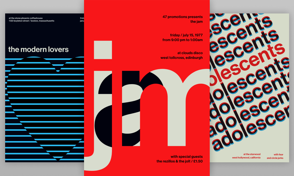
Pete also uses this technique in The Modern Lovers and The Runaways to make the lines go on forever.
It’s similar to a barbershop pole. It feels like there’s infinite red and white lines when it’s really an optical illusion.
Clever Masking
One of my favorites in the Swissted series is The Jam, which has excellent masking techniques.
It’s such a slick effect, and the dot of the ‘j’ animating at a different speed really puts the icing on the cake. So how is Pete doing this? It’s a bit easier to understand if we spread the elements apart.
The “jm” part is a mask for the red rectangle, revealing the “a” and background behind it. The dot of the “j” is floating above it all. Awesome effect.
Q & A
I had a few final questions for Pete that would benefit all of us in trying to make high-quality animation work.
Motion design
Alex: You seem to have a great sense of motion design. Do you have any tips on how you approach a piece? Any rules or principles you follow or advice you’d give?
Pete: I’ve been designing, building, and animating interfaces for nearly 20 years now, yikes! I started with Flash, so I spent a lot of time trying to recreate animations and interactions by studios such as 2advanced, Fantasy, Group94, and others. This started to instill a feeling for choreography, timing, speed, and easing, so I built up skills in motion design organically over time.
For the Swissted animations, I would get a sense of motion from the composition, shape, and colours of the design elements themselves: some simple and others more complex. They don’t always end up going in the direction I was initially thinking. A lot of the time its mistakes, or something just comes from left-field, which makes you think ‘oh, there’s something in that.‘
I’d recommend to people who are starting with motion and animation platforms like GSAP to mess about, try different things, and try not to let it get you down if an animation doesn’t go the way you were hoping. Things generally come together eventually, just tweak, tweak, tweak!
The Big Reveal
Alex: I noticed that in these CodePens, you’re hiding everything with CSS and then revealing with JavaScript. Would you recommend that to keep the reveal of an animation tidy?
Pete: It’s not recommended to do this for critical UI elements and content in general, but in some contexts it’s ok. When appropriate, the reveal can capture the user’s attention, create interest, and promote engagement, especially if interactive and not just for show.
With a lot of my public CodePen stuff, it doesn’t matter, and code quality doesn’t have to be perfect. It’s just my fun personal playground, so my rules 😉. We should now be using prefers-reduced-motion where possible in the real world.
SplitText tips
Alex: You’re using SplitText in most of these pieces to get some great effects. Do you have any additional tips for using the plugin?
Pete:
If you use SplitText to split a header’s words into ‘chars’ and add overflow: hidden; to the header, you can get some nice effects when animating the divs wrapping the characters. You could animate the characters from a positive Y position with a stagger to its default position with a masked effect. Since SplitText respects nested elements, you can apply finer control to text animations. I use this in technique in a demo for the launch of GreenSock’s GSAP ScrollTrigger plugin.
By targeting characters individually, you can get quite creative and do some fun kinetic typography animations. In this example I created a rotation animation by targeting individual characters and rotating them in different directions using a similar technique as the Radiohead Swissted animation. But here, I’m also applying animation to the variable font’s various axis.
Back to the Stable
Pete Barr’s work was one fun trail to ride along! We touched on the basics of GSAP and learned the syntax. We learned how to get impressive text effects with SplitText. We demystified the super-cool “cylinder rotation” technique (which can be applied to more than just text!). We learned about the different eases that come with GSAP, plus touched on how to make your own. Lastly, we figured out the clever trick to creating “infinite” elements.
I can’t thank Pete enough for riding with us and sharing his work and knowledge. Follow him on Twitter and check out his CodePen.