Sketchy Webcam Filter Effects
Featuring Adam Kuhn
Adam Kuhn makes some of my favorite CodePens, from the email form rollercoaster, to his gorgeous generative art, to his delightful Night at the Museum of Very Good Boys. My favorite of his recent work has to be his webcam filter in the style of the music video for Take Me On by a-ha.
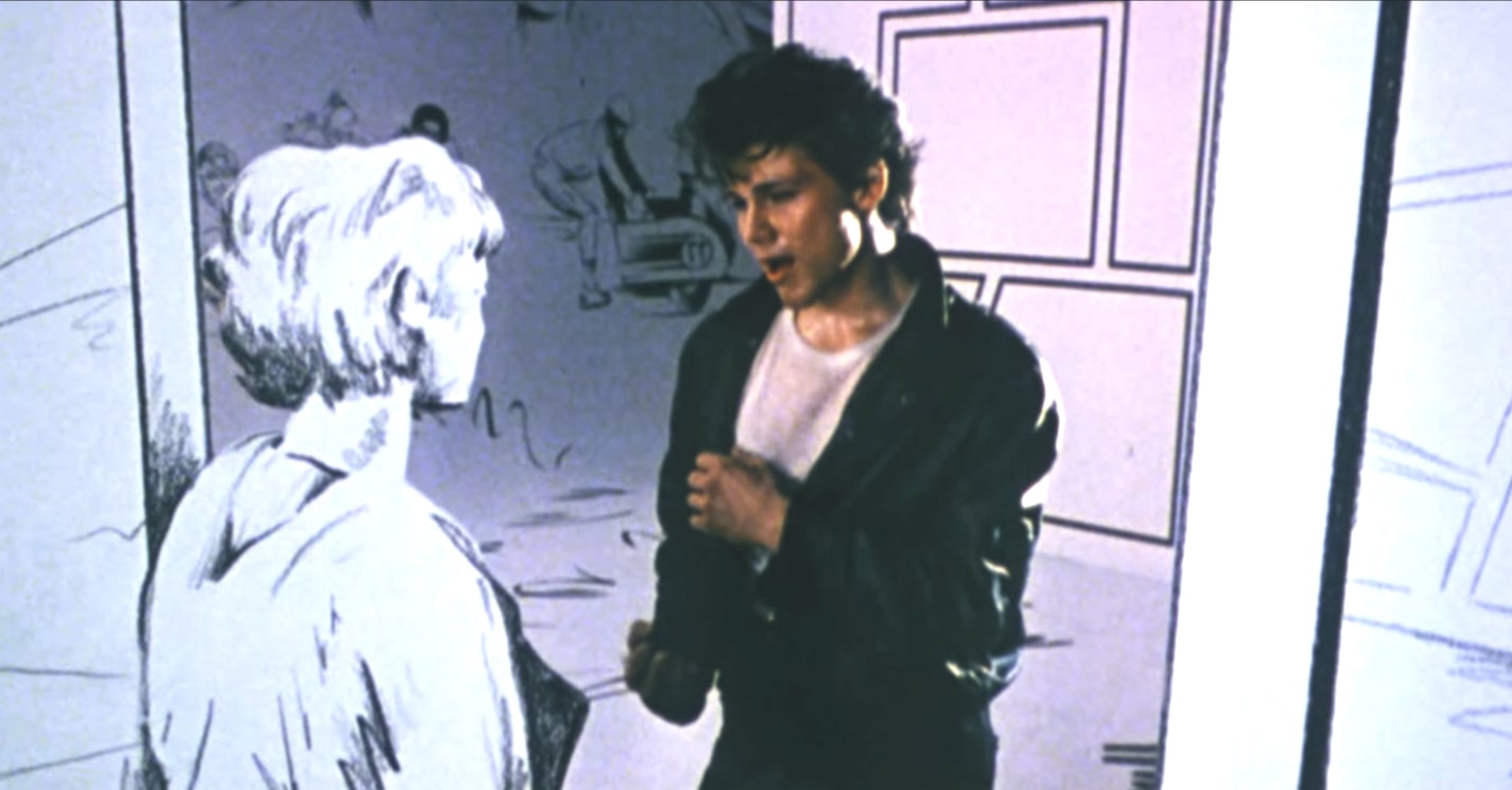
The original music video from 1986.
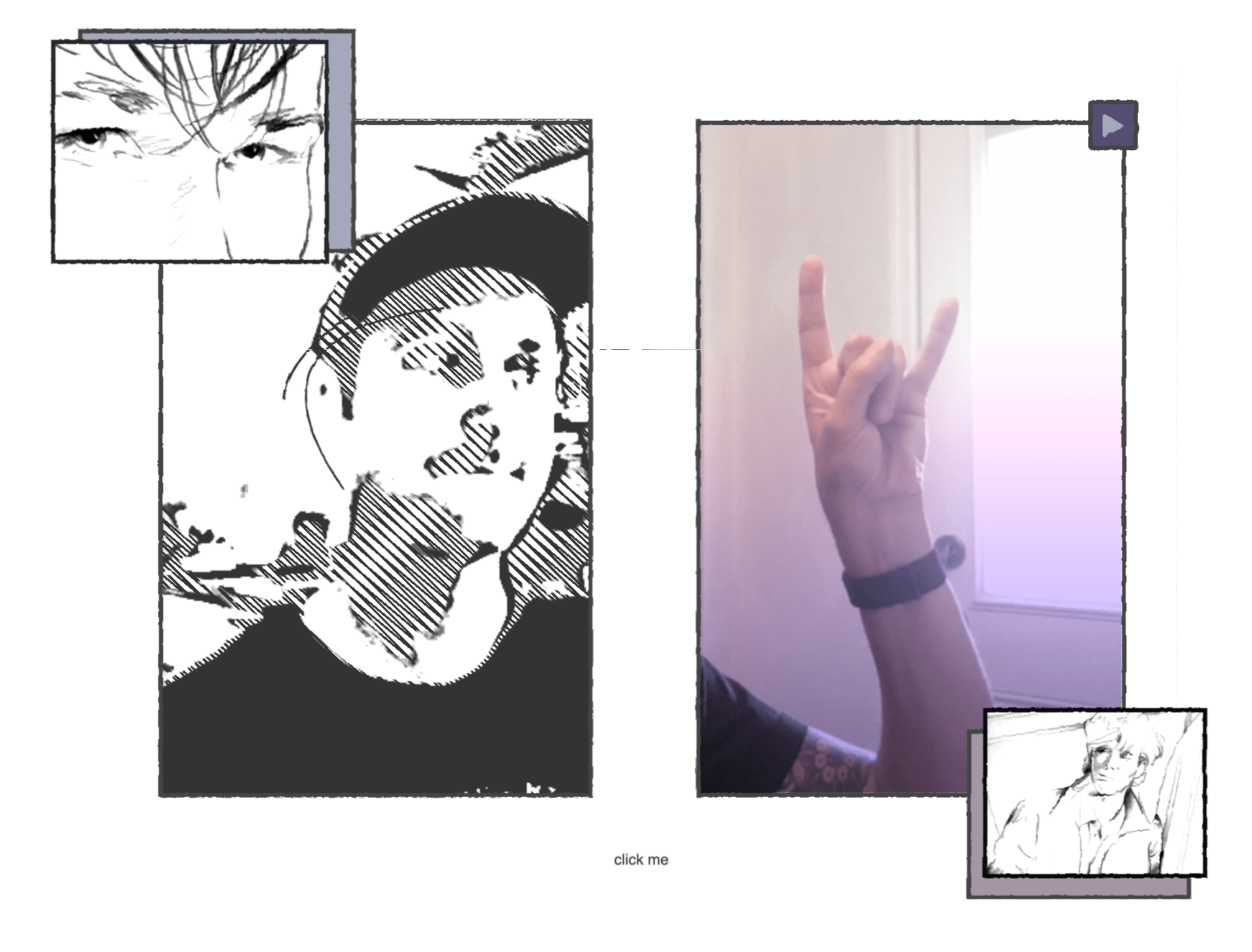
Adam’s CodePen, circa 2020.
Unfortunately, I can’t embed the CodePen because you can’t give webcam access to an iframe, so you’ll have to open this up in its own window.
View on CodePenThe coolest part of this CodePen is that he unveiled it on the Frontend Horse Livestream and we talked through how he did it. Watch the recording of that here.
One cool thing to note is Adam isn’t using any external JavaScript libraries, just browser APIs. There are many techniques we can learn from this CodePen to bring into our own work. Let’s get into it!
Webcam Source
Adam uses the webcam feed as the source for the sketchy effect and the video reveal. Let’s quickly touch on how he gets that video stream.
Adam starts by getting the user’s webcam with the getUserMedia browser API. That returns a promise that resolves to a MediaStream object. He sets that stream as the srcObject on the video element. Here’s a simplified version of the HTML and JavaScript.
<div id="container">
  <video autoplay="" playsinline=""></video>
</div>
const constraints = {
video: true,
};
const video = document.querySelector("#container video");
document.addEventListener("DOMContentLoaded", function () {
navigator.mediaDevices.getUserMedia(constraints).then(handleSuccess);
});
function handleSuccess(stream) {
video.srcObject = stream;
}Here’s a CodePen of just that code if you want to use it as a starting point for your own project.
Highlights, Midtones, and Shadows
Adam uses the webcam stream as the source for creating three mask images: highlights, midtones, and shadows. Here’s a basic diagram with different colors for clarity.
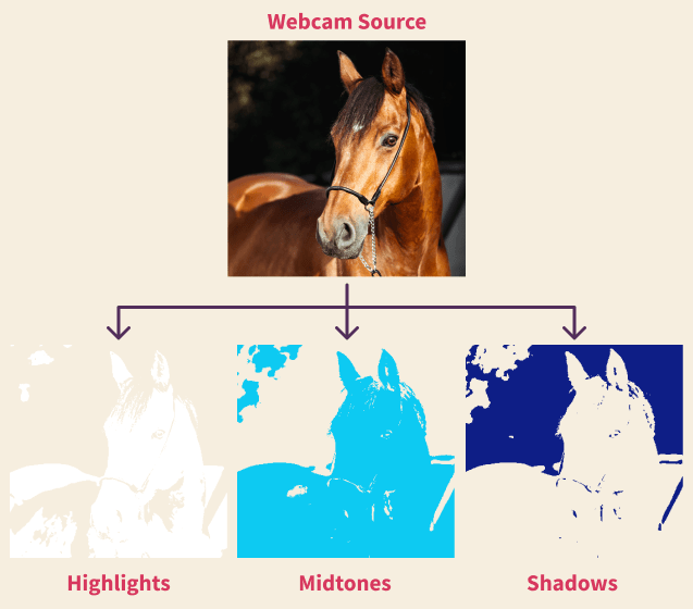
Hover or tap on this example to watch these layers stack in a similar way to Adam’s CodePen:
So how did Adam turn what your webcam sees into these three images?
By utilizing an invisible canvas element for its filter, drawImage() function, and toDataURL() function. Let’s look at the steps to create just one of the above images.
Steps for creating the highlights:
- Apply a filter to the canvas that brings out the highlights.
- Draw the video stream to the canvas.
- Draw that filtered canvas to the
#lightSVG mask.
Then do the same for midtones and shadows, and repeat every 200 milliseconds.
Here’s the function that handles it:
setInterval(function () {
  canvas.width = video.videoWidth;
  canvas.height = video.videoHeight;

  ctx.filter = "blur(1px) grayscale(100%) brightness(140%) contrast(90)"; // Step 1
  ctx.drawImage(video, 0, 0); // Step 2
  document
    .querySelector("#light")
    .setAttributeNS(
      "http://www.w3.org/1999/xlink",
      "xlink:href",
      canvas.toDataURL("image/jpg"),
    ); // Step 3
  ctx.filter = "blur(6px) grayscale(100%) brightness(140%) contrast(90)";
  ctx.drawImage(video, 0, 0);
  document
    .querySelector("#mid")
    .setAttributeNS(
      "http://www.w3.org/1999/xlink",
      "xlink:href",
      canvas.toDataURL("image/jpg"),
    );
  ctx.filter = "blur(4px) grayscale(100%) brightness(190%) contrast(120)";
  ctx.drawImage(video, 0, 0);
  document
    .querySelector("#dark")
    .setAttributeNS(
      "http://www.w3.org/1999/xlink",
      "xlink:href",
      canvas.toDataURL("image/jpg"),
    );
}, 200);
The ctx.filter declarations are where the differences between highlight, midtone, and shadows happen.
He’s using these images as SVG Masks on foreignObject elements, which behave like divs inside the SVG. Remember, the canvas is invisible: you’re seeing masked foreignObjects that were smuggled through the canvas. So let’s modify the above diagram to account for that.
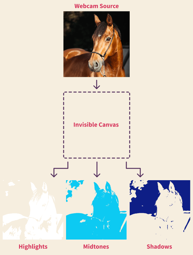
I forked this CodePen and ruined it to make it easier to see the different layers.
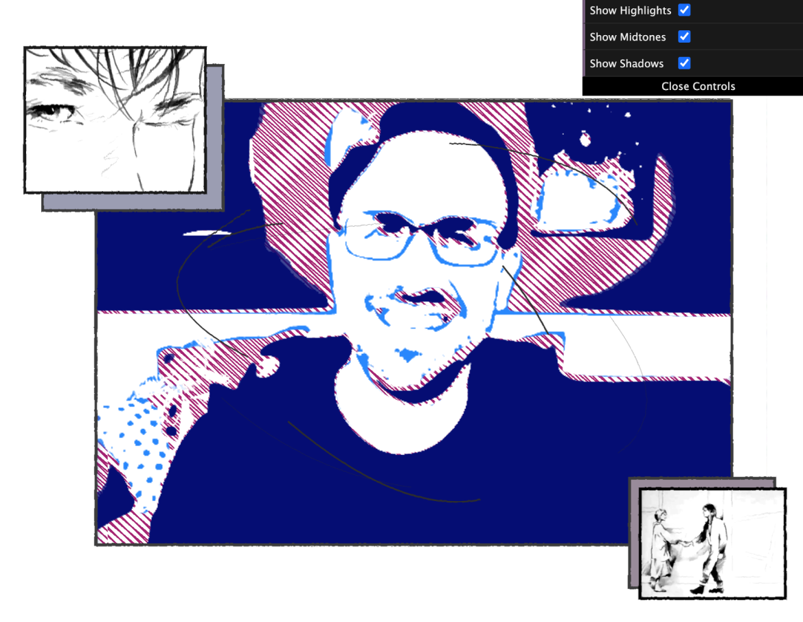
No horse models were available so this guy will have to do.
The sketchy repeating-linear-gradient is firebrick , the shadows are navy , midtones dodgerblue , and I’ve kept the highlights white. I’ve also added a GUI at the top right that lets you turn the layers on or off.
Low Framerate
The animation in the music video have a lowered framerate, so Adam slowed his animations to 5 frames per second (FPS), way slower than the 30-60 FPS we’re used to. In the setInterval function, the canvas drawing happens every 200ms.
SVG Swirls
If you look carefully, you’ll see sketchy little lines orbiting your head. Here they are isolated:
It’s a subtle touch to the piece, but it’s a great technique all by itself. Adam starts with an SVG with three curved paths.

Then with CSS @keyframes he changes the stroke width.
path {
  // ...
  stroke-width: 0px;
  @keyframes width {
    25% {
      stroke-width: 3px;
    }
    50% {
      stroke-width: 0px;
    }
    100% {
      stroke-width: 0px;
    }
  }
  // ...
}
Between 0% and 25% the stroke-width transitions up to 3px, then back down to 0px. The time spent between 50% and 100% is what makes the lines disappear for a little. If all the values in the animation were at least 1px, the lines would persist. Go ahead and change the code above and see.
But what’s making the lines spin around like that? For that he’s using stroke-dasharray and stroke-dashoffset. The CSS property stroke-dasharray turns your solid line into dashes. A low number makes for tiny dashes and tiny spaces between the dashes. Adam has set a stroke-dasharray of 300px, so the dashes and their spaces are 300px long.
Then to make the dashes move he uses stroke-dashoffset, which sets the starting point for the dashes to begin from. You can animate this property to get some nice drawing effects.
You’ll notice the animation in this version is much smoother than Adam’s. While the video update has a choppy framerate because of setInterval(), the swirls here have a step ease to reduce the frame rate. Check out my article on Ryan Mulligan’s Supa Dupa Fly where we break down step eases and this stop-motion effect.
Rough/Squiggle Effect
On top of it all, Adam’s applied an SVG filter, feTurbulence, that he then uses to displace the rest of the piece. It gives all the lines a roughness like they were drawn in pencil.
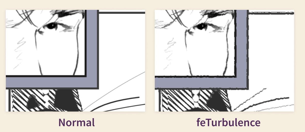
We talked about the feTurbulence SVG filter in Issue 6 if you’d like to read more.
Retro Video
We’ve touched on most of the illustration techniques, but if you hover or click, you’ll see a ‘real’ version of your webcam revealed! There’s still some techniques at work here, so let’s touch on them briefly.
Sliding Frame
In the music video, the hunky lead singer moves behind a magic frame that reveals his ‘real form.’ It’s a great little sequence in the video.
Adam brings that same effect if you hover or click the window.
The ‘real’ video is above the sketchy version with a clip-path applied. If you hover the screen, the clip path transforms to cover half the video. If you click, the clip-path fully reveals the video, covering the sketchy version. We dig deeper into clip-paths in the Supa Dupa Fly article.
The click is handled by a checkbox that covers the entire window with the highest z-index in the piece.
Retro Color Filter
Adam adds a retro feel to the non-illustrated video in a couple ways.
First he has a pseudo element on top with a gradient of #a496a4 and #554d73 . Set to mix-blend-mode: hard-light;, it adds a purple-gray tint.
He also adds filter: saturate(0.75); to the video object, setting its saturation to 75% of the original.
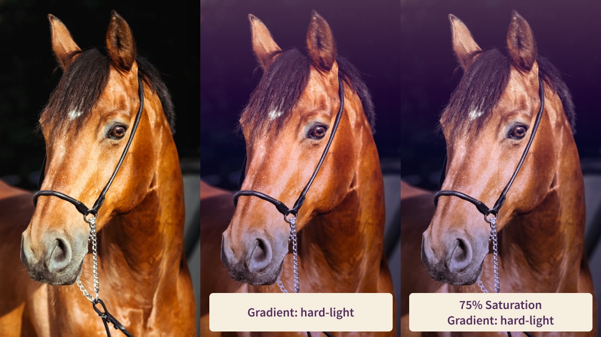
And just like that, you’ve got yourself a nice retro horse.
Wrap Up
That covers most of the big stuff with this fantastic pen! We learned the flow for taking a video stream and turning it into SVG masks. We also saw how Adam used a clip path to reveal a different version of the video, and how he gave it a retro tint. We also learned a bit about SVG filters and stroke animation.
I hope you learned as much as I did, and dig into Adam’s code for yourself. He encourages you to fork it and make it into your own piece, so give it a go! I’d love to see what you make.
Huge thanks to Adam for answering my questions on this piece, as well as coming on the Frontend Horse twitch stream to unveil it. Go follow him on Twitter and CodePen.